Trinidad & Tobago Film Festival Branding Review
1604813_10152125338402171_893755625_n
With the 2014 edition of the trinidad+tobago film festival around the corner, I decided to do a write up on what I think is a very successful brand.
Here is a description of the film festival taken from their website, "Founded in 2006, the trinidad+tobago film festival (ttff) is an annual celebration of films from and about Trinidad and Tobago, the Caribbean and its diaspora."
Usually when things are branded as "Trinidad & Tobago..." there is a trend to have it red, white and black, and to include some sort of local logo cliche, such as a humming bird, a steel pan, or something else that screams "TRINIDAD & TOBAGO." Thankfully the film festival logo did not go down this route and instead chose to use more understated nods to the T&T flag that may not be seen at first glance. Firstly it must be noted that the logo is very clean, with the subtle reference to the T&T flag both in the shape that the words are placed on, as well as the thin strokes that pass through the words.
The typography is transparent and shows a glimpse of the background it is placed on (as can be seen in the images below), and the colour of the block is interchangeable; this adds to the versatility of the branding. The colours used are vibrant and represent well the hues found throughout T&T. The only small issue I had with the logo was the fact that the typography is right aligned and perhaps a left alignment may have made it a little more successful based on the shape that the type sits on. Overall a very good logo that is used successfully throughout all the media that it rendered on.
The application of the logo by the film festival is very uniformed across the board, and the logo, as well as use of colour, makes it instantly recognizable as to what it is. I particularly like the transparent lettering that allows each image to create a unique representation of the typography in the logo.
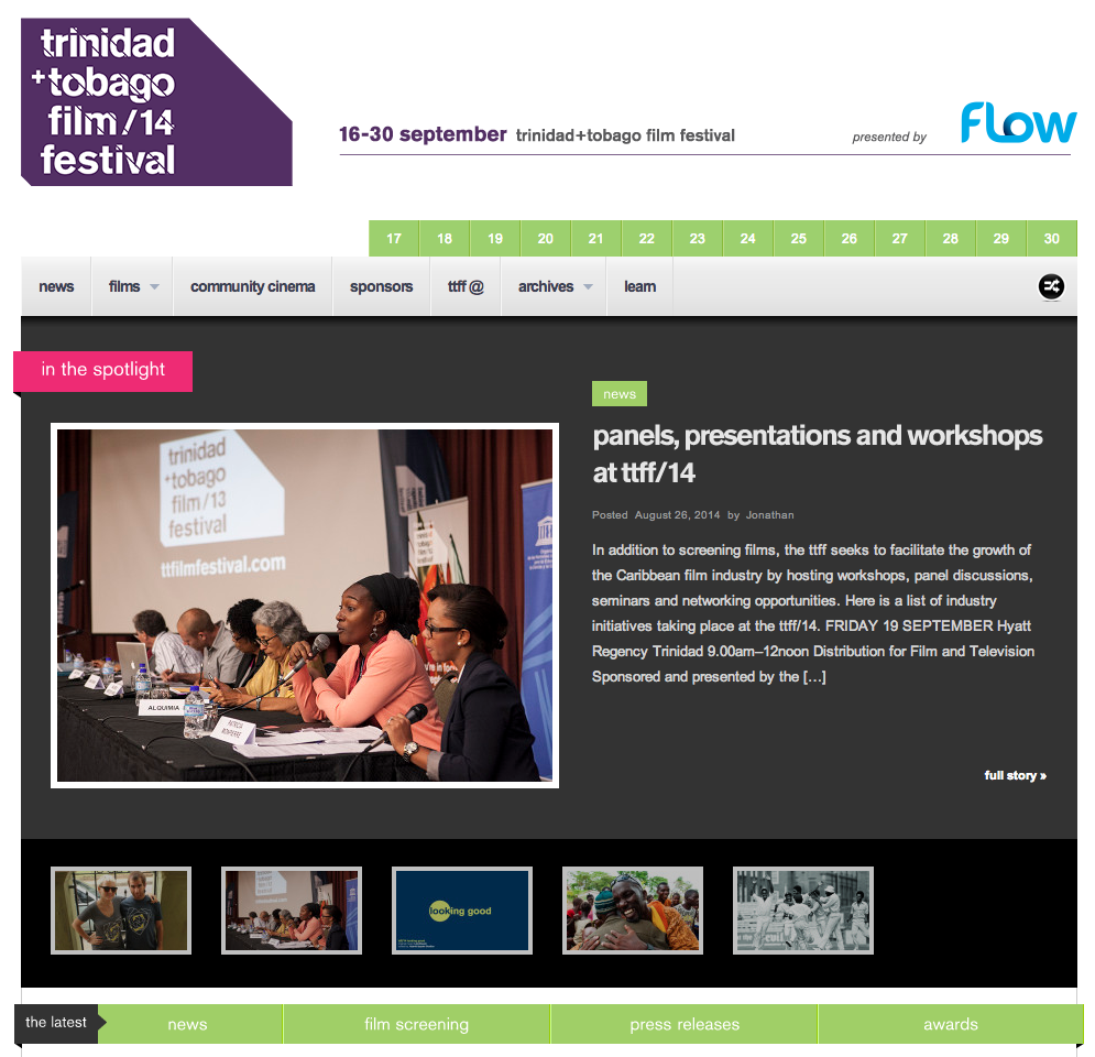
Both the cover of the 2014 guide and the website home page keep up the same quality branding and the colour choices for the typography are on point. All of the design elements are thoughtfully executed and makes for a successful and enjoyable experience for the user. The trinidad+tobago film festival definitely has a high standard when it comes to their branding and I am personally excited to be a patron this year.
The trailer for the film festival can be found here.
Update- Abovegroup rebranded the film festival in 2009 and Melanie Archer, the art director for the festival has been responsible for the application and development over the years, under Abovegroup's guidance in 2010, and then solo since.
Nick.


