
Creating a Portfolio to Get Hired
A designer’s portfolio is basically the “proof in the pudding” that both clients and agencies look at before deciding if to hire you or not. You can have a good resumé or a degree from a top art school, but if your portfolio falls flat you will most likely miss out on a lot of jobs. It is the visual representation of what you have done and achieved in your design career.
I get a lot of questions from designers looking for…

A designer’s portfolio is basically the “proof in the pudding” that both clients and agencies look at before deciding if to hire you or not. You can have a good resumé or a degree from a top art school, but if your portfolio falls flat you will most likely miss out on a lot of jobs. It is the visual representation of what you have done and achieved in your design career.
I get a lot of questions from designers looking for advice or tips on how to put together the perfect portfolio to get hired (either by agencies or by potential clients.) Creating a good portfolio can pose a challenge to designers of all levels and figuring out what you should and shouldn’t include can be a painstaking process. Here are some questions that I have received in the past about portfolios:
What should I even include?
This is one of the more common questions that I see being asked. The simple answer is to only include work that you want to be hired to do. That is the base level. If you want to be hired to create brand identities, then you need to show in your portfolio that you can create brand identities. The billboard that you designed, no matter how great of a billboard it is, will not add credence to your quest in becoming a brand identity designer. If your dream is to create album art for clients, you need to show a portfolio that has album cover designs (or at the very least, work that shows that you have the capabilities to design album covers.)
I want to design (insert any design niche here) but I don’t have any experience, so have no examples to include in my portfolio.
The most typical follow up to the first question is that, “yes I want to do brand identities (or whatever other design niche) but I’ve never done any work in that niche so I have nothing to show.” Simple solution…go do it. Then add the work to your portfolio. If no one is willing to pay you to do the work - find a friend that needs design work; find a client with no budget that might be willing to do a service/goods exchange; get an internship or a junior position; do some work for a charitable organization. Point is, there are a lot of ways to get actual, produced work to show in your portfolio. You just need to do the work and get it done.
I have a lot of work to put in my portfolio, should I add all?
No. Add what you think is the best representation of your abilities as a designer. This should be evolving and changing as time goes by. I personally cull jobs from my portfolio every few months as I add new work that I think better represents me as a designer. I’ve hired designers already, so I’ve seen my fair share of portfolios. If I receive a portfolio with 15 projects, and 8 are amazing but 7 range between OK and not that good, I would overlook that designer for a candidate that shows 5 projects and all 5 projects are amazing. Quality over quantity every time.
Can I use my Social Media pages, like Instagram, as a portfolio?
I think that when you are marketing yourself as a designer, social media is simply a part of the story. Things like Instagram or Twitter show a depth of work as well as an evolution over time. It also adds to context to what you are interested in, or any creative endeavors that you have experimented with. Having a blog is also a really good part of telling your story as a designer as it shows that you can speak about design and that you are a good writer. I was told after my interview at an advertising agency in 2014 that one of the reasons I was hired was because of a specific blog post that I had recently written. You have to expect that all candidates are going to have a degree, or a certain amount of experience, and a good portfolio. How will you set yourself apart?
How should I send my portfolio in for an agency job?
Having gone through the hiring process, I will say what I think worked best and what was most efficient for me and my team. The most effective submissions came like this:
An email with an outline as to why you think you’d be a good fit and any other information that speaks to the fact that you are a good candidate.
An attached PDF that has the Resumé/CV as the first page of content, with the portfolio pieces after that. Having your CV included in your portfolio PDF makes it easier to save your information and to share it internally during the review process. It’s one file instead of 2 or more. Make sure that the PDF is titled with your name and the word Portfolio so that it can be easily searched. (Note: if a job specifically asks for an online portfolio or your CV in a separate file, then do what is asked of you.)
Please, please, please, do not submit individual images. Compile all your work into one PDF.
Follow the submission instructions! If a call for submissions go out on Facebook and it says to email your info, DO NOT then send the Facebook page a message. This shows that you can’t/don’t follow instructions.
I always look at the actual design of the portfolio and not just the content. If you are graphic designer, I think having a well design portfolio is key. Don’t worry too much on your a personal logo, having your name in a nice elegant font is enough.
Should I add anything else to my portfolio?
Something that I think will add a lot to a portfolio is a small bit of information alongside each project. What was the brief? What design challenges did you face? How did you find solutions in your process? This adds so much to the overall story of you as a designer, and it also shows that you think about design and aren’t just interested in making something that looks good.
What’s the best way to show off my work in the portfolio?
The best way to show off you work will always be good photography. In lieu of good photography, which can be expensive, then mock ups work as well. The mock up should ideally be as realistic as possible, and I usually recommend purchasing the mock up rather than using a free one. The free ones have been used and abused by thousands of designers, so chances are they’ve already been “seen” by other creatives already. Photography is always best though! Maybe work with a photography student/friend who is also looking for portfolio pieces and collaborate with them on your own portfolio photos.
If there is anything else you’d like to know about creating an amazing portfolio, either leave a comment or click here to send me an email. Thanks for reading!
N.
PS. Here is a YouTube video I made in 2017 showing off my University Portfolio:
How I Started My Own T-Shirt Brand **PART 1**
The idea for what became Deftment began over a year before our launch, when my good friend Kevin and I dreamed of creating quality tees with a unique Caribbean style. I have always...
The idea for what became Deftment began over a year before our launch, when my good friend Kevin and I dreamed of creating quality tees with a unique Caribbean style. I have always loved t-shirt design because a t-shirt is something that everyone owns, thus making the art/design on it something that is available to a huge audience.
We officially launched Deftment on October 3rd 2014, but the real work on the brand began a year before in September, 2013. Our vision at the time was simple, to provide high quality tees that were suited to a Caribbean lifestyle. This meant that it had to be stylish, versatile and durable; it should transition from the beach, to the pavement bar, to an all-inclusive fete with ease. The Caribbean is full of skilled individuals ranging from artists, musicians, chefs, DJ's, fashion designers; and these were the people who we detailed as our ideal customer. Our brand had to reflect this culture, and this passionate bunch. I had an idea of what I wanted aesthetically; something that drew from elements of typography, nature and mathematical geometry...we just had to figure out how to pull it all together. Developing a name posed a challenge. We wanted to invent our own word, something that we could define without preconceptions. Deftment is a portmanteau of deft, as in skilful, and movement. We set out to be a skilled movement.

In these two pictures I was getting close to the final logotype for the word DEFTMENT. I hadn't settled on a final logomark, the symbol that represented the brand (i.e. the Nike Swoosh vs the word NIKE.)The final logomark was made up of a series of hexagons, and you can see the inception of this idea from the pictures here.
The next thing on the list was creating a brand identity for Deftment starting with a logo. As I stated earlier, for the aesthetic of the brand we wanted to feature different geometric elements, and this was what I focused on with initial logo explorations.

We were looking for those geometric elements for the logo, and it all came to be by experimenting. I was trying to digitally create the face of a monkey using only geometric shapes. I drew a few hexagons and got to work resulting in something really close to what is the final logo.

A lot of tweaking and hard work went into perfecting the logo, as it would be the cornerstone of our brand and something that people would associate us with. I think the result was successful because it responded to our initial needs, and in the end we ended up with something that we set out to achieve in our own design brief.
In Part Two I will discuss the lead up to our launch, and the design process for the first Deftment Line.

10 Vector artists to follow on Instagram
Instagram has recently become my new favourite social media platform, and I have been spending maybe too much time on the app. Apart from posting everyday, I also thoroughly enjoy going through the feeds of other designers and illustrators. There are a few that when I see their work I think "dammit, I wish I thought of that." Here is a list of ten of those vector artists that I always keep up with (in no particular order.) Make sure to give them a Follow to be inspired everyday!
Instagram has recently become my new favourite social media platform, and I have been spending maybe too much time on the app. Apart from posting everyday, I also thoroughly enjoy going through the feeds of other designers and illustrators. There are a few that when I see their work I think "dammit, I wish I thought of that." Here is a list of ten of those vector artists that I always keep up with (in no particular order.) Make sure to give them a Follow to be inspired everyday!
1. @MUSKETON- Musketon is an illustrator hailing from Belgium whose working is pretty amazing. He has a lot of give aways and posts regularly so is definitely one to follow.
2. @THOMCAT23 - It amazes me the amount of work Thomcat 23 puts out on a regular basis. What is really cool is that he shows his process from sketches to finished piece.
3. @TAJFRANCIS - A fellow Caribbean illustrator, this Jamaican is doing huge things in the design world with a unique style.
4. @DANMUMFORDDRAWS - The level of detail in Dan Mumford's work is astonishing, and he works on some really cool clients.
5. @SWEYDA - Sweyda's work epitomizes patience with the pen tool in illustrator. Truly a master of the craft.
6. ZPREP - This guy is all about the lines, his work is pretty cool and he illustrates a lot of Star Wars characters which is a bonus.
7. DLO168 - A modern take on Art Nouveau, DLO168 is a great illustrator.
8. THOMAS_DANTHONY - His super simple style definitely stands out. I also love the colour palettes that he uses.
9. TIMBASMITS - A sweet 1950's look makes his work really amazing.
10. GAKSDESIGNS - A fellow Trini artist, Gaks is the self proclaimed Master Vector Ninja, and his work certainly speaks for itself....seriously, check out that line work.
As a bonus, make sure you follow my Instagram page -- NICHOLASHUGGINSDESIGN -- to see some cool stuff posted daily!
Joseph Kosuth and the Idea of Art
“The 'value' of particular artists after Duchamp can be weighed according to how much they questioned the nature of art.”― Joseph Kosuth, Art After Philosophy and After: Collected Writings, 1966-1990
Joseph Kosuth is an American Conceptual artist whose work...

one-and-three-chairs
“The 'value' of particular artists after Duchamp can be weighed according to how much they questioned the nature of art.”― Joseph Kosuth, Art After Philosophy and After: Collected Writings, 1966-1990
Joseph Kosuth is an American Conceptual artist whose work focuses on exploring the nature of art and creating artwork that is about the meaning, not necessarily on producing work that we typically view as fine art. Kosuth, who draws from both his studies in anthropology and philosophy, is one of the pioneers of the conceptual art movement that came about in the 1960’s.
Conceptual art was defined based on the grounds established by the artists themselves and was conceived of entirely by the artists. The art of Kosuth was idea driven. He rejected the idea that art should be based on aesthetics, and states that in the past, art’s function was its value as decoration. He believes that art’s only claim is for art; that art is the definition of art.
“Art as Idea as Idea” is a series of work by Joseph Kosuth that involves texts through which he probed the condition of art. He went about the series by using the idea that art is a set of formal problems. He had a shift in what he thought and understood was the context of his work. The creative process to him was in changing the idea of art itself. Without larger meaning, art was reduced to decorative, formalist works.
His most renowned work in this series is “One and Three Chairs.” The 1965 work consists of a chair, an image mounted on the wall of the chair in actual size, and a print of the dictionary definition of the word “chair.” It also comes with instruction for the realization of the piece. In each location the work is set up, it will be different aesthetically yet it will keep the same idea. The goal of “One and Three Chairs” is to show that a work of art can embody an idea that doesn’t change, despite constant changes to its elements. It can be set up anyhow, by any one, with any chair, yet keep the same core idea that Kosuth intends behind the work.
“One and Three Chairs” looks at the relationship of language and a narrative in works of art. It attempts to solve the problems associated with art by making the artwork interchangeable, and substitutable. Because you can essentially create the artwork anywhere once you follow the instructions, the work can be created anywhere by anyone. It was the idea of the work that constituted the work, rather than the formal artistic elements.
It is very interesting that Kosuth values the idea behind the piece more so than simply what you saw. To him, the most important thing in his piece is the idea. Every work of art to Kosuth is tautological, and it describes only itself.
In one of his works (Leaning Glass, 1965), he has 4 square panels of glass leaning against a wall. Each glass has a different word that is factual and descriptive of the glass pane. The words are “glass,” “square,” “leaning” and “clear.” His work makes the viewer consider what is art, and he uses his philosophical learnings in order to define what art is.

untitled-142D49937FE31DE9248
Kosuth says that he chose glass as the medium due to the fact that it was clear, and there were no compositional problems as far as choice or location or color. He first started the process of the work by figuring out the presentation of the glass. He tried smashing it, stacking it, but this led him to try using language in the work. With his first glass piece he leaned it against the wall, with a lable next to it reading “Any Five Foot Sheet of Glass to Lean Against any Wall.” The work was neither a sculpture on the floor nor a painting hung on the wall, and as glass had no form or composition.
His neon signs also explore the tautology in art. He creates neon signs of text that state exactly what it is. “Five words in orange neon” is a work of Kosuth’s done in orange neon. It is exactly what is written, five words in orange neon. Or similarly, "four colors four words." It looks at the semiotics in the art and how the word relates the way it is portrayed. Joseph Kosuth focuses on the meaning of the art, and not simply the fashioning of forms and colors. The making of meaning is what he believes art to be. He states that artwork must involve a test and that art that doesn’t work within this context consists of illustrations of what art might be.

four-colors-four-words

tumblr_mewh453SHE1qkg9xeo1_1280
Joseph Kosuth is a very important figure in the last 50 years and he has helped to better define art. His work is similar to Duchamp in that if someone says it is art, then it’s art. One of his inspirations is Ad Reinhardt who painted black squares. He believes that what made Reinhardt an artist is not the fact that he paints black squares, it’s the meaning behind what he is doing, and this is just what Kosuth wants in his work, for the meaning to be the important thing and to come through.

The Artist
Trinidad & Tobago Film Festival Branding Review
With the 2014 edition of the trinidad+tobago film festival around the corner, I decided to do a write up on what I think is a very successful brand…

1604813_10152125338402171_893755625_n
With the 2014 edition of the trinidad+tobago film festival around the corner, I decided to do a write up on what I think is a very successful brand.
Here is a description of the film festival taken from their website, "Founded in 2006, the trinidad+tobago film festival (ttff) is an annual celebration of films from and about Trinidad and Tobago, the Caribbean and its diaspora."
film-fest-logo

Screen Shot 2014-09-03 at 1.47.12 PM
Usually when things are branded as "Trinidad & Tobago..." there is a trend to have it red, white and black, and to include some sort of local logo cliche, such as a humming bird, a steel pan, or something else that screams "TRINIDAD & TOBAGO." Thankfully the film festival logo did not go down this route and instead chose to use more understated nods to the T&T flag that may not be seen at first glance. Firstly it must be noted that the logo is very clean, with the subtle reference to the T&T flag both in the shape that the words are placed on, as well as the thin strokes that pass through the words.
The typography is transparent and shows a glimpse of the background it is placed on (as can be seen in the images below), and the colour of the block is interchangeable; this adds to the versatility of the branding. The colours used are vibrant and represent well the hues found throughout T&T. The only small issue I had with the logo was the fact that the typography is right aligned and perhaps a left alignment may have made it a little more successful based on the shape that the type sits on. Overall a very good logo that is used successfully throughout all the media that it rendered on.

trinidad-tobago-film-festival
The application of the logo by the film festival is very uniformed across the board, and the logo, as well as use of colour, makes it instantly recognizable as to what it is. I particularly like the transparent lettering that allows each image to create a unique representation of the typography in the logo.

Screen Shot 2014-09-03 at 1.58.05 PM

Screen Shot 2014-09-04 at 11.04.08 AM
Both the cover of the 2014 guide and the website home page keep up the same quality branding and the colour choices for the typography are on point. All of the design elements are thoughtfully executed and makes for a successful and enjoyable experience for the user. The trinidad+tobago film festival definitely has a high standard when it comes to their branding and I am personally excited to be a patron this year.
The trailer for the film festival can be found here.
Update- Abovegroup rebranded the film festival in 2009 and Melanie Archer, the art director for the festival has been responsible for the application and development over the years, under Abovegroup's guidance in 2010, and then solo since.
Nick.

My First Logo
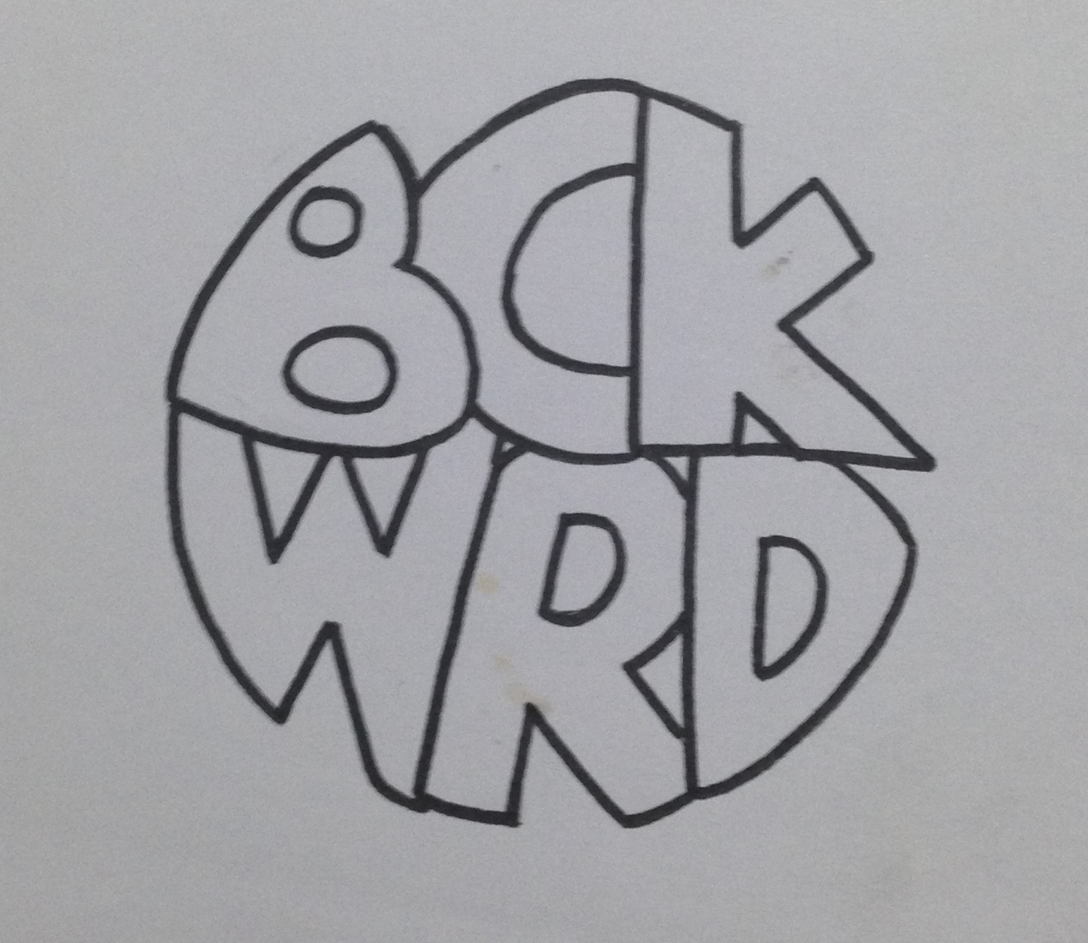
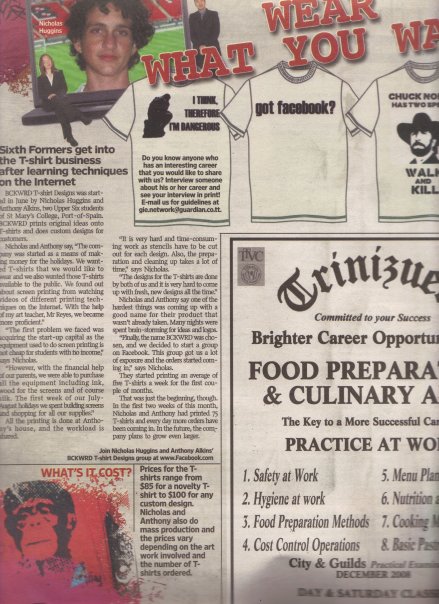
I was recently going through some of my old work and I found what is possibly the first logo I have ever created. To give some background to the logo I will give the story about what it was for. At the age of around 17, a friend (Anthony Alkins) and I decided we…

bckwrdlogo
I was recently going through some of my old work and I found what is possibly the first logo I have ever created. To give some background to the logo I will give the story about what it was for. At the age of around 17, a friend (Anthony Alkins) and I decided we were going to start a T-shirt printing business. We decided that it will be a good venture to start in an effort to make a bit of pocket money. We had achieved a small amount of success spray painting images through a stencil onto the t-shirts of fellow students during the intercol season, and figured this was a good step to take. After a little bit of research we decided that the best and most efficient way to print t-shirts was screen printing. We got all our equipment (ink, silk, built screens, etc) and wrote down a list of ideas to put onto these t-shirts. Our idealistic view was that we were going to print t-shirts that we would want to wear ourselves, and of course people will flock to buy them. Truth be told, we did sell quite a few of our own ideas, but for the most part, people came to us with their own ideas for us to print. This turned out to be our biggest money maker. Before we printed a t-shirt, we needed to come up with a brand name. Something for people to recognise us by. This was my first foray into branding and at this time I had no clue about anything in the world of graphic design. Being the "artist" in the business I was tasked with drawing a logo once we came up with the name and the name we eventually chose was BCKWRD Designs.
Come time to create the logo, I made a bunch of sketches and eventually created a finished drawing with a marker. I then scanned the image and coloured it black in photoshop with the help of the magic wand tool and the brush tool. At this point I had no idea what illustrator was, and very limited knowledge of photoshop. If you asked me about raster graphics, I would have assumed you were telling me something about Bob Marley. With the little skill possessed, a logo was eventually created and we started printing. We achieved relative success with the business, and we printed a few afternoons every week for the next 2 years or so, we were even featured in an article in the newspaper as well as a local talk show showcasing youths who were doing things out of the ordinary.
This early experience with graphic design eventually led me to choose graphic design as a career and I was fortunate enough to study it in detail for 4 years at SCAD. I think one of the positives in the early BCKWRD logo is the handmade feeling, and it is what can be achieved through sketching before going straight into illustrator and using a font found online. When designing always consider a youthful naivety in the sketching process, and this will show through in creating original designs that does not look like any old logo found on behance or pinterest. Check out the finished logo below.

bckwrdlogowhite
Here is some process work that I found in an old folder. From an initial sketch to the finished drawing that I would have scanned in.

IMG_3923

IMG_3920
IMG_3921-2
IMG_3922
353_100551145480_4108_n
"Fins by O'Brien" Logo Process
Someone recently approached me to come up with a logo for them. They had started making custom surfboard fins out of plywood and the product piqued my interest. I immediately started formulating ideas…

Image
Someone recently approached me to come up with a logo for them. They had started making custom surfboard fins out of plywood and the product piqued my interest. I immediately started formulating ideas in my mind and by the next day I had a pretty solid idea as to what I wanted the final logo to look like. Below is the initial sketch in my notebook.
From there, I drew it out in Adobe Illustrator very roughly in order to get a feel for the positioning and shape of the letters.
Image
After that it was just a matter of editing the strokes and the anchor points in order to get the desirable look for the logo. A wooden texture was added to reflect the nature of the product.

Image
The Importance of Brand Guidelines
One of the fundamental things to keep in mind when designing a brand, is consistency. You want people when they see your logo to relate it immediately to your brand/product/service. This is achieved through proper logo usage. Too often in Trinidad & Tobago…

Screen Shot 2014-04-04 at 11.34.34 AM
One of the fundamental things to keep in mind when designing a brand, is consistency. You want people when they see your logo to relate it immediately to your brand/product/service. This is achieved through proper logo usage. Too often in Trinidad & Tobago we see poor usage of logo where brand guidelines (if there are any) are thrown out the window. On my daily commute I pass "Ultracool LTD," a company that deals in air conditioning sales and parts. On the outside of their building there are three (3!!!!) different renditions of their name. The first logo is painted onto the facade of the building, the second is used as a neon light, and the third is on a banner. This lack of brand identity is typical in a place where not enough emphasis is placed on graphic design. Business owners need to realise the positive impact that having a proper brand identity will bring to the table.
