A few updates
Hey everyone, I just wanted to share some news/updates here…
deftment feature
Hey everyone, I just wanted to share some news/updates here.
Firstly, I am working on a brand new portfolio website so make sure to stay on the look out for that! It will have a ton of new work and projects that I've been holding off on posting until I was able to update my site. It's very exciting, but is proving to be a whole load of extra work to add to an already busy schedule.
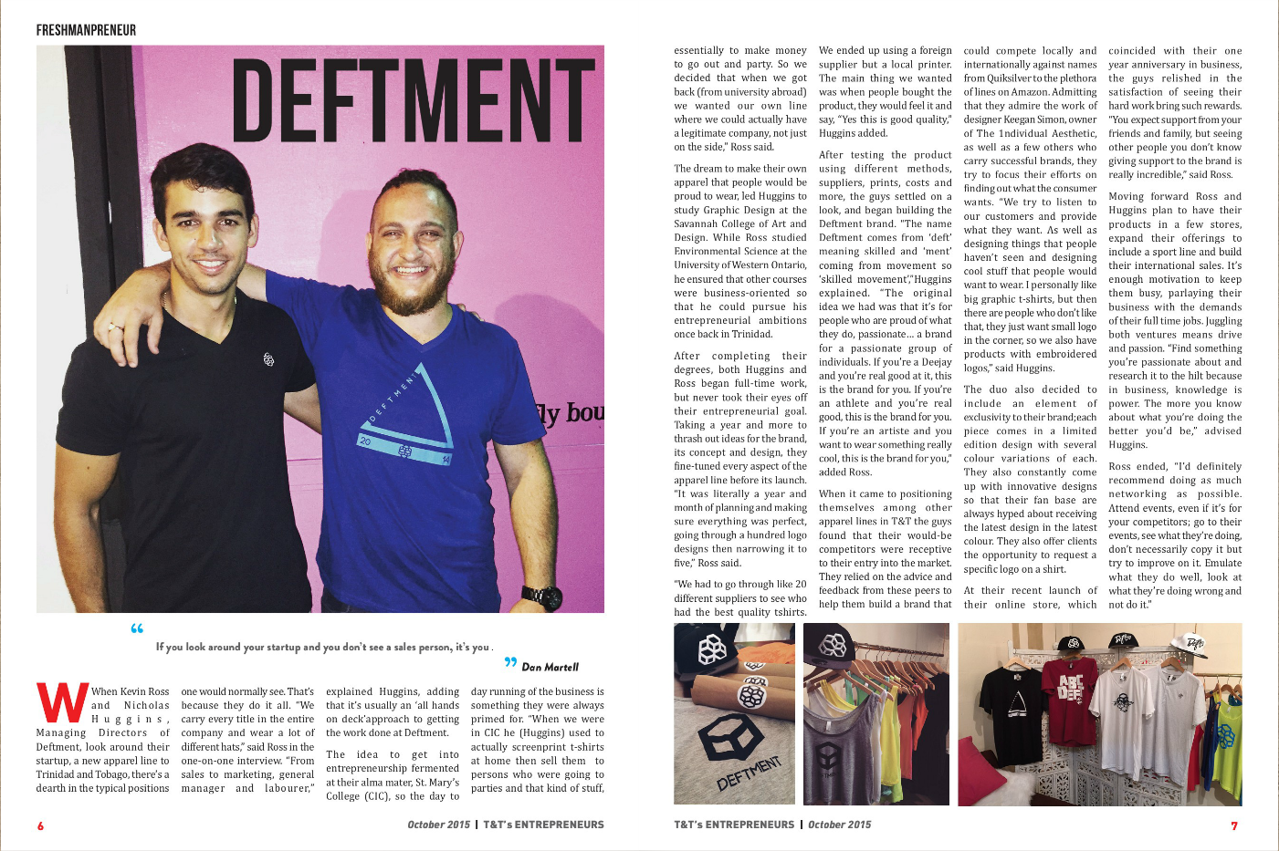
Something else that was exciting this year was being featured in two magazines. The first was T&T Entrepreneurs magazine. Click the link to see the feature or just check out the screenshot below.
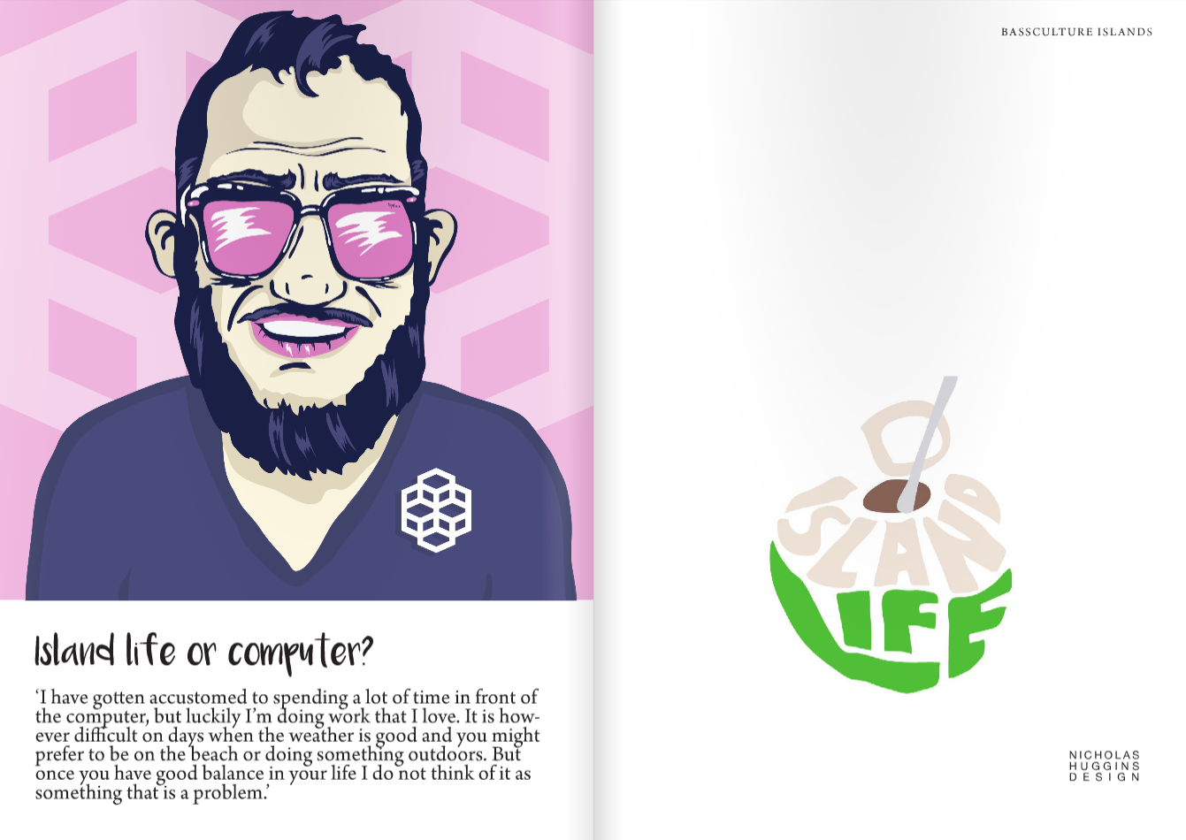
The second magazine is a really cool publication called Bassculture Islands out of Poland. They featured my illustrated portraits alongside an interview as well as using my typographic illustrations throughout the rest of the magazine.

Screen Shot 2016-02-17 at 2.09.05 PM

Screen Shot 2016-02-17 at 2.09.12 PM
Screen Shot 2016-02-17 at 2.09.20 PM
I hope you enjoy these, and make sure to look out for the launch of the new website and a few new projects that are currently under wraps!
Nick.
How to write a decent blog post in 10 easy steps
Step 1- Come up with an interesting name that could catch the attention of people. Names such as "Photographing the Mundane" is boring, back to the drawing board. Step 2- Briefly research your topic.
Step 3- Start writing.
Step 4- Perhaps, include a nice stock photo for impact. Readers respond well when images are included in blog posts.

Step 5- Think about formatting your blog post as a list. Lists have a proven track record of getting more views! Just look at buzzfeed!
Step 6- Maybe write some more. People love reading stuff.
Step 7- Make sure you proofread for any erors. This is impotent!
Step 8- Double check your accuracy.
Step 9- Upload the blog post and watch the amount of visitors to your site increase exponentially.
Trini Christmas & what we can be doing to boost tourism
If, as the popular song goes, Trini Christmas is the best, then why haven't we as a country embraced this as a possible draw for tourism in the same way as Carnival?

Men-From-The-Mainland-Carriacou-Parang-Bands-Competition-2005
If, as the popular song goes, Trini Christmas is the best, then why haven't we as a country embraced this as a possible draw for tourism in the same way as Carnival? During a conversation with a coworker about the John Lewis 2015 Christmas ad (Man on the Moon) we wondered why there is not this type of advertising in Trinidad & Tobago during the christmas season. The sort of heart warming, tear jerking christmas ads that are popular abroad, are not employed here. What is the reason? http://www.youtube.com/watch?v=9JUrLFxGgKU
The conclusion we came to is that Christmas means something else to us. I don't mean the general concept of what christmas is; I mean how we celebrate it and what can be broken down as the christmas "vibe."
Like Carnival and Calypso, we have an endemic music for Our Christmas, Parang. Parang music is played with cuatros, maracas, box bass, claves, toc-toc, guitars and tambourines amongst other instruments. Soca-parang, which is more popularly played on the radio has a very distinct style, and is usually humorous in its nature, with a lot of the songs incorporating sexual innuendos and double entendre.
While the malls in the US are softly playing Silent Night etc, our shopping centres are belting out Parang & Soca Parang tunes... "eating, drinking, having a good time; dancing, prancing, having a good time." All of this uniqueness should really encourage a new brand of tourism where Our Christmas is what we are selling.

Ponchecreme
Another main part of our Christmas is of course the food. We have pastelles, ham and hops, sorrel, black cake, and of course the usuals like macaroni pie, corn pie, turkey, stuffing. I'll let the photos do the talking.

pastels
After I began writing this, the news story of the Piarco Airport Christmas decor went viral. The point of arrival for every tourist into Trinidad was decked out as a white christmas wonderland. Maybe it was the intention of those responsible to make visitors feel at home before they were greeted with the Caribbean warmth as they exited.

decor
After the social media outrage they acted quickly to replace it with something more "local." The replacement seemed to be done without much thought, and as one commenter on Facebook said, they thought it looked like they pillaged one of the souvenir stores of their t-shirts and mannequins. It was however, a great improvement from the previous set up.

new decor.1
What this public outrage showed me is that general population do care about showing off our culture and ensuring that our Christmas traditions are celebrated. We have no need to import the customs of other countries when we have such a strong culture. Trinidad & Tobago should be pushing our Christmas to the world and thereby capitalizing on the potential tourism draw. Can you imagine someone from a cold European country purchasing an all inclusive vacation to a tropical island where the first morning they are treated with Pastelles, Hops and Ham with kuchela washed down with a glass of sorrel. That night they could be taken on a guided tour up to Paramin, or to Sangre Grande to be immersed in the Parang. The rest of the time the all inclusive package could include beach trips, hikes, christmas fetes and other cultural explorations.
This is something that should definitely be looked into as Trinidad & Tobago seek to diversify the economy, and I think as a culture and society we would be proud to see our unique Christmas shared with the world in this way.

Holiday Baked Ham-5
Carnival Vendor Booths and the Trinbagonian Aesthetic
Every year around this time the construction of vendor booths begin around the Queen's Park Savannah. Their arrival around the Savannah is always something that has intrigued me as they spark an excitement in people as it signals the arrival of Carnival. But their design is also something that captivates me.

2011-11-28-12-1a_CARNIVAL_BOOTHS_27-11-11_(1)
Every year around this time the construction of vendor booths begin around the Queen's Park Savannah. Their arrival around the Savannah is always something that has intrigued me as they spark an excitement in people as it signals the arrival of Carnival. But their design is also something that captivates me.
They are designed to be very utilitarian and serve a single purpose- to house vendors for a short space of time, usually a couple of months depending on the length of the Carnival Season, and because of this they are made to be easily installed and have basic amenities that would be needed by the vendor.
They are painted in very basic colours with each section of the booth usually different to the other. They were probably all originally painted in a single, different colour but because of the fact that they are dismantled every year and then rebuilt, each colour was mixed up and now each one is a structure of varying colours.
These booths remind me of the work of Mark Rothko, the abstract expressionist best known for his paintings of different planes of colour.

http://www.mark-rothko.org/images/paintings/number-10.jpg
As you can see in the side by side comparison below, the way the colours are used in all are similar but for very different intention. The vendor booths are painted in these colours by the National Carnival Commission and because of how they are made, have evolved into a multi coloured structure. However once put up, they are usually covered in advertising making the time that they are at their colourful best very short.
The Middle image is of the Rothko painting, done strictly for the purpose of being an art piece with the colours chosen consciously by the artist to be a work of art.
The third image is of a fete sign with a rothko-esque background. These colours were chosen as a design element; meant to convey meaning to the viewer and to make the portrayal of information effective. We have in these 3 images the difference between coincidence, art, and design.

2007-01-12-8-1A
After studying in the US for 4 years and being around designers from all over the world, I always think about the question of what is the Trinbagonian aesthetic. Visually, what is intrinsically Trinbagonian? To answer this is very difficult; where do you find the answer, what do you look at to find this. Does the answer lie in the colours that we come across everyday such as the vendor booths; or the design that we encounter on a daily basis such as the fete signs; maybe it can be found in the work of the many fine artists, photographers, fashion designers, architects, and mas men of the country.
I think though that anything designed or created here (in T&T) must represent the Trinbagonian aesthetic whether intentionally or not. Or, maybe I'm completely wrong, but I will continue to think about this and maybe one day the question will be answered.

12243720_10156229733915481_1656550792_n
12272890_10156229733850481_377729164_n

12226592_10156229733660481_1591555522_n
Nicholas Huggins is a graphic designer, art director, and painter from Trinidad & Tobago. You can see his work here.
The work of Peter Minshall
This essay will deal with the role and importance of characters and storylines in Trinidad and Tobago Carnival and more specifically, in the work of Peter Minshall. In order to define the work of Peter Minshall, we must first define Carnival.
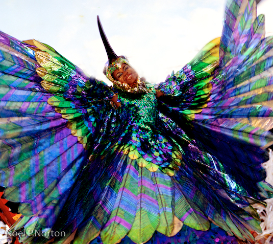
Peter Minshall’s Hummingbird, 1974. Photo by Noel Norton
This essay will deal with the role and importance of characters and storylines in Trinidad and Tobago Carnival and more specifically, in the work of Peter Minshall. In order to define the work of Peter Minshall, we must first define Carnival. Carnival comes from the Latin Carnis- Flesh and Vale- farewell.[1] Therefore Carnival literally translates to the ‘farewell to the flesh’ period prior to lent. Throughout the history of Carnival, the use of characters to portray different things has been the norm. From the Negue Jardin to the Midnight Robber, and the Pierrot Grenade to the Jab Molassi, the characters are varied and diverse. The work of Peter Minshall is world-renowned and is the epitome of Trinidad and Tobago Mas’ (abbreviated form of masquerade), so much so that he is colloquially known in Trinidad and Tobago as “Mas Man”.[2]
This paper seeks to explore the role and importance of characters in Trinidad and Tobago Carnival through the work of Peter Minshall. Minshall is known for taking the art of Carnival design into choreography and telling stories through his work. Amongst all the carnival artists, it is Minshall who first started breaking boundaries in his work as we will see in his trilogy of bands between 1983 and 1985.
From a very young age he began taking part in Carnival and it was the stories of the characters and what they represented that struck a cord with Minshall. He was riveted with the stories his father told him of the characters and the design of the characters, and how when they moved, the cloth used to make the costume danced, and through this dance, they spoke to him.[3] As a child in the Caribbean, and more specifically Trinidad and Tobago, being around the creativity and experience of Carnival would have influenced the art of Minshall. At the age of 12 he came to Trinidad with his family from British Guiana, and just one year later at the age of 13 he made his first Carnival costume. Throughout his teenage years he started making costumes for friends and family, and at the age of 21, he went to study theatre and performance arts at the Central School of Art and Design in London. In fact, his thesis paper was on the Carnival Character of the Bat; a character that intrigued him and even served as inspiration in his later works.[4]
Carnival has its origins as “Canboulay” (French- Cannes Brulees – Cane Burning) when in the 1800’s, the slaves and indentured laborers were not permitted to take part in Carnival, and they created their own procession.
The dissident slaves would signal their comrades with a hillside fire to burn the cane fields. The Negue Jardin who were field slaves from neighboring estates were the ones in charge of extinguishing the fires. This was eventually reenacted as a street performance annually, and was later joined by the upper class French- Creoles, who, in their torn pants and sooty face, parodied the Negue Jardin. The Canboulay planted the seeds for what is now Carnival in Trinidad and Tobago as there were masquerades, characters, and the early signs of an endemic music from Trinidad and Tobago, including the steel pan.[5]
By the 1940’s the Canboulay was replaced by the Dimanche Gras on Carnival Sunday with the first Dimanche Gras taking place in 1948. This was when the King and Queen of Carnival were crowned and it began as a way to create a theatrical experience out of the mas or carnival.[6] Of course it wasn’t until 26 years later in 1974 that Minshall’s debut into the this competition would take place, with his band “Land of the Hummingbird,” but it is important to note the history in order to better understand his thinking, and his work.[7]
His first Carnival Band “Land of the Hummingbird” was, to Minshall, everything he sought to embody through his Carnival designs. It was a character where the cloth was dancing.
According to Minshall, “At first she looked like nothing, just a little blue and turquoise triangle, bobbing along among those grand plumed and glittering chariots, a little tent bobbing along. And then, the hummingbird burst into life, like a sapphire exploding.”7 He sought, through this costume to make the hummingbird not someone in a hummingbird costume, but a hummingbird itself. The costume wearer became the character and performed a narrative based on that. Throughout the years and in his work that came after Land of the Hummingbird, Minshall’s work began to take on new heights as he sought to find a deeper meaning within his work. He did this by looking at world-wide issues such as environmental problems, homophobia, and other such things in his works, rather than just have his carnival bands be purely about revelry.
Nothing fits this new meaning better than Minshall’s trilogy of bands that he put out between the years 1983-1985. These bands were the epitome of the character usage that Minshall did so well, in 1983, the first band was “River,” followed by “Callaloo” in 1984, and finalized with “The Golden Calabash” in 1985. In 1983,the first band of this trilogy “River” was created. It featured Mancrab as the king and Washerwoman as the queen.[8]

Mancrab and Washerwoman. Photo by Noel Norton
The construction of the king, Mancrab, was quite exquisite. Based on a crab, the costume had six arms that resemble pincers and were able to be moved as if dancing. There were two poles attached to each foot, that were 16 feet in height and attached to a 25-foot square canopy of white silk. The mask was papier-mache and was made to reflect the contours of the human face. Everything from the music played (East Indian- derived Tassa Drums) when the king crossed the stage, to the actions of the dance, were coordinated into a form of theatre never before seen in Trinidad carnival.[9] Washerwoman was the beautiful Queen of Mancrab. She wore a long white skirt, and she had two poles attached to her shoulders where clothes were hung from a clothesline. She also carried a wash basket, which reflected the washing of clothes.
The story of Mancrab and Washerwoman was called “Crab and de Callaloo,” which was derived from a Trinidadian folktale. “Mancrab was jealous of the powers of this beautiful queen, who protected her river people from the crab’s pollution and greed. Through the course of Carnival, the Mancrab was determined to capture the admiration of the river people by offering them technology. Jealous of the power of love symbolized by a magical calabash filled with pure water, which was controlled by the queen, Mancrab planned to destroy that protective love. With slick black oils and beautiful chemicals that composed a rainbow, this villain painted the river. The colors stood for the luxury and profits brought by the technology. The river people were attracted to the promised wealth and fought with one another to fill their basins with the colored water. This turning away from purity by the people broke the heart of the queen, causing her death.”9
The following year with “Callaloo,” the costume was, according to Minshall, “an unprecedented conjunction of celebration and dance.”[10] The importance of story line and character in Minshall’s work at this time were very important. Callaloo is defined as “A thick green soup made from dasheen leaves, ochroes, coconut milk, seasoned to taste. Invariably includes crab. Pot- Pourri. Blending of unlikely elements.”[11] For this piece of the trilogy, the main characters included King Callaloo who was the son of Washerwoman, the Mancrab, the Bird of Paradise as queen symbolized peace and harmony and represented the spirit of Washerwoman, and an individual called Madame Hiroshima who was a creation of Mancrab’s technology. King Callaloo represented the every race of the very diverse Trinidad and Tobago; African, European, Chinese, Indian, mixed. It represented every color, creed, race, and culture.[12]

Madame Hiroshima-Photograph by Jeffrey Chock
In the finale of the trilogy entitled “The Golden Calabash” in 1985, the concept of good versus evil was explored by Minshall. This was presented as a clash of two bands, the “Lords of the Light “ and the “Princes of Darkness.”12 The battle of these two bands would determine who won the prized Golden Callabash, however it ended inconclusively before an awestruck audience at the Queens Park Savannah.
Historically in Carnival, the characters could be divided into either good or bad, light or dark. Characters such as Clowns, Pierrot Grenades, Fancy Sailors and Dame Lorraines can be considered as the light characters with the dark characters including the Bat, the Midnight Robber, Jab Molassi, and Blue devils. Throughout his career as a Mas Man, Minshall explored both good and bad characters in his bands, and this can be seen clearly in the River trilogy where both good and bad characters are portrayed.[13]
Peter Minshall’s trilogy was perhaps before its time in terms of Trinidad and Tobago Carnival as it failed to win any official titles, but it did win the people’s choice award, which was decided by ordinary spectators.[14] The river trilogy was, in a time when Carnival was being described as a form of mindless and immoral behavior, a type of masquerade that attained a sublime in its art form. Minshall’s artistic ambitions were not recognized this time, however, it opened opportunities for him such as being commissioned to create the opening presentation of the Pan-American Games in Indianapolis in 1987, and of course the 1992 Barcelona Olympics , 1996 Atlanta Olympics, 1994 FIFA World Cup, and the 2002 Salt Lake City Winter Olympics for which he won an Emmy Award for Outstanding Costumes for a Variety or Music Program.[15]

Barcelona Olympics-photographer unknown to writer
Throughout his career, Minshall has stayed true to the core meaning of Trinidad and Tobago Carnival. He has used characters and storylines and made them into yearly productions of Mas. His work defines the meaning of Carnival production in that he doesn’t simply create a Carnival Band; he creates a production of color, costume, sculpture, and music, where the participants also serve as the performers and the characters in his story.

The artist- photo by Trinidad Newsday
[1] Mendes, John, “Cote ci Cote la, Trinidad & Tobago Dictionary,” (Port-of-Spain, Medianet Ltd, 1986.)
[2] Narine, Dalton, “Mas Man- The Complete Work,” DVD (King Carnival Productions, 2012.)
[3] Ganase, Pat, “Lord of the Dance: Peter Minshall,” (Caribbean Beat Magazine, September/ October 1992.)
[4] Laughlin, Nicholas, “Masman: Peter Minshall,” (Caribbean Beat Magazine, May/ June 2006.)
[5] Mendes, John, “Cote ci Cote la, Trinidad & Tobago Dictionary,” (Port-of-Spain, Medianet Ltd, 1986.)
[6] Trinidad & Tobago National Library and Information System Authority, “Mama Dis is Mas” Accessed October 31st, 2012 http://www2.nalis.gov.tt/Research/SubjectGuide/Carnival/tabid/105/Default.aspx?PageContentMode=1
[7] Ganase, Pat, “Lord of the Dance: Peter Minshall,” (Caribbean Beat Magazine, September/ October 1992.)
[8] Nunley, John, “Peter Minshall- The Good, the Bad, and the Old in Trinidad Carnival,” Imagery & Creativity: Ethnoaesthetcics and Art Worlds in the Americas/ edited by Whitten, Dorothy S. and Whitten, Norman E. (The University of Arizona Press, 1993), 289-307.
[9] Nunley, John, “Peter Minshall- The Good, the Bad, and the Old in Trinidad Carnival,” Imagery & Creativity: Ethnoaesthetcics and Art Worlds in the Americas/ edited by Whitten, Dorothy S. and Whitten, Norman E. (The University of Arizona Press, 1993), 289-307.
[10] Ganase, Pat, “Lord of the Dance: Peter Minshall,” (Caribbean Beat Magazine, September/ October 1992.)
[11] Mendes, John, “Cote ci Cote la, Trinidad & Tobago Dictionary,” (Port-of-Spain, Medianet Ltd, 1986.)
[12] Nunley, John, “Peter Minshall- The Good, the Bad, and the Old in Trinidad Carnival,” Imagery & Creativity: Ethnoaesthetcics and Art Worlds in the Americas/ edited by Whitten, Dorothy S. and Whitten, Norman E. (The University of Arizona Press, 1993), 289-307.
[13] Nunley, John, “Peter Minshall- The Good, the Bad, and the Old in Trinidad Carnival,” Imagery & Creativity: Ethnoaesthetcics and Art Worlds in the Americas/ edited by Whitten, Dorothy S. and Whitten, Norman E. (The University of Arizona Press, 1993), 289-307.
[14] Laughlin, Nicholas, “Masman: Peter Minshall,” (Caribbean Beat Magazine, May/ June 2006.)
[15] Narine, Dalton, “Mas Man- The Complete Work,” DVD (King Carnival Productions, 2012.)
Joseph Kosuth and the Idea of Art
“The 'value' of particular artists after Duchamp can be weighed according to how much they questioned the nature of art.”― Joseph Kosuth, Art After Philosophy and After: Collected Writings, 1966-1990
Joseph Kosuth is an American Conceptual artist whose work...

one-and-three-chairs
“The 'value' of particular artists after Duchamp can be weighed according to how much they questioned the nature of art.”― Joseph Kosuth, Art After Philosophy and After: Collected Writings, 1966-1990
Joseph Kosuth is an American Conceptual artist whose work focuses on exploring the nature of art and creating artwork that is about the meaning, not necessarily on producing work that we typically view as fine art. Kosuth, who draws from both his studies in anthropology and philosophy, is one of the pioneers of the conceptual art movement that came about in the 1960’s.
Conceptual art was defined based on the grounds established by the artists themselves and was conceived of entirely by the artists. The art of Kosuth was idea driven. He rejected the idea that art should be based on aesthetics, and states that in the past, art’s function was its value as decoration. He believes that art’s only claim is for art; that art is the definition of art.
“Art as Idea as Idea” is a series of work by Joseph Kosuth that involves texts through which he probed the condition of art. He went about the series by using the idea that art is a set of formal problems. He had a shift in what he thought and understood was the context of his work. The creative process to him was in changing the idea of art itself. Without larger meaning, art was reduced to decorative, formalist works.
His most renowned work in this series is “One and Three Chairs.” The 1965 work consists of a chair, an image mounted on the wall of the chair in actual size, and a print of the dictionary definition of the word “chair.” It also comes with instruction for the realization of the piece. In each location the work is set up, it will be different aesthetically yet it will keep the same idea. The goal of “One and Three Chairs” is to show that a work of art can embody an idea that doesn’t change, despite constant changes to its elements. It can be set up anyhow, by any one, with any chair, yet keep the same core idea that Kosuth intends behind the work.
“One and Three Chairs” looks at the relationship of language and a narrative in works of art. It attempts to solve the problems associated with art by making the artwork interchangeable, and substitutable. Because you can essentially create the artwork anywhere once you follow the instructions, the work can be created anywhere by anyone. It was the idea of the work that constituted the work, rather than the formal artistic elements.
It is very interesting that Kosuth values the idea behind the piece more so than simply what you saw. To him, the most important thing in his piece is the idea. Every work of art to Kosuth is tautological, and it describes only itself.
In one of his works (Leaning Glass, 1965), he has 4 square panels of glass leaning against a wall. Each glass has a different word that is factual and descriptive of the glass pane. The words are “glass,” “square,” “leaning” and “clear.” His work makes the viewer consider what is art, and he uses his philosophical learnings in order to define what art is.

untitled-142D49937FE31DE9248
Kosuth says that he chose glass as the medium due to the fact that it was clear, and there were no compositional problems as far as choice or location or color. He first started the process of the work by figuring out the presentation of the glass. He tried smashing it, stacking it, but this led him to try using language in the work. With his first glass piece he leaned it against the wall, with a lable next to it reading “Any Five Foot Sheet of Glass to Lean Against any Wall.” The work was neither a sculpture on the floor nor a painting hung on the wall, and as glass had no form or composition.
His neon signs also explore the tautology in art. He creates neon signs of text that state exactly what it is. “Five words in orange neon” is a work of Kosuth’s done in orange neon. It is exactly what is written, five words in orange neon. Or similarly, "four colors four words." It looks at the semiotics in the art and how the word relates the way it is portrayed. Joseph Kosuth focuses on the meaning of the art, and not simply the fashioning of forms and colors. The making of meaning is what he believes art to be. He states that artwork must involve a test and that art that doesn’t work within this context consists of illustrations of what art might be.

four-colors-four-words

tumblr_mewh453SHE1qkg9xeo1_1280
Joseph Kosuth is a very important figure in the last 50 years and he has helped to better define art. His work is similar to Duchamp in that if someone says it is art, then it’s art. One of his inspirations is Ad Reinhardt who painted black squares. He believes that what made Reinhardt an artist is not the fact that he paints black squares, it’s the meaning behind what he is doing, and this is just what Kosuth wants in his work, for the meaning to be the important thing and to come through.

The Artist
Art, Design & Music
Who doesn't love good music, and good art? I was inspired to write this post after seeing the album art for Logic's album "Under Pressure." It was illustrated and designed by fellow SCAD grad, and the always amazing, Sam Spratt…

logicalbum
Who doesn't love good music, and good art? I was inspired to write this post after seeing the album art for Logic's album "Under Pressure." It was illustrated and designed by fellow SCAD grad, and the always amazing, Sam Spratt. It got me thinking how important the relationship between art and music is. The album art is of course the face of the music that is on the album and represents what the musician has spent their time producing. The album art for Under Pressure depicts a scene that was common for Logic when he was an up and coming rapper; sitting in the basement of his friend's home reading lyrics off his phone while his friends listen.
The most memorable album covers throughout time are ingrained into our minds and of course the designer plays a role in ensuring this. Some albums have remained a part of culture years after being released. Two of my favourite album covers of all time are The Beatles' Abbey Road & Pink Floyd's The Dark Side of the Moon. The designer for Abbey Road, John Kosh, famously said "we didn't need to write the band's name on the cover ... They were the most famous band in the world." The album art for The Dark Side of the Moon was designed by Hipgnosis and George Hardie under the instruction to come up with something "smarter, neater- more classy."
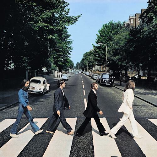
beatles
Dark_Side_of_the_Moon
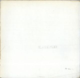
As a fan of minimal design, it always intrigues me to see just how minimal album art can go, while still achieving something that is memorable. Another Beatles classic that has come to be known as The White Album (1968), designed by Richard Hamilton, consisted of a simple white sleeve embossed with the name of the band, and each with a unique serial number. This was perhaps as minimal as possible an album art can get...right? Well Kanye West proved that to be wrong with his 2013 release of Yeezus, with the packaging that Kanye designed himself. The album had no album art, and consisted of a simple CD encasing with a red sticker affixed to the front, and the CD within the case (also blank in terms of artwork) showing through.
6a00e5536294b788330133f61596f6970b-320wi

Yeezus4
Despite the minimal nature of these two albums, I am sure that they will continue to stand the test of time and remain an important part of our design culture. In a world where we are visually bombarded on a daily basis, the designer (along with the musician) must figure out how to solve the problem of not getting lost to the consumer, and it is truly amazing to see just how they continue to solve this problem.
Below are some examples of album covers that I think have been successfully designed. Enjoy!

bob_marley_the_wailers-exodus2
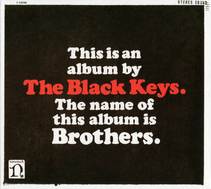
coverparadise.to
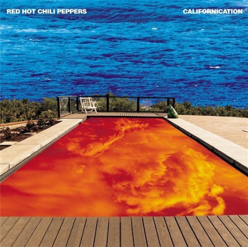
californication
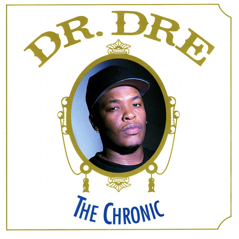
the-chronic-4ea687eb81068

think_cd_cover_big

london-calling
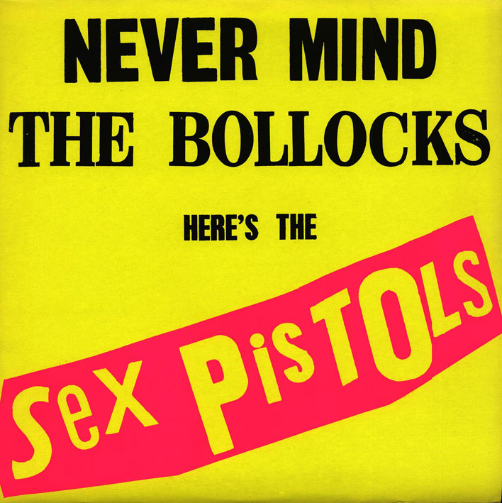
bollocksslv25

joy-division-unkown-pleasures
And here's the first album cover I ever designed for the Trinidadian band jointpop :

553762_10151052111241137_890095540_b
Trinidad & Tobago Film Festival Branding Review
With the 2014 edition of the trinidad+tobago film festival around the corner, I decided to do a write up on what I think is a very successful brand…

1604813_10152125338402171_893755625_n
With the 2014 edition of the trinidad+tobago film festival around the corner, I decided to do a write up on what I think is a very successful brand.
Here is a description of the film festival taken from their website, "Founded in 2006, the trinidad+tobago film festival (ttff) is an annual celebration of films from and about Trinidad and Tobago, the Caribbean and its diaspora."
film-fest-logo

Screen Shot 2014-09-03 at 1.47.12 PM
Usually when things are branded as "Trinidad & Tobago..." there is a trend to have it red, white and black, and to include some sort of local logo cliche, such as a humming bird, a steel pan, or something else that screams "TRINIDAD & TOBAGO." Thankfully the film festival logo did not go down this route and instead chose to use more understated nods to the T&T flag that may not be seen at first glance. Firstly it must be noted that the logo is very clean, with the subtle reference to the T&T flag both in the shape that the words are placed on, as well as the thin strokes that pass through the words.
The typography is transparent and shows a glimpse of the background it is placed on (as can be seen in the images below), and the colour of the block is interchangeable; this adds to the versatility of the branding. The colours used are vibrant and represent well the hues found throughout T&T. The only small issue I had with the logo was the fact that the typography is right aligned and perhaps a left alignment may have made it a little more successful based on the shape that the type sits on. Overall a very good logo that is used successfully throughout all the media that it rendered on.

trinidad-tobago-film-festival
The application of the logo by the film festival is very uniformed across the board, and the logo, as well as use of colour, makes it instantly recognizable as to what it is. I particularly like the transparent lettering that allows each image to create a unique representation of the typography in the logo.

Screen Shot 2014-09-03 at 1.58.05 PM

Screen Shot 2014-09-04 at 11.04.08 AM
Both the cover of the 2014 guide and the website home page keep up the same quality branding and the colour choices for the typography are on point. All of the design elements are thoughtfully executed and makes for a successful and enjoyable experience for the user. The trinidad+tobago film festival definitely has a high standard when it comes to their branding and I am personally excited to be a patron this year.
The trailer for the film festival can be found here.
Update- Abovegroup rebranded the film festival in 2009 and Melanie Archer, the art director for the festival has been responsible for the application and development over the years, under Abovegroup's guidance in 2010, and then solo since.
Nick.
Photographing the Mundane
Artists see the world through different eyes to most people; they see the beauty in things that may be considered boring or mundane, and there are no photographers who capture this beauty as well as William Eggleston. Eggleston is a pioneering photographer and is credited with…
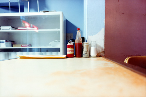
hot_sauce
Artists see the world through different eyes to most people; they see the beauty in things that may be considered boring or mundane, and there are no photographers who capture this beauty as well as William Eggleston. Eggleston is a pioneering photographer and is credited with introducing colour to art photography in the late 1960s. To understand how avant-garde this was, it must be acknowledged that most art photography at the time was shot in black and white, and colour was considered to be ugly; no serious photographer would photograph in colour.
The reason behind art photographers shooting in black and white is summed up best by John Szarkowski, writing in the introduction to the book "William Eggleston's Guide."
He stated, "For the photographer who demanded formal rigor from his pictures, color was an enormous complication of a problem already cruelly difficult. And not merely a complication, for the new medium meant that the syntax the photographer had learned - the pattern of his educated intuitions - was perhaps worse than useless, for it led him toward the discovery of black-and-white photographs. Most serious photographers, after a period of frustrating experimentation, decided that since black and white had been good enough for David Octavius Hill, Brady, and Stieglitz, it was good enough for them. Professionals used color when they were paid to, doing their very best, without quite knowing what they meant by that."
Below is a photograph by Eggleston, taken before he started shooting in colour.
eggleston-before-colour-006
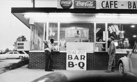
Eggleston was born in Memphis, Tennessee, and it is here that he has done the majority of his work. According to his wife Rosa, when he was first getting started in photography he told his friend that in Memphis everything was ugly and he didn't know what to photograph; his friend responded "well, photograph the ugly stuff." So this is exactly what he did. He began photographing otherwise unremarkable subjects yet achieving remarkable results.

troubled_waters_i
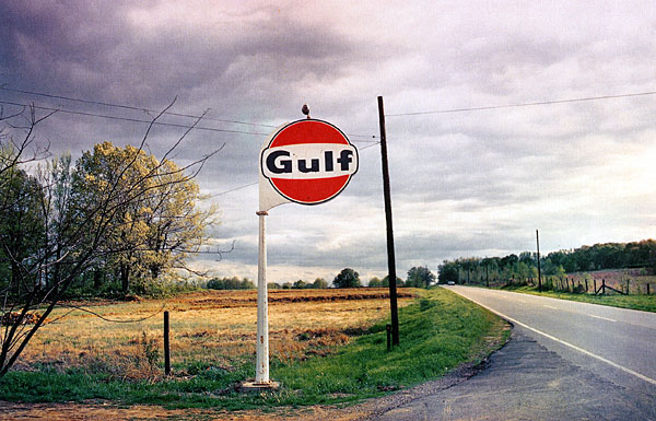
He has been said to photograph democratically, where he treats everything he sees equally and produces pictures out of nothing.
His subject matter could be described as banal, boring, mundane and everyday, however he shoots it with such beauty, and what at first seems simple turns out to show quite a complex message where nothing in the frame can be taken for granted. His wife has said, “One thing that I will never forget in my mind what Bill did say to me earlier on when he was talking to me, ‘Now you must not take anything for granted when you are looking at a picture. Never do that. Every single little tiny space on that page works and counts.”

troubled_waters_b
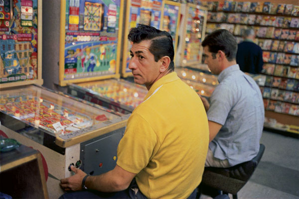
Eggleston has gone on to achieve great recognition, however, in the beginning of his career he had a show at the Museum of Modern Art (MoMA) in New York City and one art critic deemed it "the most hated exhibition of the year." There were a lot of negative reviews by critics who simply did not get what it was he was doing. Another critic stated that it was "totally boring and perfectly banal" which is ironically the intention of the exhibition, and something that he went on to become recognised for.

dust_bells_v2_m
In the documentary "William Eggleston-Imagine," he said in response to his critics at his MoMA show, "“I think it was wonderful having a first major show at MOMA, of all places. It got tremendous recognition, great amount of it—-negative. I really felt sorry for them, because it was so obvious –-it was like they had the wrong time. They didn’t understand what they were looking at. And their job was to understand it. Modern art, it is the museum of modern art. And, they wrote pretty stupid things. Then it became known all over the world, so, the critics who wrote all that stuff later apologized [laughed] that they were wrong.”
southern_suite_c
Eggleston is truly great at what he does and his photographs are a joy to look at. What might be considered as mundane by some, his images transport us to a time where we are stuck in the moment that each photograph was taken. Despite living in an "ugly & boring" place, he has transformed it through his photography, and he is truly a master of his art.

los_alamos_s
To conclude, here is a great quote by Eudora Wetley that perfectly sums up the work of Eggleston, "The extraordinary, compelling, honest, beautiful and unsparing photographs all have to do with the quality of our lives in the ongoing world: they succeed in showing us the grain of the present, like the cross-section of a tree. The photographs have cut it straight through the center. They focus on the mundane world. But no subject is fuller of implications than the mundane world!”
los_alamos_o
All images are © Eggleston Artist Trust. All rights reserved.
You can see more of his work at the Eggleston Artist Trust website.
Neal & Massy Rebranding
One of the most talked about rebrandings in Trinidad has just occurred. Neal and Massy has rebranded themselves as Massy, and with it, all of their subsidiary companies. The logo is described as such on the new Massy website– "The Massy logo is simple, bold and modern and represents the mutuality of our Group of companies, with a stylized infinity symbol that retains the N and M of our previous corporate identity. The visibility of both letters in the logo design…

Massy-rebrand
One of the most talked about rebrandings in Trinidad has just occurred. Neal and Massy has rebranded themselves as Massy, and with it, all of their subsidiary companies. The logo is described as such on the new Massy website– "The Massy logo is simple, bold and modern and represents the mutuality of our Group of companies, with a stylized infinity symbol that retains the N and M of our previous corporate identity. The visibility of both letters in the logo design is a deliberate reference to the heritage of founders Harry Neal and Charles Massy."
From the first time I saw the new logo, it struck me as being an overdone concept, and I wasn't sure if I had seen it before. Everyday I peruse websites such as logopond, dribbble, and behance to look at logos and I just felt that the new Massy logo looked like an idea that I had seen before. And then, I received a message on facebook with a link to a logo that looked eerily similar.
18.-logo-design
The original can be found by clicking here. It is a logo done for the National Museum in Warsaw by Polish designer Dawid Cmok.
There are of course many similarities between this logo and the new Massy logo. The logomark is almost the same shape, similar colours are used, and the logotype seems to be written in the same font.
The fact that Massy now has what seems to be an unoriginal logo of course isn't their fault, and the onus should be on the design firm hired by them. The agency/designer should've gone to all lengths to ensure the originality of their work. Below is a transparency of the two logos to show the similarity.

Screen Shot 2014-07-02 at 1.21.10 PM
There are also other brand components that are similar. For instance the Massy card is very similar to the envelope of the Museum.
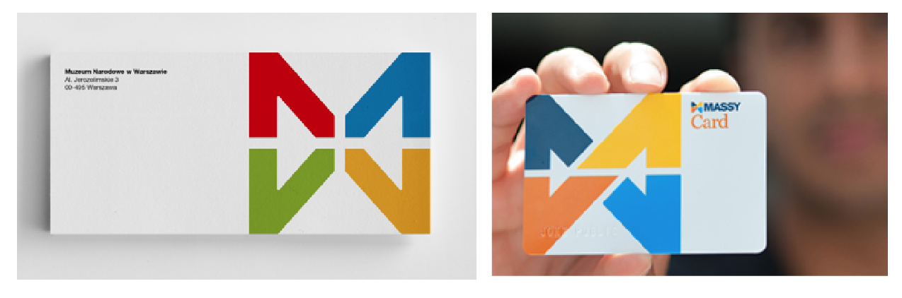
Screen Shot 2014-07-02 at 1.22.57 PM
Despite the seemingly unoriginal design, the new logo for Massy is definitely an improvement on the old "NM" logo, however, one must feel that they would not be completely satisfied with what is a very uninspired final product. Also the use of a font very similar to Helvetica for the word "MASSY" comes off as a bit boring. All in all though, the logo is an improvement and the colour choice stands out well when put to use, and from what I have seen on their website, press ads, and signage, everything is working cohesively.
hilo_logo
Logo and brand identity aside, the thing that seems to be upsetting people the most is the fact that Massy has decided to change the names of all their subsidiary companies. There will now be Massy Motors, Massy Energy, Massy Pres-T-Con, Massy Technologies, Massy Communications, just to name a few. Perhaps the biggest change for most people would be the renaming of Hi Lo food stores to Massy Stores Supermarket. Hi Lo has been around since the 1950s and has a very strong brand reputation; Trinis all over the world could sympathize with me in admitting that any plastic bag regardless of their origins, is a "Hi Lo bag."
Hi Lo is one of the most recognizable brands in Trinidad and the change to Massy Stores feels a bit "corporate." The nation's favourite food store, in appearances, has become just another company under the umbrella of Neal & Massy, and it certainly loses its personality and brand heritage. Sure, the old Hi Lo logo could have used a face lift, but to completely change a name that is so ingrained into the culture is certainly a bold move that would upset a lot of consumers.
One could argue that in order for the branding to be withheld throughout all of the companies, perhaps it was a necessary move, however they could have maintained the Hi Lo name and included "A Massy Company" or something to that effect under the logo, or somewhere else on their media. It certainly seems that Trinidad has lost a small part of our brand culture, and the next time you are looking for a plastic bag, maybe try asking for a "Massy bag" and see what happens.
**UPDATE** The intention of this article was not to insinuate that any sort of plagiarism has occurred with regards to the Massy logo. The choice to show the Museum logo was to make the point that the Massy logo was not an original idea/concept, and that the logo could be pushed further. As a designer I know that we create things that, of no fault to ourselves, might appear to be very similar to other works that have been previously created. Does a similarity mean plagiarism? Absolutely not! It just means that as a designer, we should push our ideas and concepts further.
Nicholas Huggins is a graphic designer. See his work here.

My First Logo
I was recently going through some of my old work and I found what is possibly the first logo I have ever created. To give some background to the logo I will give the story about what it was for. At the age of around 17, a friend (Anthony Alkins) and I decided we…

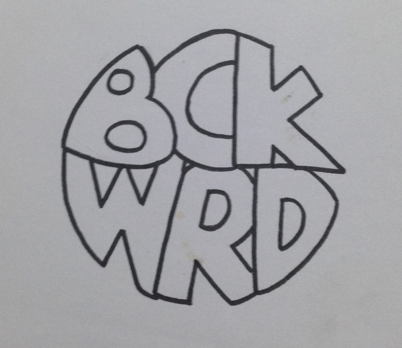
bckwrdlogo
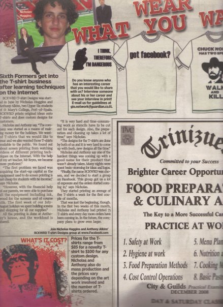
I was recently going through some of my old work and I found what is possibly the first logo I have ever created. To give some background to the logo I will give the story about what it was for. At the age of around 17, a friend (Anthony Alkins) and I decided we were going to start a T-shirt printing business. We decided that it will be a good venture to start in an effort to make a bit of pocket money. We had achieved a small amount of success spray painting images through a stencil onto the t-shirts of fellow students during the intercol season, and figured this was a good step to take. After a little bit of research we decided that the best and most efficient way to print t-shirts was screen printing. We got all our equipment (ink, silk, built screens, etc) and wrote down a list of ideas to put onto these t-shirts. Our idealistic view was that we were going to print t-shirts that we would want to wear ourselves, and of course people will flock to buy them. Truth be told, we did sell quite a few of our own ideas, but for the most part, people came to us with their own ideas for us to print. This turned out to be our biggest money maker. Before we printed a t-shirt, we needed to come up with a brand name. Something for people to recognise us by. This was my first foray into branding and at this time I had no clue about anything in the world of graphic design. Being the "artist" in the business I was tasked with drawing a logo once we came up with the name and the name we eventually chose was BCKWRD Designs.
Come time to create the logo, I made a bunch of sketches and eventually created a finished drawing with a marker. I then scanned the image and coloured it black in photoshop with the help of the magic wand tool and the brush tool. At this point I had no idea what illustrator was, and very limited knowledge of photoshop. If you asked me about raster graphics, I would have assumed you were telling me something about Bob Marley. With the little skill possessed, a logo was eventually created and we started printing. We achieved relative success with the business, and we printed a few afternoons every week for the next 2 years or so, we were even featured in an article in the newspaper as well as a local talk show showcasing youths who were doing things out of the ordinary.
This early experience with graphic design eventually led me to choose graphic design as a career and I was fortunate enough to study it in detail for 4 years at SCAD. I think one of the positives in the early BCKWRD logo is the handmade feeling, and it is what can be achieved through sketching before going straight into illustrator and using a font found online. When designing always consider a youthful naivety in the sketching process, and this will show through in creating original designs that does not look like any old logo found on behance or pinterest. Check out the finished logo below.

bckwrdlogowhite
Here is some process work that I found in an old folder. From an initial sketch to the finished drawing that I would have scanned in.

IMG_3923

IMG_3920
IMG_3921-2
IMG_3922
353_100551145480_4108_n
"Fins by O'Brien" Logo Process
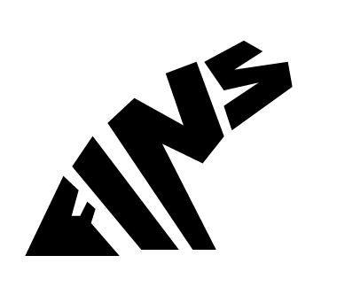
Someone recently approached me to come up with a logo for them. They had started making custom surfboard fins out of plywood and the product piqued my interest. I immediately started formulating ideas…

Image
Someone recently approached me to come up with a logo for them. They had started making custom surfboard fins out of plywood and the product piqued my interest. I immediately started formulating ideas in my mind and by the next day I had a pretty solid idea as to what I wanted the final logo to look like. Below is the initial sketch in my notebook.
From there, I drew it out in Adobe Illustrator very roughly in order to get a feel for the positioning and shape of the letters.
Image
After that it was just a matter of editing the strokes and the anchor points in order to get the desirable look for the logo. A wooden texture was added to reflect the nature of the product.

Image
The Importance of Brand Guidelines
One of the fundamental things to keep in mind when designing a brand, is consistency. You want people when they see your logo to relate it immediately to your brand/product/service. This is achieved through proper logo usage. Too often in Trinidad & Tobago…

Screen Shot 2014-04-04 at 11.34.34 AM
One of the fundamental things to keep in mind when designing a brand, is consistency. You want people when they see your logo to relate it immediately to your brand/product/service. This is achieved through proper logo usage. Too often in Trinidad & Tobago we see poor usage of logo where brand guidelines (if there are any) are thrown out the window. On my daily commute I pass "Ultracool LTD," a company that deals in air conditioning sales and parts. On the outside of their building there are three (3!!!!) different renditions of their name. The first logo is painted onto the facade of the building, the second is used as a neon light, and the third is on a banner. This lack of brand identity is typical in a place where not enough emphasis is placed on graphic design. Business owners need to realise the positive impact that having a proper brand identity will bring to the table.

Mark Bradford
I was recently going through some chicken scratch notes that I made in a class I took at SCAD called Alternative Design Approaches. I had a bunch of names scrawled down and circled, which I would…

pic1

1782_MB-12598
I was recently going through some chicken scratch notes that I made in a class I took at SCAD called Alternative Design Approaches. I had a bunch of names scrawled down and circled, which I would do in order to remember to do more research into whatever it was that was written down. In this case it was the names of a few artists that had caught my attention during a lecture. One of the names that was written down was Mark Bradford, and after a quick google image search, I realised why I had taken note of this artist while I sat in class. His work is unique, insightful, and truly speaks to this generation of artists.
Bradford creates large scale pieces combining collage and painting. He uses found objects, often times signs that he finds on the streets of his hometown of Los Angeles, in his pieces. He applies layer after layer of paper and paint and usually sands and scratches the surface to expose the layers. His marriage of art & design, and typography & painting is very unique and really speaks to me as an artist and graphic designer. Bradford uses imagery and elements found on the streets to create his work, specifically signs found in urban areas that are advertising various things. According to artspace.com his work "addresses the spontaneous systems and networks that materialize within cities, such as displaced communities, patterns of violence, and black-market economies". The typographic elements and grid like structures found in his work give an urban map-like feel to his pieces.
There is also a reflection of the De Stijl Movement to be found in his pieces as can be seen in the comparison between his piece titled "Disappear like a a dope fiend" and the work of Piet Mondrian, done 93 years apart, seen below.

bradford_mondrian

bradford-6-popup-v2

mark_bradford_kryptonite
I will leave you with this video of Bradford talking about the use of language in his pieces, as well as touching on his process while working.
[vimeo http://vimeo.com/16325475]
Also check out this PBS Art 21 documentary on Bradford that is definitely worth the watch.
For even more info, visit his website "The Mark Bradford Project"
Fete Signs of Trinidad
As a graphic designer who studied abroad, I always think about what kind of design or aesthetic is intrinsically Trinbagonian; what colours do we use, what sorts of typography is used, what sort of trends are seen in our design? Now that I am back living and working at home…

Image
As a graphic designer who studied abroad, I always think about what kind of design or aesthetic is intrinsically Trinbagonian; what colours do we use, what sorts of typography is used, what sort of trends are seen in our design? Now that I am back living and working at home I can't help but look out for things that set us apart from the rest of the world when it comes to design, and whether this design is done deliberately or not.
The one part of our designed environment that really stands out to me, and I find strangely satisfying, is the art of Fete (party) Sign Painting. These signs are painted and then attached to posts/trees/poles as advertisements for public parties. They are almost always up to date, due mostly to the fact that room has to be made for the next Fete Sign to go up. Each one is hand painted, and it is a breath of fresh air in a place where quality in design aesthetic is often over looked for cheaper prices, leaving us with eye sores at every turn.
One of the things that is common of these Fete Signs is hand painted typography over a background painted with a gradient. In just a few lines and with minimum words, all of the information needs to be placed so that it can be read clearly by passing motorists and pedestrians. They are used as an invitation to the nation.
There is not much info to be found online however I did come across this photo set on Flikr that has some really great, up close photos of some of the fete signs. There is also an Instagram account devoted to capturing found Trinidadian typography. If you have any additional information regarding Fete Signs, don't hesitate to send me an email via the contact page.