Massy- An Update
After posting the article about the Massy Rebranding I had no idea how many people it would reach and what sort of reaction it would cause. My previously highest read blog post has a tally of 113 views; needless to say the article on Massy got a bit more. I didn't (don't) know how to feel about the reaction…
After posting the article about the Massy Rebranding I had no idea how many people it would reach and what sort of reaction it would cause. My previously highest read blog post has a tally of 113 views; needless to say the article on Massy got a bit more. I didn't (don't) know how to feel about the reaction the article garnered for several reasons. On the outset I was pleased that people were reacting to the rebranding of a company, and the graphic designer in me was happy that others seemed passionate about a subject that I am most passionate about; however my cynical side was quick to think that people just love a scandal, and this was the cause of the article being shared. The majority of shares on Facebook only made reference to the "stealing/plagiarism" of the logo, something I made clear in my article that I didn't think was the case. I still stand by my opinion that it was a coincidence, and it is unfortunate that people are using my blog to try to prove plagiarism, of course there is no way to prove for sure so I can only give my opinion. The inclusion of the museum logo was to back up my original statement that the concept of the Massy logo could have been pushed further.
The article in the Express that used my blog as reference chose to include the fact that I said that both logos have similar fonts, however they failed to acknowledge the fact that the typeface is Helvetica which is one of the most (over)used typefaces in the world so that has no bearing on anything in my opinion, and once again I made reference to the Helvetica typeface to support my earlier claims of the logo.
To conclude I want to show you an article a good friend of mine sent me this morning showing another example of two logos looking very similar, you can find the article here. The logos are for airbnb, an online company that rents out lodgings, and Automation Anywhere, an IT company focused on automation. The similarities in this story, and the Massy story are extremely close and I urge you to check out the article to see that these types of coincidences happen in design and unfortunately, sometimes it can only be discovered after being seen by the public.
Thanks for reading and sharing.
Neal & Massy Rebranding
One of the most talked about rebrandings in Trinidad has just occurred. Neal and Massy has rebranded themselves as Massy, and with it, all of their subsidiary companies. The logo is described as such on the new Massy website– "The Massy logo is simple, bold and modern and represents the mutuality of our Group of companies, with a stylized infinity symbol that retains the N and M of our previous corporate identity. The visibility of both letters in the logo design…

Massy-rebrand
One of the most talked about rebrandings in Trinidad has just occurred. Neal and Massy has rebranded themselves as Massy, and with it, all of their subsidiary companies. The logo is described as such on the new Massy website– "The Massy logo is simple, bold and modern and represents the mutuality of our Group of companies, with a stylized infinity symbol that retains the N and M of our previous corporate identity. The visibility of both letters in the logo design is a deliberate reference to the heritage of founders Harry Neal and Charles Massy."
From the first time I saw the new logo, it struck me as being an overdone concept, and I wasn't sure if I had seen it before. Everyday I peruse websites such as logopond, dribbble, and behance to look at logos and I just felt that the new Massy logo looked like an idea that I had seen before. And then, I received a message on facebook with a link to a logo that looked eerily similar.
18.-logo-design
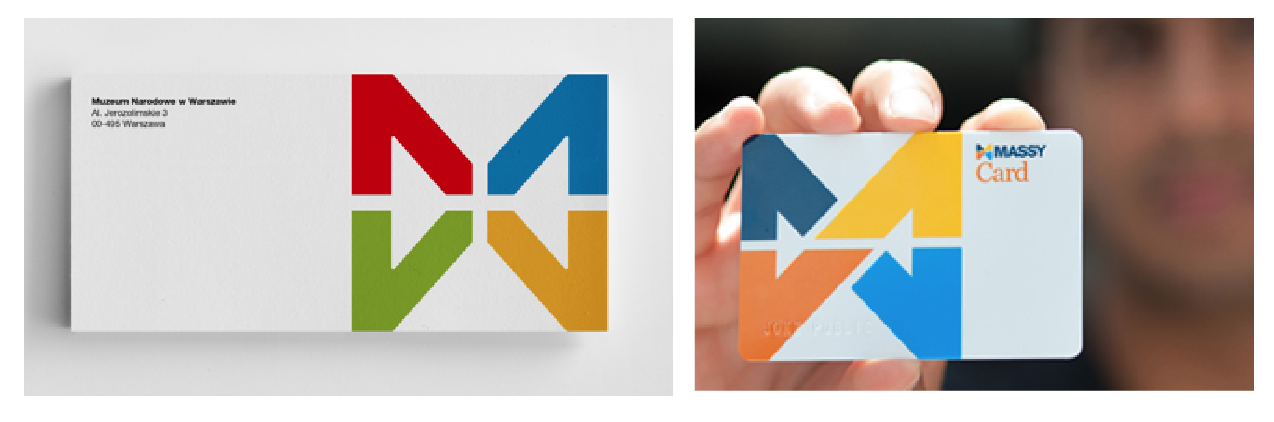
The original can be found by clicking here. It is a logo done for the National Museum in Warsaw by Polish designer Dawid Cmok.
There are of course many similarities between this logo and the new Massy logo. The logomark is almost the same shape, similar colours are used, and the logotype seems to be written in the same font.
The fact that Massy now has what seems to be an unoriginal logo of course isn't their fault, and the onus should be on the design firm hired by them. The agency/designer should've gone to all lengths to ensure the originality of their work. Below is a transparency of the two logos to show the similarity.

Screen Shot 2014-07-02 at 1.21.10 PM
There are also other brand components that are similar. For instance the Massy card is very similar to the envelope of the Museum.
Screen Shot 2014-07-02 at 1.22.57 PM
Despite the seemingly unoriginal design, the new logo for Massy is definitely an improvement on the old "NM" logo, however, one must feel that they would not be completely satisfied with what is a very uninspired final product. Also the use of a font very similar to Helvetica for the word "MASSY" comes off as a bit boring. All in all though, the logo is an improvement and the colour choice stands out well when put to use, and from what I have seen on their website, press ads, and signage, everything is working cohesively.
hilo_logo
Logo and brand identity aside, the thing that seems to be upsetting people the most is the fact that Massy has decided to change the names of all their subsidiary companies. There will now be Massy Motors, Massy Energy, Massy Pres-T-Con, Massy Technologies, Massy Communications, just to name a few. Perhaps the biggest change for most people would be the renaming of Hi Lo food stores to Massy Stores Supermarket. Hi Lo has been around since the 1950s and has a very strong brand reputation; Trinis all over the world could sympathize with me in admitting that any plastic bag regardless of their origins, is a "Hi Lo bag."
Hi Lo is one of the most recognizable brands in Trinidad and the change to Massy Stores feels a bit "corporate." The nation's favourite food store, in appearances, has become just another company under the umbrella of Neal & Massy, and it certainly loses its personality and brand heritage. Sure, the old Hi Lo logo could have used a face lift, but to completely change a name that is so ingrained into the culture is certainly a bold move that would upset a lot of consumers.
One could argue that in order for the branding to be withheld throughout all of the companies, perhaps it was a necessary move, however they could have maintained the Hi Lo name and included "A Massy Company" or something to that effect under the logo, or somewhere else on their media. It certainly seems that Trinidad has lost a small part of our brand culture, and the next time you are looking for a plastic bag, maybe try asking for a "Massy bag" and see what happens.
**UPDATE** The intention of this article was not to insinuate that any sort of plagiarism has occurred with regards to the Massy logo. The choice to show the Museum logo was to make the point that the Massy logo was not an original idea/concept, and that the logo could be pushed further. As a designer I know that we create things that, of no fault to ourselves, might appear to be very similar to other works that have been previously created. Does a similarity mean plagiarism? Absolutely not! It just means that as a designer, we should push our ideas and concepts further.
Nicholas Huggins is a graphic designer. See his work here.