How I Started My Own T-Shirt Brand **PART 1**
The idea for what became Deftment began over a year before our launch, when my good friend Kevin and I dreamed of creating quality tees with a unique Caribbean style. I have always...
The idea for what became Deftment began over a year before our launch, when my good friend Kevin and I dreamed of creating quality tees with a unique Caribbean style. I have always loved t-shirt design because a t-shirt is something that everyone owns, thus making the art/design on it something that is available to a huge audience.
We officially launched Deftment on October 3rd 2014, but the real work on the brand began a year before in September, 2013. Our vision at the time was simple, to provide high quality tees that were suited to a Caribbean lifestyle. This meant that it had to be stylish, versatile and durable; it should transition from the beach, to the pavement bar, to an all-inclusive fete with ease. The Caribbean is full of skilled individuals ranging from artists, musicians, chefs, DJ's, fashion designers; and these were the people who we detailed as our ideal customer. Our brand had to reflect this culture, and this passionate bunch. I had an idea of what I wanted aesthetically; something that drew from elements of typography, nature and mathematical geometry...we just had to figure out how to pull it all together. Developing a name posed a challenge. We wanted to invent our own word, something that we could define without preconceptions. Deftment is a portmanteau of deft, as in skilful, and movement. We set out to be a skilled movement.

In these two pictures I was getting close to the final logotype for the word DEFTMENT. I hadn't settled on a final logomark, the symbol that represented the brand (i.e. the Nike Swoosh vs the word NIKE.)The final logomark was made up of a series of hexagons, and you can see the inception of this idea from the pictures here.
The next thing on the list was creating a brand identity for Deftment starting with a logo. As I stated earlier, for the aesthetic of the brand we wanted to feature different geometric elements, and this was what I focused on with initial logo explorations.

We were looking for those geometric elements for the logo, and it all came to be by experimenting. I was trying to digitally create the face of a monkey using only geometric shapes. I drew a few hexagons and got to work resulting in something really close to what is the final logo.

A lot of tweaking and hard work went into perfecting the logo, as it would be the cornerstone of our brand and something that people would associate us with. I think the result was successful because it responded to our initial needs, and in the end we ended up with something that we set out to achieve in our own design brief.
In Part Two I will discuss the lead up to our launch, and the design process for the first Deftment Line.
Trinidad & Tobago Film Festival Branding Review
With the 2014 edition of the trinidad+tobago film festival around the corner, I decided to do a write up on what I think is a very successful brand…

1604813_10152125338402171_893755625_n
With the 2014 edition of the trinidad+tobago film festival around the corner, I decided to do a write up on what I think is a very successful brand.
Here is a description of the film festival taken from their website, "Founded in 2006, the trinidad+tobago film festival (ttff) is an annual celebration of films from and about Trinidad and Tobago, the Caribbean and its diaspora."
film-fest-logo

Screen Shot 2014-09-03 at 1.47.12 PM
Usually when things are branded as "Trinidad & Tobago..." there is a trend to have it red, white and black, and to include some sort of local logo cliche, such as a humming bird, a steel pan, or something else that screams "TRINIDAD & TOBAGO." Thankfully the film festival logo did not go down this route and instead chose to use more understated nods to the T&T flag that may not be seen at first glance. Firstly it must be noted that the logo is very clean, with the subtle reference to the T&T flag both in the shape that the words are placed on, as well as the thin strokes that pass through the words.
The typography is transparent and shows a glimpse of the background it is placed on (as can be seen in the images below), and the colour of the block is interchangeable; this adds to the versatility of the branding. The colours used are vibrant and represent well the hues found throughout T&T. The only small issue I had with the logo was the fact that the typography is right aligned and perhaps a left alignment may have made it a little more successful based on the shape that the type sits on. Overall a very good logo that is used successfully throughout all the media that it rendered on.

trinidad-tobago-film-festival
The application of the logo by the film festival is very uniformed across the board, and the logo, as well as use of colour, makes it instantly recognizable as to what it is. I particularly like the transparent lettering that allows each image to create a unique representation of the typography in the logo.

Screen Shot 2014-09-03 at 1.58.05 PM

Screen Shot 2014-09-04 at 11.04.08 AM
Both the cover of the 2014 guide and the website home page keep up the same quality branding and the colour choices for the typography are on point. All of the design elements are thoughtfully executed and makes for a successful and enjoyable experience for the user. The trinidad+tobago film festival definitely has a high standard when it comes to their branding and I am personally excited to be a patron this year.
The trailer for the film festival can be found here.
Update- Abovegroup rebranded the film festival in 2009 and Melanie Archer, the art director for the festival has been responsible for the application and development over the years, under Abovegroup's guidance in 2010, and then solo since.
Nick.

My First Logo
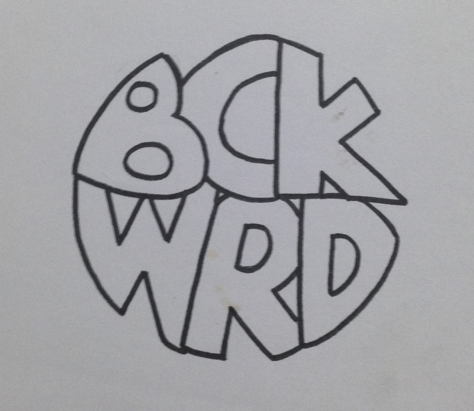
I was recently going through some of my old work and I found what is possibly the first logo I have ever created. To give some background to the logo I will give the story about what it was for. At the age of around 17, a friend (Anthony Alkins) and I decided we…

bckwrdlogo
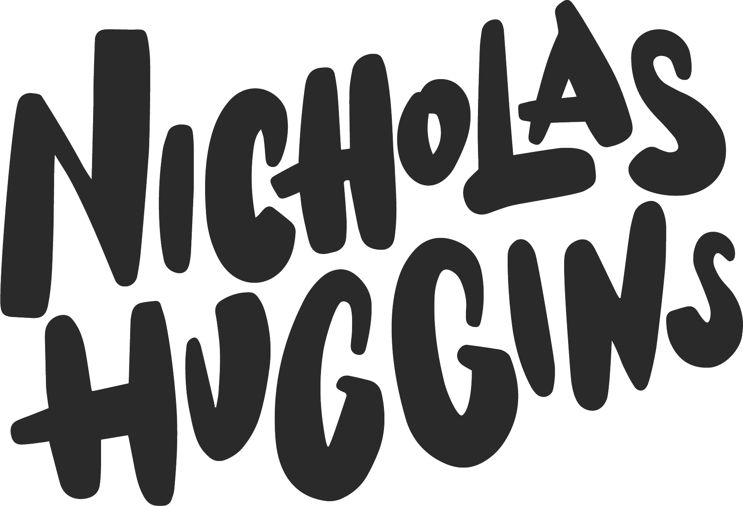
I was recently going through some of my old work and I found what is possibly the first logo I have ever created. To give some background to the logo I will give the story about what it was for. At the age of around 17, a friend (Anthony Alkins) and I decided we were going to start a T-shirt printing business. We decided that it will be a good venture to start in an effort to make a bit of pocket money. We had achieved a small amount of success spray painting images through a stencil onto the t-shirts of fellow students during the intercol season, and figured this was a good step to take. After a little bit of research we decided that the best and most efficient way to print t-shirts was screen printing. We got all our equipment (ink, silk, built screens, etc) and wrote down a list of ideas to put onto these t-shirts. Our idealistic view was that we were going to print t-shirts that we would want to wear ourselves, and of course people will flock to buy them. Truth be told, we did sell quite a few of our own ideas, but for the most part, people came to us with their own ideas for us to print. This turned out to be our biggest money maker. Before we printed a t-shirt, we needed to come up with a brand name. Something for people to recognise us by. This was my first foray into branding and at this time I had no clue about anything in the world of graphic design. Being the "artist" in the business I was tasked with drawing a logo once we came up with the name and the name we eventually chose was BCKWRD Designs.
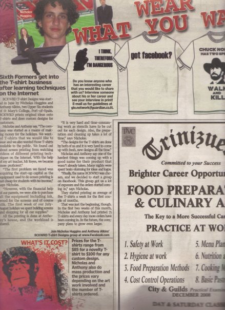
Come time to create the logo, I made a bunch of sketches and eventually created a finished drawing with a marker. I then scanned the image and coloured it black in photoshop with the help of the magic wand tool and the brush tool. At this point I had no idea what illustrator was, and very limited knowledge of photoshop. If you asked me about raster graphics, I would have assumed you were telling me something about Bob Marley. With the little skill possessed, a logo was eventually created and we started printing. We achieved relative success with the business, and we printed a few afternoons every week for the next 2 years or so, we were even featured in an article in the newspaper as well as a local talk show showcasing youths who were doing things out of the ordinary.
This early experience with graphic design eventually led me to choose graphic design as a career and I was fortunate enough to study it in detail for 4 years at SCAD. I think one of the positives in the early BCKWRD logo is the handmade feeling, and it is what can be achieved through sketching before going straight into illustrator and using a font found online. When designing always consider a youthful naivety in the sketching process, and this will show through in creating original designs that does not look like any old logo found on behance or pinterest. Check out the finished logo below.

bckwrdlogowhite
Here is some process work that I found in an old folder. From an initial sketch to the finished drawing that I would have scanned in.

IMG_3923

IMG_3920
IMG_3921-2
IMG_3922
353_100551145480_4108_n
"Fins by O'Brien" Logo Process
Someone recently approached me to come up with a logo for them. They had started making custom surfboard fins out of plywood and the product piqued my interest. I immediately started formulating ideas…

Image
Someone recently approached me to come up with a logo for them. They had started making custom surfboard fins out of plywood and the product piqued my interest. I immediately started formulating ideas in my mind and by the next day I had a pretty solid idea as to what I wanted the final logo to look like. Below is the initial sketch in my notebook.
From there, I drew it out in Adobe Illustrator very roughly in order to get a feel for the positioning and shape of the letters.
Image
After that it was just a matter of editing the strokes and the anchor points in order to get the desirable look for the logo. A wooden texture was added to reflect the nature of the product.

Image