
Creating a Portfolio to Get Hired
A designer’s portfolio is basically the “proof in the pudding” that both clients and agencies look at before deciding if to hire you or not. You can have a good resumé or a degree from a top art school, but if your portfolio falls flat you will most likely miss out on a lot of jobs. It is the visual representation of what you have done and achieved in your design career.
I get a lot of questions from designers looking for…

A designer’s portfolio is basically the “proof in the pudding” that both clients and agencies look at before deciding if to hire you or not. You can have a good resumé or a degree from a top art school, but if your portfolio falls flat you will most likely miss out on a lot of jobs. It is the visual representation of what you have done and achieved in your design career.
I get a lot of questions from designers looking for advice or tips on how to put together the perfect portfolio to get hired (either by agencies or by potential clients.) Creating a good portfolio can pose a challenge to designers of all levels and figuring out what you should and shouldn’t include can be a painstaking process. Here are some questions that I have received in the past about portfolios:
What should I even include?
This is one of the more common questions that I see being asked. The simple answer is to only include work that you want to be hired to do. That is the base level. If you want to be hired to create brand identities, then you need to show in your portfolio that you can create brand identities. The billboard that you designed, no matter how great of a billboard it is, will not add credence to your quest in becoming a brand identity designer. If your dream is to create album art for clients, you need to show a portfolio that has album cover designs (or at the very least, work that shows that you have the capabilities to design album covers.)
I want to design (insert any design niche here) but I don’t have any experience, so have no examples to include in my portfolio.
The most typical follow up to the first question is that, “yes I want to do brand identities (or whatever other design niche) but I’ve never done any work in that niche so I have nothing to show.” Simple solution…go do it. Then add the work to your portfolio. If no one is willing to pay you to do the work - find a friend that needs design work; find a client with no budget that might be willing to do a service/goods exchange; get an internship or a junior position; do some work for a charitable organization. Point is, there are a lot of ways to get actual, produced work to show in your portfolio. You just need to do the work and get it done.
I have a lot of work to put in my portfolio, should I add all?
No. Add what you think is the best representation of your abilities as a designer. This should be evolving and changing as time goes by. I personally cull jobs from my portfolio every few months as I add new work that I think better represents me as a designer. I’ve hired designers already, so I’ve seen my fair share of portfolios. If I receive a portfolio with 15 projects, and 8 are amazing but 7 range between OK and not that good, I would overlook that designer for a candidate that shows 5 projects and all 5 projects are amazing. Quality over quantity every time.
Can I use my Social Media pages, like Instagram, as a portfolio?
I think that when you are marketing yourself as a designer, social media is simply a part of the story. Things like Instagram or Twitter show a depth of work as well as an evolution over time. It also adds to context to what you are interested in, or any creative endeavors that you have experimented with. Having a blog is also a really good part of telling your story as a designer as it shows that you can speak about design and that you are a good writer. I was told after my interview at an advertising agency in 2014 that one of the reasons I was hired was because of a specific blog post that I had recently written. You have to expect that all candidates are going to have a degree, or a certain amount of experience, and a good portfolio. How will you set yourself apart?
How should I send my portfolio in for an agency job?
Having gone through the hiring process, I will say what I think worked best and what was most efficient for me and my team. The most effective submissions came like this:
An email with an outline as to why you think you’d be a good fit and any other information that speaks to the fact that you are a good candidate.
An attached PDF that has the Resumé/CV as the first page of content, with the portfolio pieces after that. Having your CV included in your portfolio PDF makes it easier to save your information and to share it internally during the review process. It’s one file instead of 2 or more. Make sure that the PDF is titled with your name and the word Portfolio so that it can be easily searched. (Note: if a job specifically asks for an online portfolio or your CV in a separate file, then do what is asked of you.)
Please, please, please, do not submit individual images. Compile all your work into one PDF.
Follow the submission instructions! If a call for submissions go out on Facebook and it says to email your info, DO NOT then send the Facebook page a message. This shows that you can’t/don’t follow instructions.
I always look at the actual design of the portfolio and not just the content. If you are graphic designer, I think having a well design portfolio is key. Don’t worry too much on your a personal logo, having your name in a nice elegant font is enough.
Should I add anything else to my portfolio?
Something that I think will add a lot to a portfolio is a small bit of information alongside each project. What was the brief? What design challenges did you face? How did you find solutions in your process? This adds so much to the overall story of you as a designer, and it also shows that you think about design and aren’t just interested in making something that looks good.
What’s the best way to show off my work in the portfolio?
The best way to show off you work will always be good photography. In lieu of good photography, which can be expensive, then mock ups work as well. The mock up should ideally be as realistic as possible, and I usually recommend purchasing the mock up rather than using a free one. The free ones have been used and abused by thousands of designers, so chances are they’ve already been “seen” by other creatives already. Photography is always best though! Maybe work with a photography student/friend who is also looking for portfolio pieces and collaborate with them on your own portfolio photos.
If there is anything else you’d like to know about creating an amazing portfolio, either leave a comment or click here to send me an email. Thanks for reading!
N.
PS. Here is a YouTube video I made in 2017 showing off my University Portfolio:
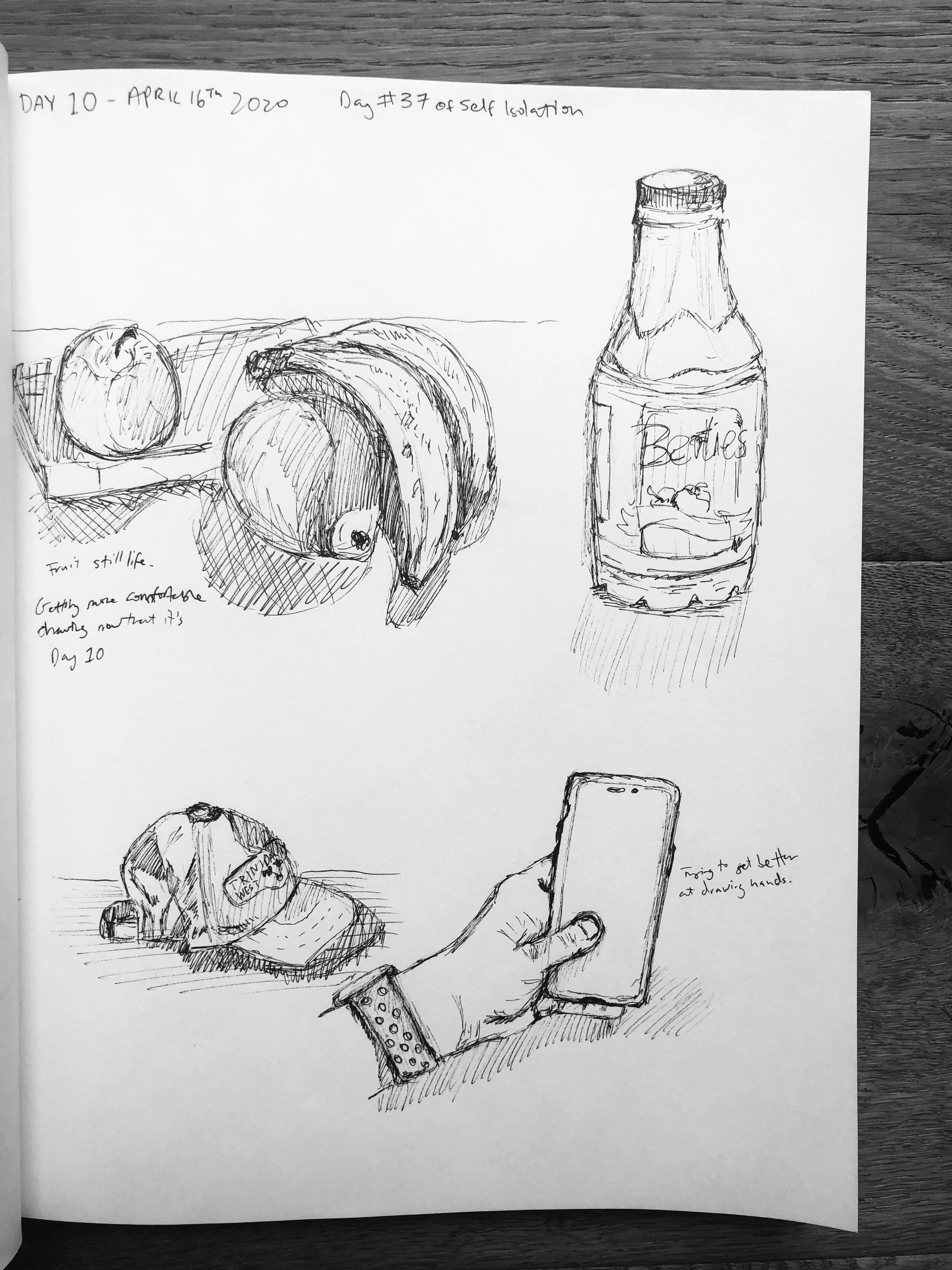
The 100 day Project - Day 10 update
10 days ago I was sent a link to the 100 Day Project’s landing page and was immediately drawn in (no pun intended.) The only problem was that I couldn’t decide if to do…

10 days ago I was sent a link to the 100 Day Project’s landing page and was immediately drawn in (no pun intended.) The only problem was that I couldn’t decide if to do 100 days of hand lettering or 100 days of sketching. Hand lettering was a skill that I am interested in learning more about and improving on; however, I really wanted to start sketching again. So I decided, you know what, I’ll do both. The rule I set for myself for the project was that I had to do at least 1 page of my sketch book for each.
I write this on the morning of Day 11 as an update on the first ten days. So far it has been pretty good with the exception of a couple days where it felt more tedious than fun, however on the average day it is enjoyable. For the sketching, I realised I enjoyed it more when I chose different areas of the house to sketch from. That seems obvious, but when you are at your desk working, it feels like a task to go find somewhere else to draw from.
See below to see the 2 galleries of images from my first ten days of the 100 day project. If you want to follow along, I am sharing this project on my Instagram stories everyday, and I have a story highlight where you can see everyone!
Also, just a reminder that if you want to support my work, please consider becoming a patron over at Patreon by clicking the button below.


How I Started My Own T-Shirt Brand **PART 1**
The idea for what became Deftment began over a year before our launch, when my good friend Kevin and I dreamed of creating quality tees with a unique Caribbean style. I have always...
The idea for what became Deftment began over a year before our launch, when my good friend Kevin and I dreamed of creating quality tees with a unique Caribbean style. I have always loved t-shirt design because a t-shirt is something that everyone owns, thus making the art/design on it something that is available to a huge audience.
We officially launched Deftment on October 3rd 2014, but the real work on the brand began a year before in September, 2013. Our vision at the time was simple, to provide high quality tees that were suited to a Caribbean lifestyle. This meant that it had to be stylish, versatile and durable; it should transition from the beach, to the pavement bar, to an all-inclusive fete with ease. The Caribbean is full of skilled individuals ranging from artists, musicians, chefs, DJ's, fashion designers; and these were the people who we detailed as our ideal customer. Our brand had to reflect this culture, and this passionate bunch. I had an idea of what I wanted aesthetically; something that drew from elements of typography, nature and mathematical geometry...we just had to figure out how to pull it all together. Developing a name posed a challenge. We wanted to invent our own word, something that we could define without preconceptions. Deftment is a portmanteau of deft, as in skilful, and movement. We set out to be a skilled movement.

In these two pictures I was getting close to the final logotype for the word DEFTMENT. I hadn't settled on a final logomark, the symbol that represented the brand (i.e. the Nike Swoosh vs the word NIKE.)The final logomark was made up of a series of hexagons, and you can see the inception of this idea from the pictures here.
The next thing on the list was creating a brand identity for Deftment starting with a logo. As I stated earlier, for the aesthetic of the brand we wanted to feature different geometric elements, and this was what I focused on with initial logo explorations.

We were looking for those geometric elements for the logo, and it all came to be by experimenting. I was trying to digitally create the face of a monkey using only geometric shapes. I drew a few hexagons and got to work resulting in something really close to what is the final logo.

A lot of tweaking and hard work went into perfecting the logo, as it would be the cornerstone of our brand and something that people would associate us with. I think the result was successful because it responded to our initial needs, and in the end we ended up with something that we set out to achieve in our own design brief.
In Part Two I will discuss the lead up to our launch, and the design process for the first Deftment Line.

How to stay inspired?
There are some weeks where I feel a sense of artistic inspiration from morning until night and I find the ability to create a lot of illustrations and think of a bunch of cool ideas with seamless ease. Other weeks however, it is a bit of a struggle to find the energy to pull out a blank canvas or to create a new file in illustrator. If this happens to you as well, I've put together a few things I find helpful to do when I'm stuck in a rut that help me find the creative energy…
There are some weeks where I feel a sense of artistic inspiration from morning until night and I find the ability to create a lot of illustrations and think of a bunch of cool ideas with seamless ease. Other weeks however, it is a bit of a struggle to find the energy to pull out a blank canvas or to create a new file in illustrator. If this happens to you as well, I've put together a few things I find helpful to do when I'm stuck in a rut that help me find the creative energy.
1) Look at other artists/designers who are better than you. My number one source for finding and interacting with other designers is Instagram. Check out some of my favourite Instagrammers here.
2) Check art/design blogs. My favourites are This is Colossal, Design Boom and Abduzeedo. There are many others out there that are endless sources of inspiration.
3) Talk to other artists. Catch up on what your designer friends are up to; they may have some extra ideas up their sleeve or a different perspective on a project you may be working on even if they are not in the same field as you. I am an illustrator and graphic designer, yet whenever I need advice or inspiration, one of my go to's is my friend Fede who is an Industrial Designer.
4) Doodle. By simply opening a sketch book and doodling, your brain starts thinking of ideas. This is especially true if you work a lot on the computer. Taking a break and doing an actual sketch helps in the design process.

I always start with sketching.
5) Open a book. There are so many art/design books out there that are full of ideas, you can't help but feel inspired. A few of my favourites are Things I have Learned in my Life So Far by Stefan Sagmeister, Graphic Design- A New History and Pretty Much Everything by Aaron Draplin

My copy of the great book by Stefan Sagmeister
6) Go for a walk. There are so many things to see outdoors, and by changing where we go, it opens our eyes to new things and ideas.
7) Go through old work. Sometimes your old work may inspire a new project, or maybe you might find a way to improve on your past designs. Many times I have gone through an old sketch book and found an overlooked concept or idea that is relevant to something I was working on.
8) Make lists of ideas. Writing lists (even when you are not in a creative rut) helps the creative method. For every 10 things you write down if you get one good idea out of it, you will eventually have a lot of ideas stored up over time. I try to add a few ideas to my list every day, and every so often I go back to search for inspiration.

Make lists of ideas!
9) Take a break. Sometimes overthinking takes a toll, and it is best to just walk away from your work and relax. Let your brain do some subconscious problem solving and then attack the project with a reinvigorated energy.
10) Listen to music. Everyone has music that they like to listen to while they create work. Put on your favourite tunes and wait for the creative juices to start flowing. Click here for a song that I love to listen to when working.
Hopefully this was all super helpful and maybe you found some inspiration in the list of things that I do. If you have anything to add feel free to leave a comment!
Trinidad & Tobago Film Festival Branding Review
With the 2014 edition of the trinidad+tobago film festival around the corner, I decided to do a write up on what I think is a very successful brand…

1604813_10152125338402171_893755625_n
With the 2014 edition of the trinidad+tobago film festival around the corner, I decided to do a write up on what I think is a very successful brand.
Here is a description of the film festival taken from their website, "Founded in 2006, the trinidad+tobago film festival (ttff) is an annual celebration of films from and about Trinidad and Tobago, the Caribbean and its diaspora."
film-fest-logo

Screen Shot 2014-09-03 at 1.47.12 PM
Usually when things are branded as "Trinidad & Tobago..." there is a trend to have it red, white and black, and to include some sort of local logo cliche, such as a humming bird, a steel pan, or something else that screams "TRINIDAD & TOBAGO." Thankfully the film festival logo did not go down this route and instead chose to use more understated nods to the T&T flag that may not be seen at first glance. Firstly it must be noted that the logo is very clean, with the subtle reference to the T&T flag both in the shape that the words are placed on, as well as the thin strokes that pass through the words.
The typography is transparent and shows a glimpse of the background it is placed on (as can be seen in the images below), and the colour of the block is interchangeable; this adds to the versatility of the branding. The colours used are vibrant and represent well the hues found throughout T&T. The only small issue I had with the logo was the fact that the typography is right aligned and perhaps a left alignment may have made it a little more successful based on the shape that the type sits on. Overall a very good logo that is used successfully throughout all the media that it rendered on.

trinidad-tobago-film-festival
The application of the logo by the film festival is very uniformed across the board, and the logo, as well as use of colour, makes it instantly recognizable as to what it is. I particularly like the transparent lettering that allows each image to create a unique representation of the typography in the logo.

Screen Shot 2014-09-03 at 1.58.05 PM

Screen Shot 2014-09-04 at 11.04.08 AM
Both the cover of the 2014 guide and the website home page keep up the same quality branding and the colour choices for the typography are on point. All of the design elements are thoughtfully executed and makes for a successful and enjoyable experience for the user. The trinidad+tobago film festival definitely has a high standard when it comes to their branding and I am personally excited to be a patron this year.
The trailer for the film festival can be found here.
Update- Abovegroup rebranded the film festival in 2009 and Melanie Archer, the art director for the festival has been responsible for the application and development over the years, under Abovegroup's guidance in 2010, and then solo since.
Nick.
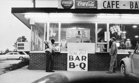
Photographing the Mundane
Artists see the world through different eyes to most people; they see the beauty in things that may be considered boring or mundane, and there are no photographers who capture this beauty as well as William Eggleston. Eggleston is a pioneering photographer and is credited with…
hot_sauce
Artists see the world through different eyes to most people; they see the beauty in things that may be considered boring or mundane, and there are no photographers who capture this beauty as well as William Eggleston. Eggleston is a pioneering photographer and is credited with introducing colour to art photography in the late 1960s. To understand how avant-garde this was, it must be acknowledged that most art photography at the time was shot in black and white, and colour was considered to be ugly; no serious photographer would photograph in colour.
The reason behind art photographers shooting in black and white is summed up best by John Szarkowski, writing in the introduction to the book "William Eggleston's Guide."
He stated, "For the photographer who demanded formal rigor from his pictures, color was an enormous complication of a problem already cruelly difficult. And not merely a complication, for the new medium meant that the syntax the photographer had learned - the pattern of his educated intuitions - was perhaps worse than useless, for it led him toward the discovery of black-and-white photographs. Most serious photographers, after a period of frustrating experimentation, decided that since black and white had been good enough for David Octavius Hill, Brady, and Stieglitz, it was good enough for them. Professionals used color when they were paid to, doing their very best, without quite knowing what they meant by that."
Below is a photograph by Eggleston, taken before he started shooting in colour.
eggleston-before-colour-006
Eggleston was born in Memphis, Tennessee, and it is here that he has done the majority of his work. According to his wife Rosa, when he was first getting started in photography he told his friend that in Memphis everything was ugly and he didn't know what to photograph; his friend responded "well, photograph the ugly stuff." So this is exactly what he did. He began photographing otherwise unremarkable subjects yet achieving remarkable results.
troubled_waters_i
He has been said to photograph democratically, where he treats everything he sees equally and produces pictures out of nothing.
His subject matter could be described as banal, boring, mundane and everyday, however he shoots it with such beauty, and what at first seems simple turns out to show quite a complex message where nothing in the frame can be taken for granted. His wife has said, “One thing that I will never forget in my mind what Bill did say to me earlier on when he was talking to me, ‘Now you must not take anything for granted when you are looking at a picture. Never do that. Every single little tiny space on that page works and counts.”

troubled_waters_b
Eggleston has gone on to achieve great recognition, however, in the beginning of his career he had a show at the Museum of Modern Art (MoMA) in New York City and one art critic deemed it "the most hated exhibition of the year." There were a lot of negative reviews by critics who simply did not get what it was he was doing. Another critic stated that it was "totally boring and perfectly banal" which is ironically the intention of the exhibition, and something that he went on to become recognised for.

dust_bells_v2_m
In the documentary "William Eggleston-Imagine," he said in response to his critics at his MoMA show, "“I think it was wonderful having a first major show at MOMA, of all places. It got tremendous recognition, great amount of it—-negative. I really felt sorry for them, because it was so obvious –-it was like they had the wrong time. They didn’t understand what they were looking at. And their job was to understand it. Modern art, it is the museum of modern art. And, they wrote pretty stupid things. Then it became known all over the world, so, the critics who wrote all that stuff later apologized [laughed] that they were wrong.”
southern_suite_c
Eggleston is truly great at what he does and his photographs are a joy to look at. What might be considered as mundane by some, his images transport us to a time where we are stuck in the moment that each photograph was taken. Despite living in an "ugly & boring" place, he has transformed it through his photography, and he is truly a master of his art.

los_alamos_s
To conclude, here is a great quote by Eudora Wetley that perfectly sums up the work of Eggleston, "The extraordinary, compelling, honest, beautiful and unsparing photographs all have to do with the quality of our lives in the ongoing world: they succeed in showing us the grain of the present, like the cross-section of a tree. The photographs have cut it straight through the center. They focus on the mundane world. But no subject is fuller of implications than the mundane world!”
los_alamos_o
All images are © Eggleston Artist Trust. All rights reserved.
You can see more of his work at the Eggleston Artist Trust website.

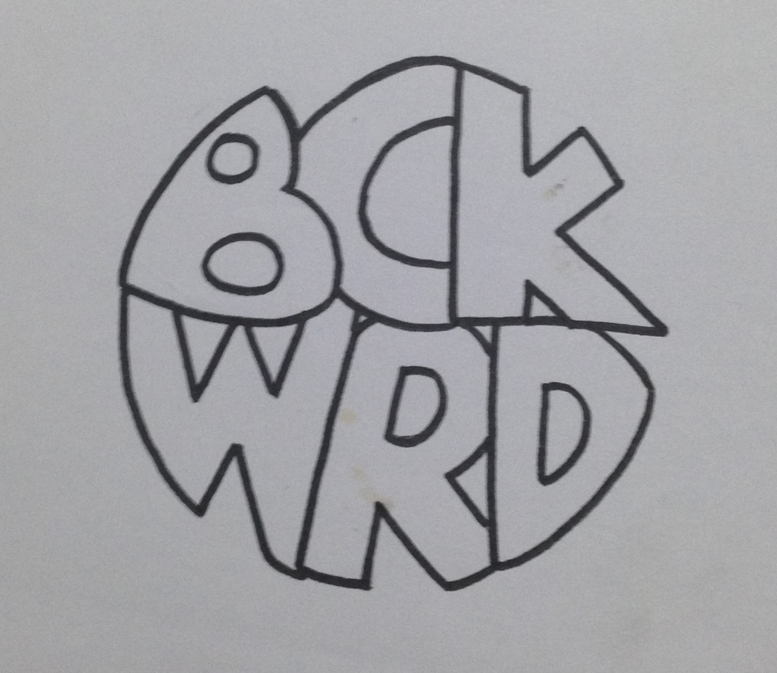
My First Logo
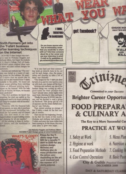
I was recently going through some of my old work and I found what is possibly the first logo I have ever created. To give some background to the logo I will give the story about what it was for. At the age of around 17, a friend (Anthony Alkins) and I decided we…

bckwrdlogo
I was recently going through some of my old work and I found what is possibly the first logo I have ever created. To give some background to the logo I will give the story about what it was for. At the age of around 17, a friend (Anthony Alkins) and I decided we were going to start a T-shirt printing business. We decided that it will be a good venture to start in an effort to make a bit of pocket money. We had achieved a small amount of success spray painting images through a stencil onto the t-shirts of fellow students during the intercol season, and figured this was a good step to take. After a little bit of research we decided that the best and most efficient way to print t-shirts was screen printing. We got all our equipment (ink, silk, built screens, etc) and wrote down a list of ideas to put onto these t-shirts. Our idealistic view was that we were going to print t-shirts that we would want to wear ourselves, and of course people will flock to buy them. Truth be told, we did sell quite a few of our own ideas, but for the most part, people came to us with their own ideas for us to print. This turned out to be our biggest money maker. Before we printed a t-shirt, we needed to come up with a brand name. Something for people to recognise us by. This was my first foray into branding and at this time I had no clue about anything in the world of graphic design. Being the "artist" in the business I was tasked with drawing a logo once we came up with the name and the name we eventually chose was BCKWRD Designs.
Come time to create the logo, I made a bunch of sketches and eventually created a finished drawing with a marker. I then scanned the image and coloured it black in photoshop with the help of the magic wand tool and the brush tool. At this point I had no idea what illustrator was, and very limited knowledge of photoshop. If you asked me about raster graphics, I would have assumed you were telling me something about Bob Marley. With the little skill possessed, a logo was eventually created and we started printing. We achieved relative success with the business, and we printed a few afternoons every week for the next 2 years or so, we were even featured in an article in the newspaper as well as a local talk show showcasing youths who were doing things out of the ordinary.
This early experience with graphic design eventually led me to choose graphic design as a career and I was fortunate enough to study it in detail for 4 years at SCAD. I think one of the positives in the early BCKWRD logo is the handmade feeling, and it is what can be achieved through sketching before going straight into illustrator and using a font found online. When designing always consider a youthful naivety in the sketching process, and this will show through in creating original designs that does not look like any old logo found on behance or pinterest. Check out the finished logo below.

bckwrdlogowhite
Here is some process work that I found in an old folder. From an initial sketch to the finished drawing that I would have scanned in.

IMG_3923

IMG_3920
IMG_3921-2
IMG_3922
353_100551145480_4108_n
"Fins by O'Brien" Logo Process
Someone recently approached me to come up with a logo for them. They had started making custom surfboard fins out of plywood and the product piqued my interest. I immediately started formulating ideas…

Image
Someone recently approached me to come up with a logo for them. They had started making custom surfboard fins out of plywood and the product piqued my interest. I immediately started formulating ideas in my mind and by the next day I had a pretty solid idea as to what I wanted the final logo to look like. Below is the initial sketch in my notebook.
From there, I drew it out in Adobe Illustrator very roughly in order to get a feel for the positioning and shape of the letters.
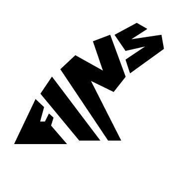
Image
After that it was just a matter of editing the strokes and the anchor points in order to get the desirable look for the logo. A wooden texture was added to reflect the nature of the product.

Image

Fete Signs of Trinidad
As a graphic designer who studied abroad, I always think about what kind of design or aesthetic is intrinsically Trinbagonian; what colours do we use, what sorts of typography is used, what sort of trends are seen in our design? Now that I am back living and working at home…

Image
As a graphic designer who studied abroad, I always think about what kind of design or aesthetic is intrinsically Trinbagonian; what colours do we use, what sorts of typography is used, what sort of trends are seen in our design? Now that I am back living and working at home I can't help but look out for things that set us apart from the rest of the world when it comes to design, and whether this design is done deliberately or not.
The one part of our designed environment that really stands out to me, and I find strangely satisfying, is the art of Fete (party) Sign Painting. These signs are painted and then attached to posts/trees/poles as advertisements for public parties. They are almost always up to date, due mostly to the fact that room has to be made for the next Fete Sign to go up. Each one is hand painted, and it is a breath of fresh air in a place where quality in design aesthetic is often over looked for cheaper prices, leaving us with eye sores at every turn.
One of the things that is common of these Fete Signs is hand painted typography over a background painted with a gradient. In just a few lines and with minimum words, all of the information needs to be placed so that it can be read clearly by passing motorists and pedestrians. They are used as an invitation to the nation.
There is not much info to be found online however I did come across this photo set on Flikr that has some really great, up close photos of some of the fete signs. There is also an Instagram account devoted to capturing found Trinidadian typography. If you have any additional information regarding Fete Signs, don't hesitate to send me an email via the contact page.