
2022 Wrap Up
2022 was an amazing year.
Apart from getting married, I got to work on some really great projects. The Google Doodle was the icing on the cake of course, but I’ve also included some other accomplishments this year…

2022 was an amazing year.
Apart from getting married, I got to work on some really great projects. The Google Doodle was the icing on the cake of course, but I’ve also included some other accomplishments this year.
1. The 230’ x 15’ mural at C3 Centre in Trinidad was my biggest display of art to date. It was a huge job and rounded out the year!
2. It’s always been a bucket list item of mine to design the packaging for a rum. I got to do that this year with Ferdi’s Rum…a limited edition rum.
3. I got to work on an epic Johnnie Walker mural that I drive past every week.
4. I was accepted as an artist to SuperRare… another bucket list item
5. The Google Doodle! My career highlight so far
6. I sold a piece on Foundation for 1.5 ETH, my all time high for a piece
7. I exhibited at Miami Art Week at the Let There Be Reggae exhibition.
8. I created more artwork for Kes The Band including Liki Tiki!
9. My work was exhibited in London at the Adidas flagship store for the Creative Debuts show.
Thanks for following along on this creative journey of mine! Here’s to a great and productive 2023! 🇹🇹

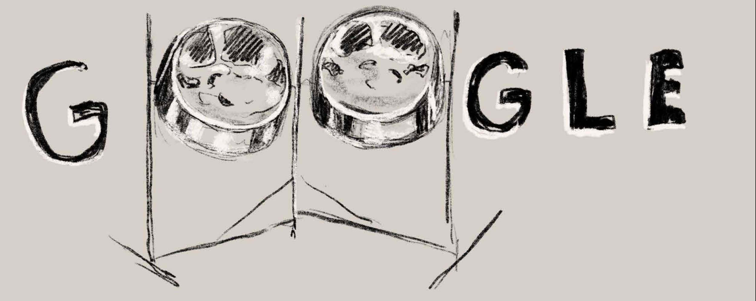
Google Doodle - Steel Pan
About two years ago I received a message on Instagram from an Art Director at Google requesting my email address. The following day I received an email with an NDA and then the brief for the project…

About two years ago I received a message on Instagram from an Art Director at Google requesting my email address. The following day I received an email with an NDA and then the brief for the project. The Doodle was to be “a celebration of the Steel Pan”, the national instrument of Trinidad & Tobago which was invented right here in T&T. When I was first approached to tackle such a culturally significant topic for this Doodle I was a bit nervous because I wanted the story being told to be one that Trinbagonians worldwide would be proud of. I was also very excited because I love creating art that showcases Trinidad & Tobago and this Doodle will allow my country to be showcased on one of the biggest online stages
The Steel Pan is the national instrument of Trinidad & Tobago and was actually invented here. It is an instrument that was born from resistance and rebellion and is truly emblematic of the people of T&T. At the time, African percussion was banned among other things, and the steel pan developed out of that. The fact that such a sweet tune can be extracted from industrial oil drums is something that should be cherished. The steel pan is also closely associated with our national Carnival celebrations, and therefore is a great source of national pride.
The initial brief was for a static illustration, but after some more conversations it was decided that the essence of the pan, and the music should be showcased. It was decided to postpone the initial launch date in 2020 to work on a full length animation with original music. Mick Seegobin (motion design), Etienne Charles (composer, arranger, producer) and the living legend Lennox “Boogsie” Sharpe (composer) were brought on to the project.
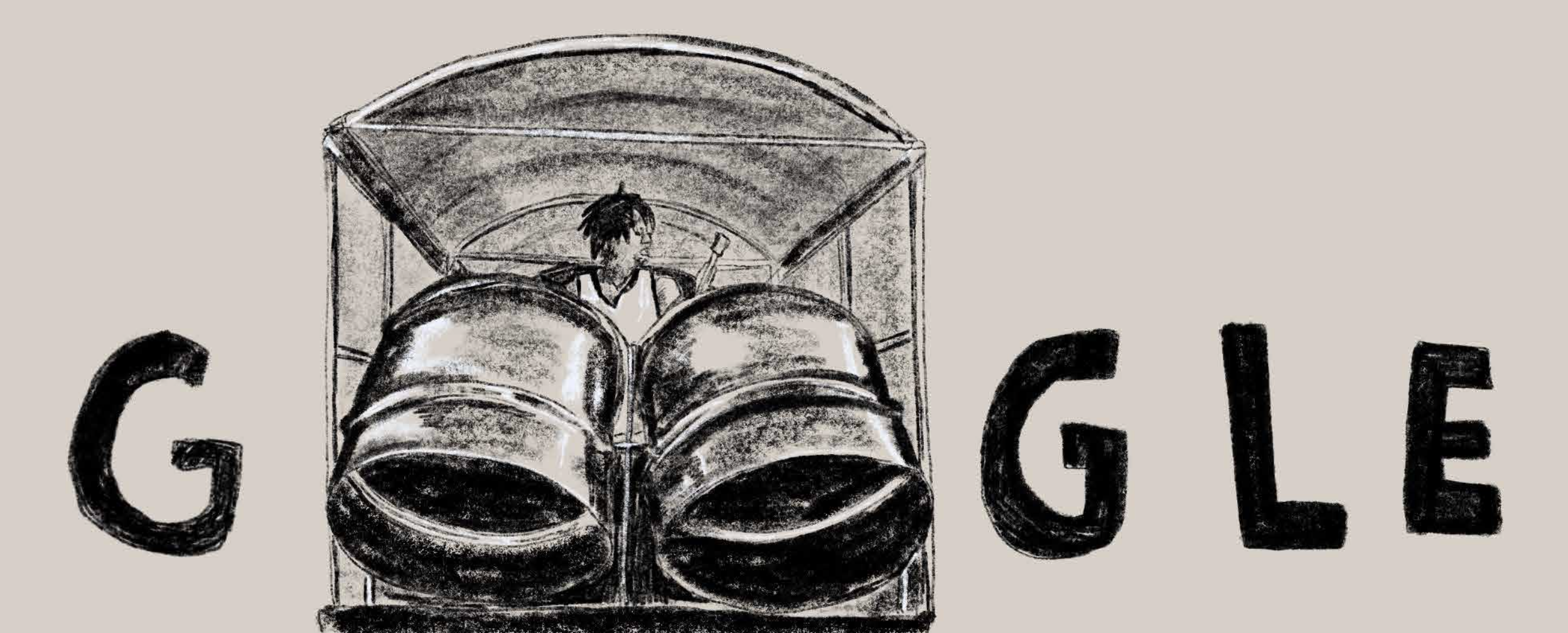


Once the decision was made to do the Doodle as an animation, the next step was to do a storyboard and create sketches that could direct the flow of the storyline. The truck was used to tie together the different scenes and to be a motif used throughout the animation. The initial sketches were done really rough simply to show the idea behind the piece. Below, you can see some of the initial sketches.


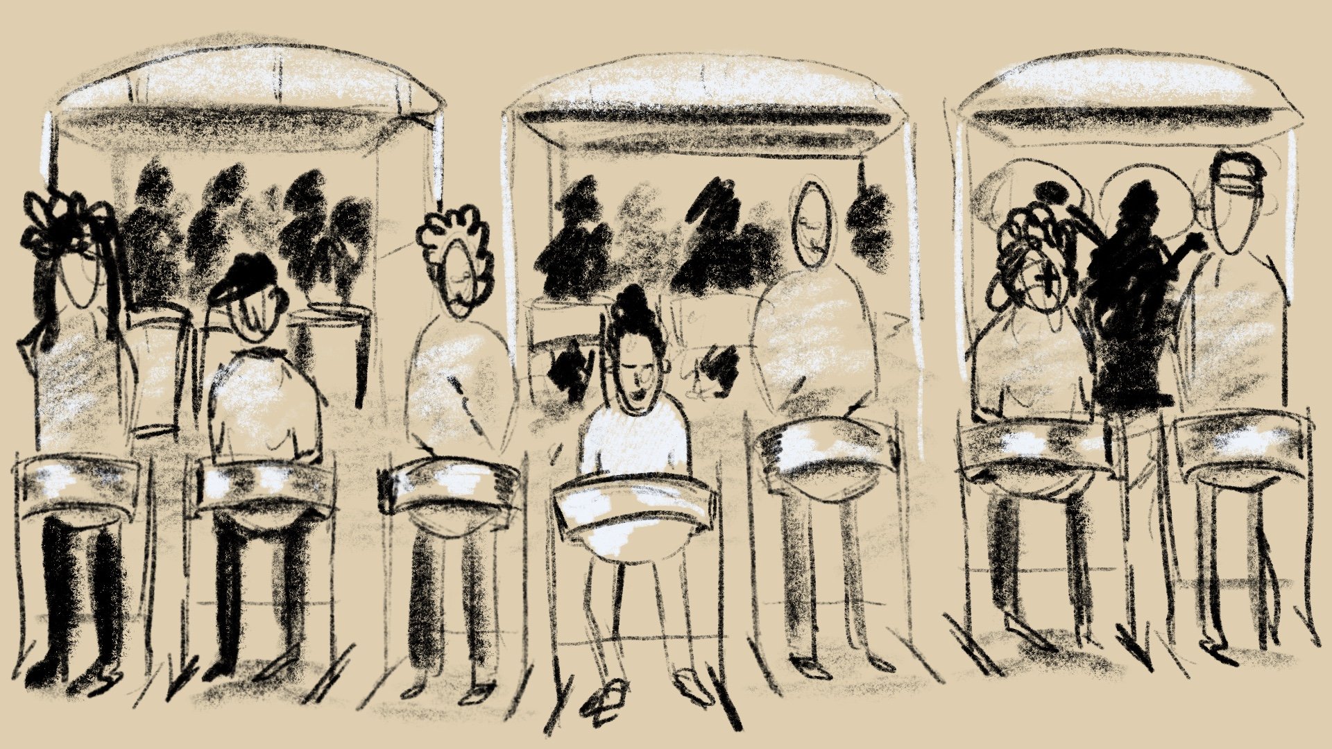
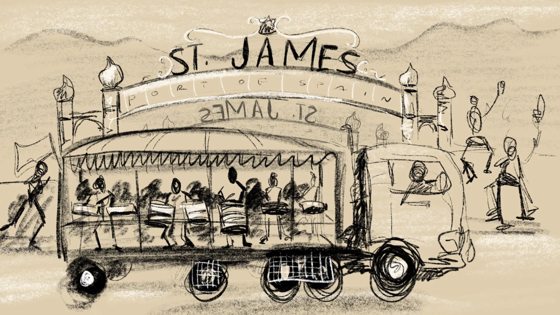
Before animating anything, we created an animatic that showed the basic timing of each scene and gave an idea of what the final flow of the animation would be. The animatic also gave the music team an idea of what was needed as far as the length of the piece of music that had to be composed. It was also decided that we would create one long tracking shot of the truck which meant that I had to illustrate a panoramic scene that the truck could drive through. This scene turned out to be one of my favourites in the entire animation.

The final step for the animation was to refine each scene illustration as well as to refine the actual animated movements throughout the video. Once this was done, the music team of Etienne Charles and Boogsie Sharpe were then able to make sure that the music and sound effects matched perfectly with the visuals.
Overall, this was a great project to be a part of, and hopefully the end product is something that Trinbagonians and Steel Pan lovers everywhere can be proud of. I hope that people can take away the sense of the industriousness and creativity of the people of Trinidad & Tobago. We are a small country on the global stage but the fact that we have given the world such a beautiful instrument is something to be held in the highest regard.
And of course a special big up to the team that worked with me on this:
Mick Seegobin : Motion Design
Etienne Charles : Composer, Musician
Lennox “Boogsie” Sharpe : Steel Pan Soloist
See the final piece below -

McDonald's Illustrations : The Process
What do you do when you’re on holiday and McDonald’s asks you to work on 3 illustrations for them to celebrate their 10th anniversary in Trinidad & Tobago?
You say yes and thank your lucky stars that you cleared your week in advance.
The brief for the job was simple…
What do you do when you’re on holiday and McDonald’s asks you to work on 3 illustrations for them to celebrate their 10th anniversary in Trinidad & Tobago?
You say yes and thank your lucky stars that you cleared your week in advance.
The brief for the job was simple, to create 3 custom illustrations which are patriotic, family-friendly, and feature local landscapes/ topics. Sounds easy enough…but how do you capture the essence of a place like Trinidad & Tobago in just 3 illustrations, there are literally hundreds of things that you can do to represent T&T.
As with all jobs, the first thing I did was to start brainstorming ideas. I also decided to ask my Instagram followers for some help by asking them what they think of when they think of Trinidad & Tobago. I definitely got some good answers that helped me get a gauge on what were the most frequent answers (example: Carnival.) I’ve included below a selection of the answers that I receieved.

Once I narrowed down some of the ideas, the next step was to start sketching. At this point I had a pretty good idea of what I wanted to do so the sketches would be super rough just to try to figure out the actual composition of the concept. If you look at the sketches below, you can see how the final designs originated in these thumbnails.

The sketches above aren’t shared with the client during the process, however what I typically do is send across refined pencil sketches for the client’s approval before I move on to adding any colour. This way, the layout can be approved and there are no surprises for the client at the end; and of course if there are any changes to the layout, all I have to do is change a pencil sketch and not redo an entire section of a fully formed illustration.
The concepts that I chose covered a lot of bases of T&T culture and life.
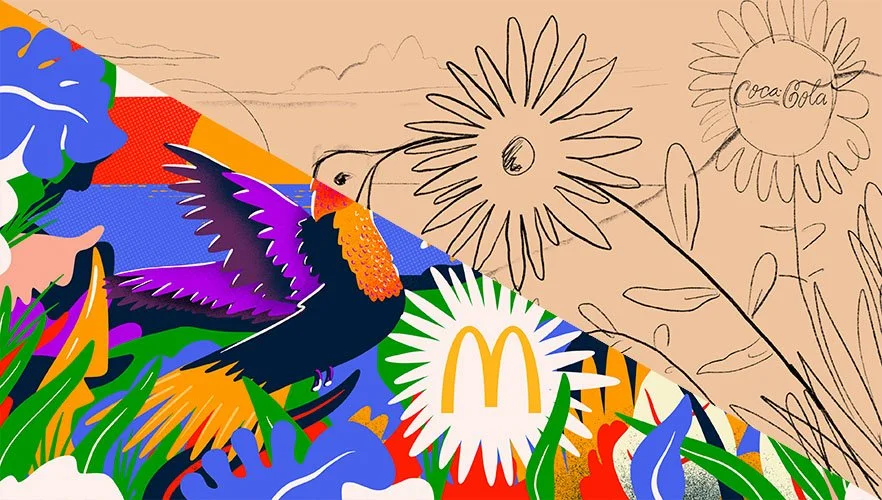
Design 1 showed a hummingbird in the hills; the original Amerindian name for Trinidad is Ieri or the Land of the Hummingbirds so I felt it a fitting tribute to have a hummingbird as the focal point in the illustration.
Design 2 was of course an ode to Carnival. I tried to capture the energy of Carnival showcasing masqueraders at the Queen’s Park Savannah in full revelry.
Design 3 was meant to showcase the melting pot that is Trinidad & Tobago using many elements of what makes us who we are in one design.

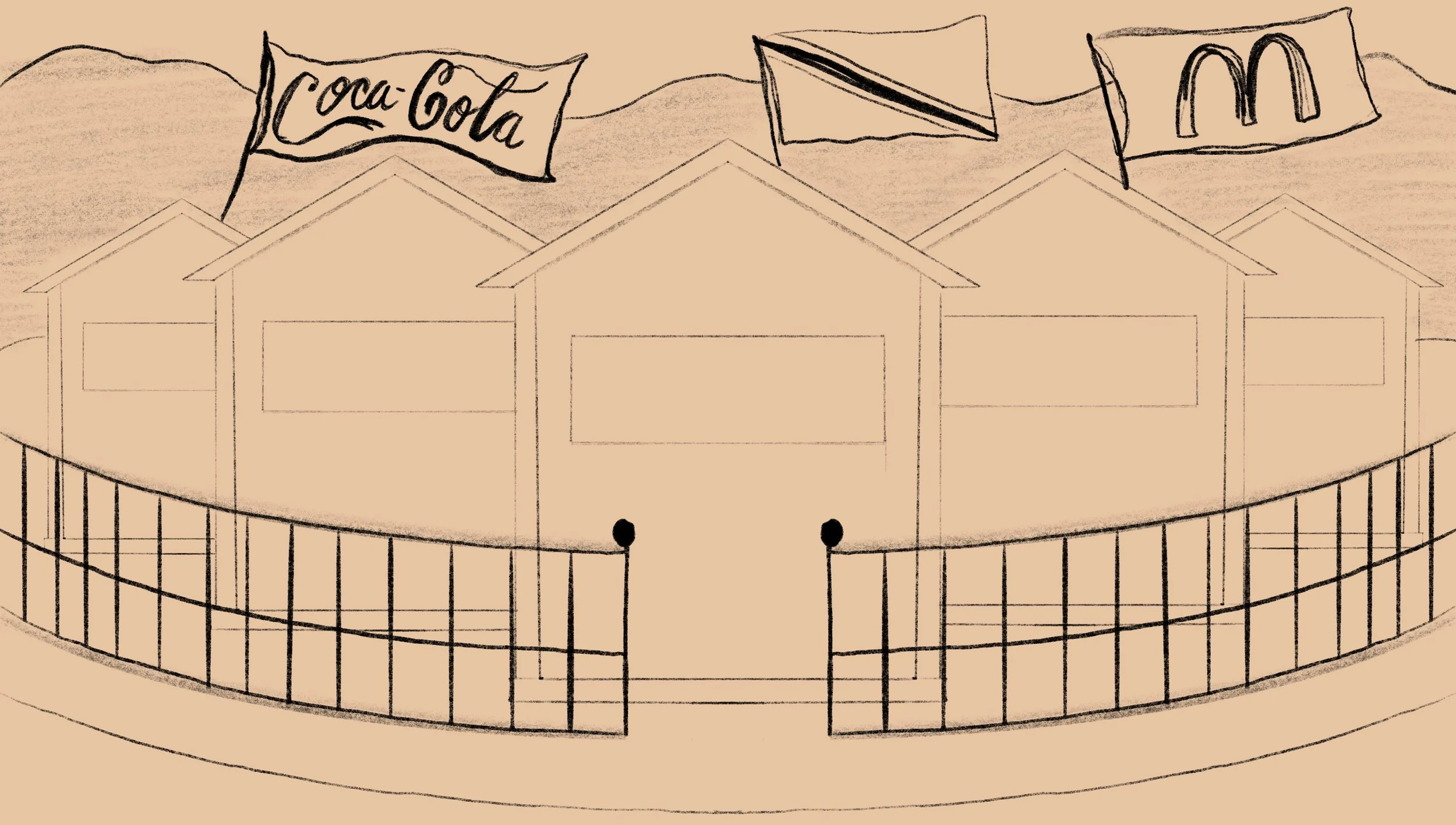

Once the sketches are approved, I usually work on a colour-study which is a more refined sketch that includes some colour so that the client can get an idea as to what the palette will be.
This job however, had a pretty tight deadline, so I included a small segment of colour in the initial sketch presentation so that the client can both see the layout and palette in one shot. There were a few minor changes after this stage of the process but nothing major.
Next up was to create the final illustration!
For the final pieces, I had a pretty good idea of the style and vibe I was going for. The three designs were done on the iPad Pro using the Procreate app. Procreate is an extremely versatile program that I really enjoy using. If you want to know more about my Procreate work flow, click here to check out a video I made. Once I wrapped up the finished illustrations, I worked on some mockups so that the client can best see what the final product would look like.


Overall this was a really fun project to work on and I am extremely happy with the final result. If you scroll down you will see the promo video as well as the television interview for the launch of the illustrations. I hope you enjoyed this insight into the process, and if you have any questions make sure to leave them as a comment.
Nick
Neal & Massy Rebranding
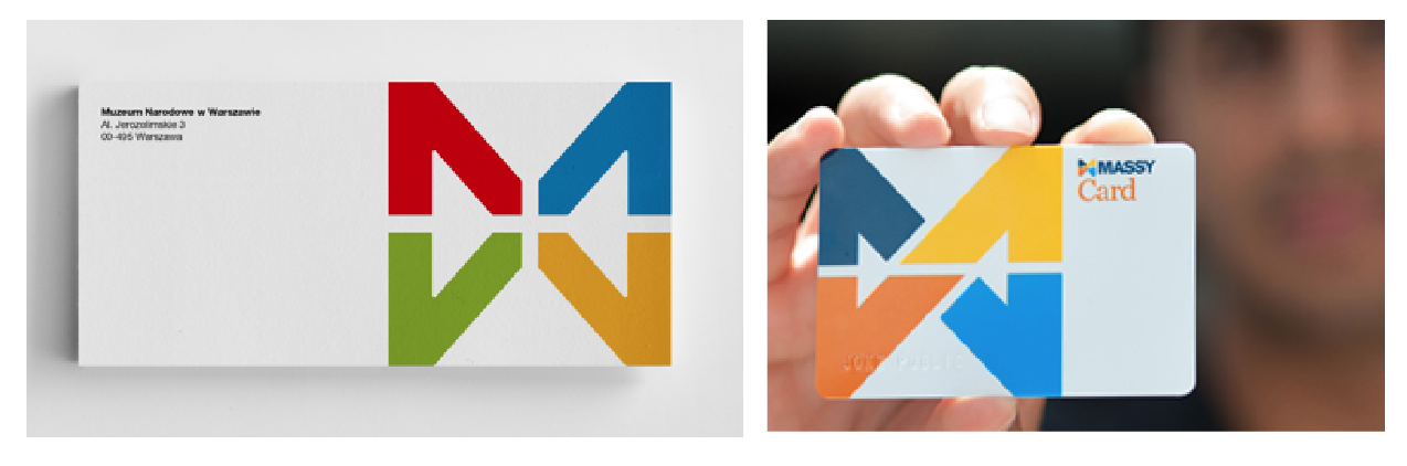
One of the most talked about rebrandings in Trinidad has just occurred. Neal and Massy has rebranded themselves as Massy, and with it, all of their subsidiary companies. The logo is described as such on the new Massy website– "The Massy logo is simple, bold and modern and represents the mutuality of our Group of companies, with a stylized infinity symbol that retains the N and M of our previous corporate identity. The visibility of both letters in the logo design…

Massy-rebrand
One of the most talked about rebrandings in Trinidad has just occurred. Neal and Massy has rebranded themselves as Massy, and with it, all of their subsidiary companies. The logo is described as such on the new Massy website– "The Massy logo is simple, bold and modern and represents the mutuality of our Group of companies, with a stylized infinity symbol that retains the N and M of our previous corporate identity. The visibility of both letters in the logo design is a deliberate reference to the heritage of founders Harry Neal and Charles Massy."
From the first time I saw the new logo, it struck me as being an overdone concept, and I wasn't sure if I had seen it before. Everyday I peruse websites such as logopond, dribbble, and behance to look at logos and I just felt that the new Massy logo looked like an idea that I had seen before. And then, I received a message on facebook with a link to a logo that looked eerily similar.
18.-logo-design
The original can be found by clicking here. It is a logo done for the National Museum in Warsaw by Polish designer Dawid Cmok.
There are of course many similarities between this logo and the new Massy logo. The logomark is almost the same shape, similar colours are used, and the logotype seems to be written in the same font.
The fact that Massy now has what seems to be an unoriginal logo of course isn't their fault, and the onus should be on the design firm hired by them. The agency/designer should've gone to all lengths to ensure the originality of their work. Below is a transparency of the two logos to show the similarity.

Screen Shot 2014-07-02 at 1.21.10 PM
There are also other brand components that are similar. For instance the Massy card is very similar to the envelope of the Museum.
Screen Shot 2014-07-02 at 1.22.57 PM
Despite the seemingly unoriginal design, the new logo for Massy is definitely an improvement on the old "NM" logo, however, one must feel that they would not be completely satisfied with what is a very uninspired final product. Also the use of a font very similar to Helvetica for the word "MASSY" comes off as a bit boring. All in all though, the logo is an improvement and the colour choice stands out well when put to use, and from what I have seen on their website, press ads, and signage, everything is working cohesively.
hilo_logo
Logo and brand identity aside, the thing that seems to be upsetting people the most is the fact that Massy has decided to change the names of all their subsidiary companies. There will now be Massy Motors, Massy Energy, Massy Pres-T-Con, Massy Technologies, Massy Communications, just to name a few. Perhaps the biggest change for most people would be the renaming of Hi Lo food stores to Massy Stores Supermarket. Hi Lo has been around since the 1950s and has a very strong brand reputation; Trinis all over the world could sympathize with me in admitting that any plastic bag regardless of their origins, is a "Hi Lo bag."
Hi Lo is one of the most recognizable brands in Trinidad and the change to Massy Stores feels a bit "corporate." The nation's favourite food store, in appearances, has become just another company under the umbrella of Neal & Massy, and it certainly loses its personality and brand heritage. Sure, the old Hi Lo logo could have used a face lift, but to completely change a name that is so ingrained into the culture is certainly a bold move that would upset a lot of consumers.
One could argue that in order for the branding to be withheld throughout all of the companies, perhaps it was a necessary move, however they could have maintained the Hi Lo name and included "A Massy Company" or something to that effect under the logo, or somewhere else on their media. It certainly seems that Trinidad has lost a small part of our brand culture, and the next time you are looking for a plastic bag, maybe try asking for a "Massy bag" and see what happens.
**UPDATE** The intention of this article was not to insinuate that any sort of plagiarism has occurred with regards to the Massy logo. The choice to show the Museum logo was to make the point that the Massy logo was not an original idea/concept, and that the logo could be pushed further. As a designer I know that we create things that, of no fault to ourselves, might appear to be very similar to other works that have been previously created. Does a similarity mean plagiarism? Absolutely not! It just means that as a designer, we should push our ideas and concepts further.
Nicholas Huggins is a graphic designer. See his work here.

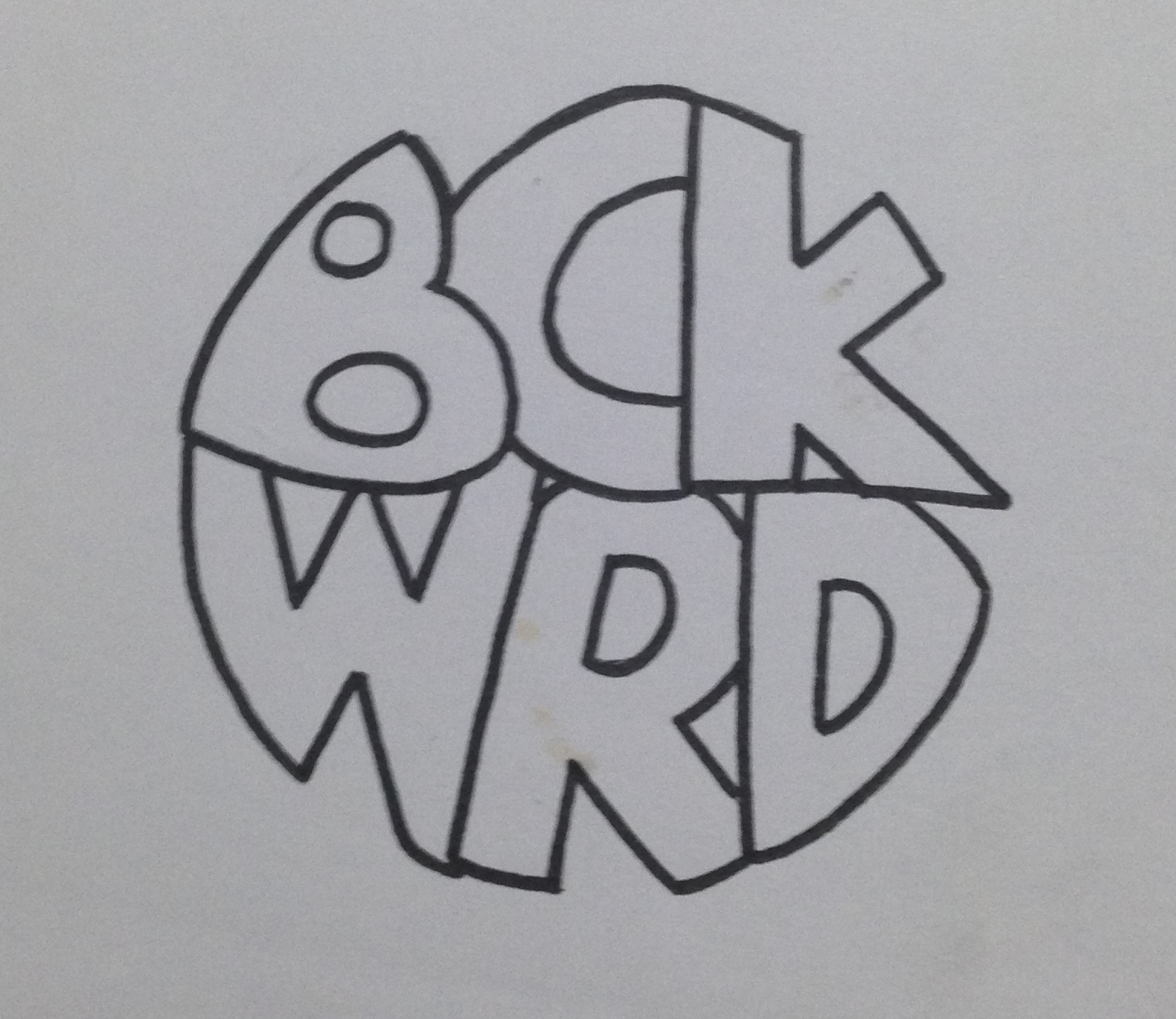
My First Logo
I was recently going through some of my old work and I found what is possibly the first logo I have ever created. To give some background to the logo I will give the story about what it was for. At the age of around 17, a friend (Anthony Alkins) and I decided we…

bckwrdlogo
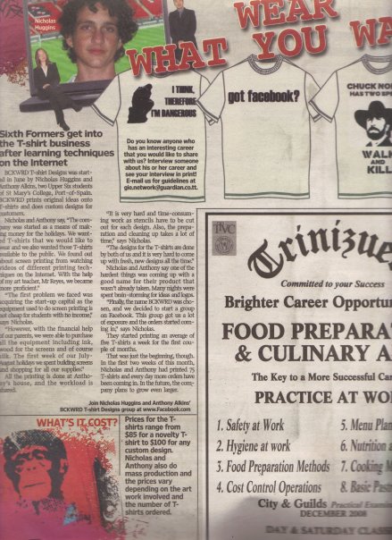
I was recently going through some of my old work and I found what is possibly the first logo I have ever created. To give some background to the logo I will give the story about what it was for. At the age of around 17, a friend (Anthony Alkins) and I decided we were going to start a T-shirt printing business. We decided that it will be a good venture to start in an effort to make a bit of pocket money. We had achieved a small amount of success spray painting images through a stencil onto the t-shirts of fellow students during the intercol season, and figured this was a good step to take. After a little bit of research we decided that the best and most efficient way to print t-shirts was screen printing. We got all our equipment (ink, silk, built screens, etc) and wrote down a list of ideas to put onto these t-shirts. Our idealistic view was that we were going to print t-shirts that we would want to wear ourselves, and of course people will flock to buy them. Truth be told, we did sell quite a few of our own ideas, but for the most part, people came to us with their own ideas for us to print. This turned out to be our biggest money maker. Before we printed a t-shirt, we needed to come up with a brand name. Something for people to recognise us by. This was my first foray into branding and at this time I had no clue about anything in the world of graphic design. Being the "artist" in the business I was tasked with drawing a logo once we came up with the name and the name we eventually chose was BCKWRD Designs.
Come time to create the logo, I made a bunch of sketches and eventually created a finished drawing with a marker. I then scanned the image and coloured it black in photoshop with the help of the magic wand tool and the brush tool. At this point I had no idea what illustrator was, and very limited knowledge of photoshop. If you asked me about raster graphics, I would have assumed you were telling me something about Bob Marley. With the little skill possessed, a logo was eventually created and we started printing. We achieved relative success with the business, and we printed a few afternoons every week for the next 2 years or so, we were even featured in an article in the newspaper as well as a local talk show showcasing youths who were doing things out of the ordinary.
This early experience with graphic design eventually led me to choose graphic design as a career and I was fortunate enough to study it in detail for 4 years at SCAD. I think one of the positives in the early BCKWRD logo is the handmade feeling, and it is what can be achieved through sketching before going straight into illustrator and using a font found online. When designing always consider a youthful naivety in the sketching process, and this will show through in creating original designs that does not look like any old logo found on behance or pinterest. Check out the finished logo below.

bckwrdlogowhite
Here is some process work that I found in an old folder. From an initial sketch to the finished drawing that I would have scanned in.

IMG_3923

IMG_3920
IMG_3921-2
IMG_3922
353_100551145480_4108_n
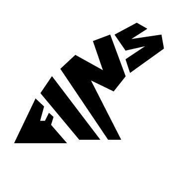
"Fins by O'Brien" Logo Process
Someone recently approached me to come up with a logo for them. They had started making custom surfboard fins out of plywood and the product piqued my interest. I immediately started formulating ideas…

Image
Someone recently approached me to come up with a logo for them. They had started making custom surfboard fins out of plywood and the product piqued my interest. I immediately started formulating ideas in my mind and by the next day I had a pretty solid idea as to what I wanted the final logo to look like. Below is the initial sketch in my notebook.
From there, I drew it out in Adobe Illustrator very roughly in order to get a feel for the positioning and shape of the letters.
Image
After that it was just a matter of editing the strokes and the anchor points in order to get the desirable look for the logo. A wooden texture was added to reflect the nature of the product.

Image
The Importance of Brand Guidelines
One of the fundamental things to keep in mind when designing a brand, is consistency. You want people when they see your logo to relate it immediately to your brand/product/service. This is achieved through proper logo usage. Too often in Trinidad & Tobago…

Screen Shot 2014-04-04 at 11.34.34 AM
One of the fundamental things to keep in mind when designing a brand, is consistency. You want people when they see your logo to relate it immediately to your brand/product/service. This is achieved through proper logo usage. Too often in Trinidad & Tobago we see poor usage of logo where brand guidelines (if there are any) are thrown out the window. On my daily commute I pass "Ultracool LTD," a company that deals in air conditioning sales and parts. On the outside of their building there are three (3!!!!) different renditions of their name. The first logo is painted onto the facade of the building, the second is used as a neon light, and the third is on a banner. This lack of brand identity is typical in a place where not enough emphasis is placed on graphic design. Business owners need to realise the positive impact that having a proper brand identity will bring to the table.

Fete Signs of Trinidad
As a graphic designer who studied abroad, I always think about what kind of design or aesthetic is intrinsically Trinbagonian; what colours do we use, what sorts of typography is used, what sort of trends are seen in our design? Now that I am back living and working at home…

Image
As a graphic designer who studied abroad, I always think about what kind of design or aesthetic is intrinsically Trinbagonian; what colours do we use, what sorts of typography is used, what sort of trends are seen in our design? Now that I am back living and working at home I can't help but look out for things that set us apart from the rest of the world when it comes to design, and whether this design is done deliberately or not.
The one part of our designed environment that really stands out to me, and I find strangely satisfying, is the art of Fete (party) Sign Painting. These signs are painted and then attached to posts/trees/poles as advertisements for public parties. They are almost always up to date, due mostly to the fact that room has to be made for the next Fete Sign to go up. Each one is hand painted, and it is a breath of fresh air in a place where quality in design aesthetic is often over looked for cheaper prices, leaving us with eye sores at every turn.
One of the things that is common of these Fete Signs is hand painted typography over a background painted with a gradient. In just a few lines and with minimum words, all of the information needs to be placed so that it can be read clearly by passing motorists and pedestrians. They are used as an invitation to the nation.
There is not much info to be found online however I did come across this photo set on Flikr that has some really great, up close photos of some of the fete signs. There is also an Instagram account devoted to capturing found Trinidadian typography. If you have any additional information regarding Fete Signs, don't hesitate to send me an email via the contact page.