
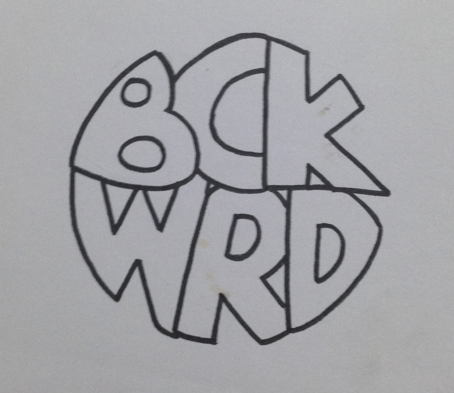
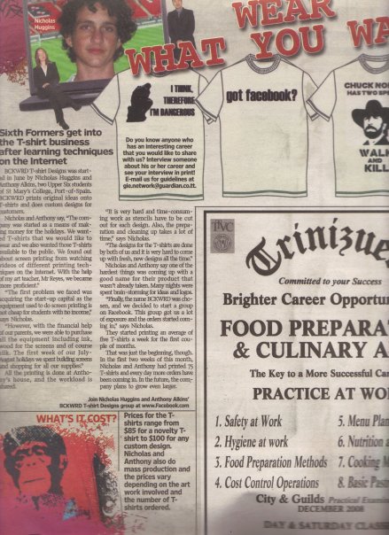
My First Logo
I was recently going through some of my old work and I found what is possibly the first logo I have ever created. To give some background to the logo I will give the story about what it was for. At the age of around 17, a friend (Anthony Alkins) and I decided we…

bckwrdlogo
I was recently going through some of my old work and I found what is possibly the first logo I have ever created. To give some background to the logo I will give the story about what it was for. At the age of around 17, a friend (Anthony Alkins) and I decided we were going to start a T-shirt printing business. We decided that it will be a good venture to start in an effort to make a bit of pocket money. We had achieved a small amount of success spray painting images through a stencil onto the t-shirts of fellow students during the intercol season, and figured this was a good step to take. After a little bit of research we decided that the best and most efficient way to print t-shirts was screen printing. We got all our equipment (ink, silk, built screens, etc) and wrote down a list of ideas to put onto these t-shirts. Our idealistic view was that we were going to print t-shirts that we would want to wear ourselves, and of course people will flock to buy them. Truth be told, we did sell quite a few of our own ideas, but for the most part, people came to us with their own ideas for us to print. This turned out to be our biggest money maker. Before we printed a t-shirt, we needed to come up with a brand name. Something for people to recognise us by. This was my first foray into branding and at this time I had no clue about anything in the world of graphic design. Being the "artist" in the business I was tasked with drawing a logo once we came up with the name and the name we eventually chose was BCKWRD Designs.
Come time to create the logo, I made a bunch of sketches and eventually created a finished drawing with a marker. I then scanned the image and coloured it black in photoshop with the help of the magic wand tool and the brush tool. At this point I had no idea what illustrator was, and very limited knowledge of photoshop. If you asked me about raster graphics, I would have assumed you were telling me something about Bob Marley. With the little skill possessed, a logo was eventually created and we started printing. We achieved relative success with the business, and we printed a few afternoons every week for the next 2 years or so, we were even featured in an article in the newspaper as well as a local talk show showcasing youths who were doing things out of the ordinary.
This early experience with graphic design eventually led me to choose graphic design as a career and I was fortunate enough to study it in detail for 4 years at SCAD. I think one of the positives in the early BCKWRD logo is the handmade feeling, and it is what can be achieved through sketching before going straight into illustrator and using a font found online. When designing always consider a youthful naivety in the sketching process, and this will show through in creating original designs that does not look like any old logo found on behance or pinterest. Check out the finished logo below.

bckwrdlogowhite
Here is some process work that I found in an old folder. From an initial sketch to the finished drawing that I would have scanned in.

IMG_3923

IMG_3920
IMG_3921-2
IMG_3922
353_100551145480_4108_n
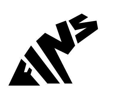
"Fins by O'Brien" Logo Process
Someone recently approached me to come up with a logo for them. They had started making custom surfboard fins out of plywood and the product piqued my interest. I immediately started formulating ideas…

Image
Someone recently approached me to come up with a logo for them. They had started making custom surfboard fins out of plywood and the product piqued my interest. I immediately started formulating ideas in my mind and by the next day I had a pretty solid idea as to what I wanted the final logo to look like. Below is the initial sketch in my notebook.
From there, I drew it out in Adobe Illustrator very roughly in order to get a feel for the positioning and shape of the letters.
Image
After that it was just a matter of editing the strokes and the anchor points in order to get the desirable look for the logo. A wooden texture was added to reflect the nature of the product.

Image
Mark Bradford
I was recently going through some chicken scratch notes that I made in a class I took at SCAD called Alternative Design Approaches. I had a bunch of names scrawled down and circled, which I would…

pic1

1782_MB-12598
I was recently going through some chicken scratch notes that I made in a class I took at SCAD called Alternative Design Approaches. I had a bunch of names scrawled down and circled, which I would do in order to remember to do more research into whatever it was that was written down. In this case it was the names of a few artists that had caught my attention during a lecture. One of the names that was written down was Mark Bradford, and after a quick google image search, I realised why I had taken note of this artist while I sat in class. His work is unique, insightful, and truly speaks to this generation of artists.
Bradford creates large scale pieces combining collage and painting. He uses found objects, often times signs that he finds on the streets of his hometown of Los Angeles, in his pieces. He applies layer after layer of paper and paint and usually sands and scratches the surface to expose the layers. His marriage of art & design, and typography & painting is very unique and really speaks to me as an artist and graphic designer. Bradford uses imagery and elements found on the streets to create his work, specifically signs found in urban areas that are advertising various things. According to artspace.com his work "addresses the spontaneous systems and networks that materialize within cities, such as displaced communities, patterns of violence, and black-market economies". The typographic elements and grid like structures found in his work give an urban map-like feel to his pieces.
There is also a reflection of the De Stijl Movement to be found in his pieces as can be seen in the comparison between his piece titled "Disappear like a a dope fiend" and the work of Piet Mondrian, done 93 years apart, seen below.

bradford_mondrian

bradford-6-popup-v2

mark_bradford_kryptonite
I will leave you with this video of Bradford talking about the use of language in his pieces, as well as touching on his process while working.
[vimeo http://vimeo.com/16325475]
Also check out this PBS Art 21 documentary on Bradford that is definitely worth the watch.
For even more info, visit his website "The Mark Bradford Project"