
McDonald's Illustrations : The Process
What do you do when you’re on holiday and McDonald’s asks you to work on 3 illustrations for them to celebrate their 10th anniversary in Trinidad & Tobago?
You say yes and thank your lucky stars that you cleared your week in advance.
The brief for the job was simple…
What do you do when you’re on holiday and McDonald’s asks you to work on 3 illustrations for them to celebrate their 10th anniversary in Trinidad & Tobago?
You say yes and thank your lucky stars that you cleared your week in advance.
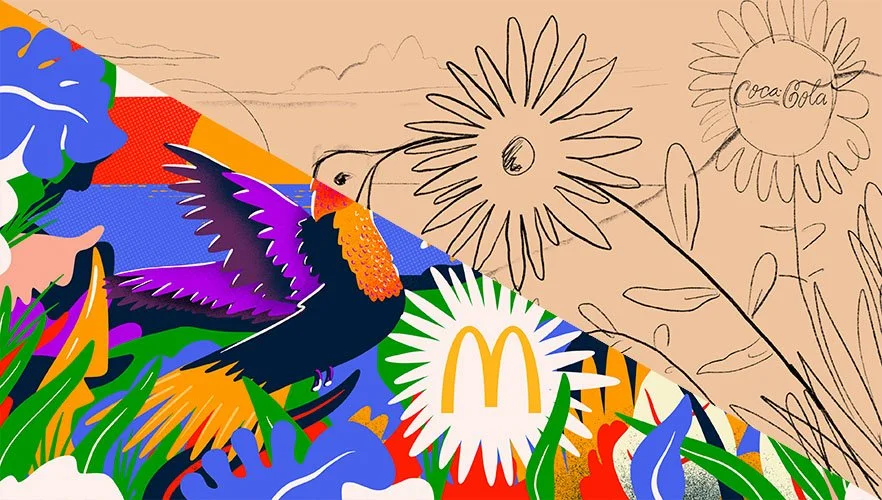
The brief for the job was simple, to create 3 custom illustrations which are patriotic, family-friendly, and feature local landscapes/ topics. Sounds easy enough…but how do you capture the essence of a place like Trinidad & Tobago in just 3 illustrations, there are literally hundreds of things that you can do to represent T&T.
As with all jobs, the first thing I did was to start brainstorming ideas. I also decided to ask my Instagram followers for some help by asking them what they think of when they think of Trinidad & Tobago. I definitely got some good answers that helped me get a gauge on what were the most frequent answers (example: Carnival.) I’ve included below a selection of the answers that I receieved.

Once I narrowed down some of the ideas, the next step was to start sketching. At this point I had a pretty good idea of what I wanted to do so the sketches would be super rough just to try to figure out the actual composition of the concept. If you look at the sketches below, you can see how the final designs originated in these thumbnails.

The sketches above aren’t shared with the client during the process, however what I typically do is send across refined pencil sketches for the client’s approval before I move on to adding any colour. This way, the layout can be approved and there are no surprises for the client at the end; and of course if there are any changes to the layout, all I have to do is change a pencil sketch and not redo an entire section of a fully formed illustration.
The concepts that I chose covered a lot of bases of T&T culture and life.
Design 1 showed a hummingbird in the hills; the original Amerindian name for Trinidad is Ieri or the Land of the Hummingbirds so I felt it a fitting tribute to have a hummingbird as the focal point in the illustration.
Design 2 was of course an ode to Carnival. I tried to capture the energy of Carnival showcasing masqueraders at the Queen’s Park Savannah in full revelry.
Design 3 was meant to showcase the melting pot that is Trinidad & Tobago using many elements of what makes us who we are in one design.

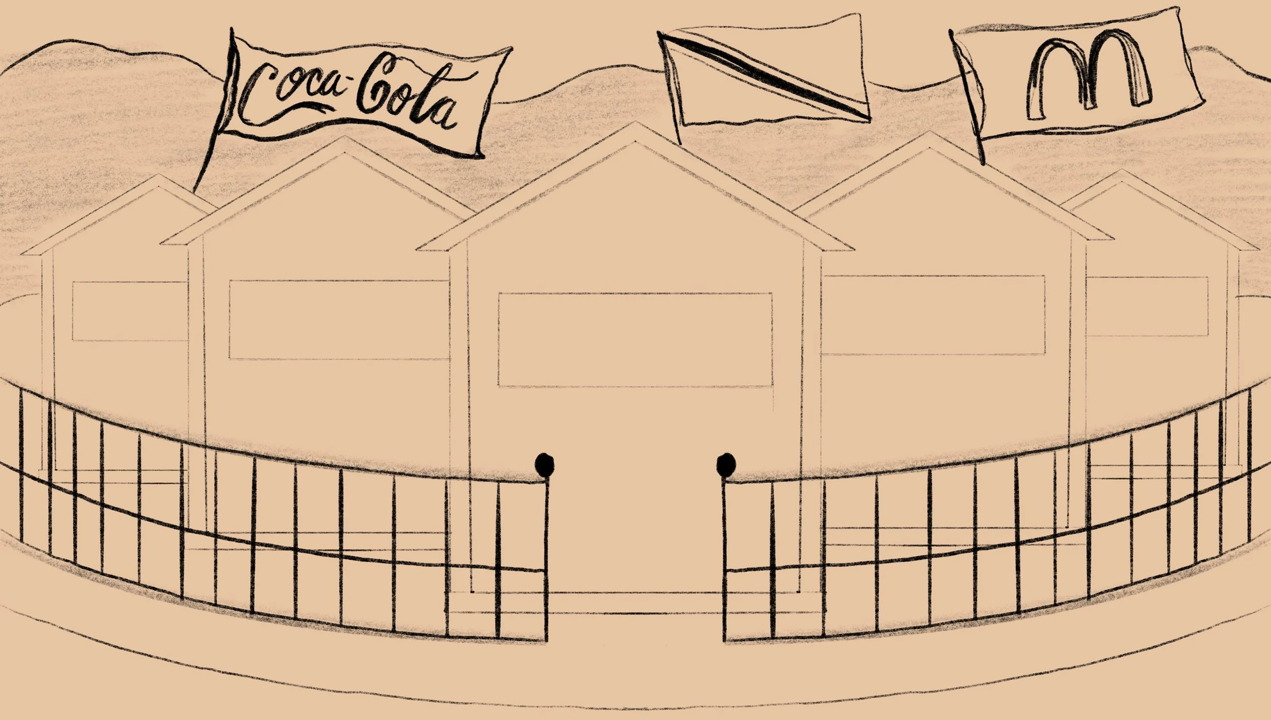

Once the sketches are approved, I usually work on a colour-study which is a more refined sketch that includes some colour so that the client can get an idea as to what the palette will be.
This job however, had a pretty tight deadline, so I included a small segment of colour in the initial sketch presentation so that the client can both see the layout and palette in one shot. There were a few minor changes after this stage of the process but nothing major.
Next up was to create the final illustration!
For the final pieces, I had a pretty good idea of the style and vibe I was going for. The three designs were done on the iPad Pro using the Procreate app. Procreate is an extremely versatile program that I really enjoy using. If you want to know more about my Procreate work flow, click here to check out a video I made. Once I wrapped up the finished illustrations, I worked on some mockups so that the client can best see what the final product would look like.


Overall this was a really fun project to work on and I am extremely happy with the final result. If you scroll down you will see the promo video as well as the television interview for the launch of the illustrations. I hope you enjoyed this insight into the process, and if you have any questions make sure to leave them as a comment.
Nick
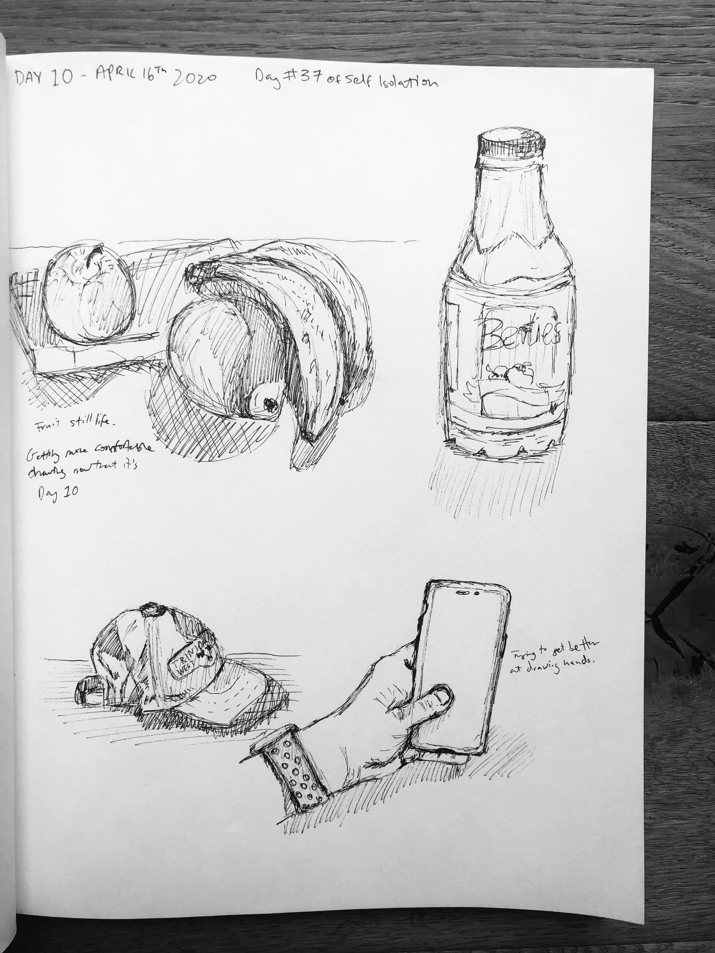
The 100 day Project - Day 10 update
10 days ago I was sent a link to the 100 Day Project’s landing page and was immediately drawn in (no pun intended.) The only problem was that I couldn’t decide if to do…

10 days ago I was sent a link to the 100 Day Project’s landing page and was immediately drawn in (no pun intended.) The only problem was that I couldn’t decide if to do 100 days of hand lettering or 100 days of sketching. Hand lettering was a skill that I am interested in learning more about and improving on; however, I really wanted to start sketching again. So I decided, you know what, I’ll do both. The rule I set for myself for the project was that I had to do at least 1 page of my sketch book for each.
I write this on the morning of Day 11 as an update on the first ten days. So far it has been pretty good with the exception of a couple days where it felt more tedious than fun, however on the average day it is enjoyable. For the sketching, I realised I enjoyed it more when I chose different areas of the house to sketch from. That seems obvious, but when you are at your desk working, it feels like a task to go find somewhere else to draw from.
See below to see the 2 galleries of images from my first ten days of the 100 day project. If you want to follow along, I am sharing this project on my Instagram stories everyday, and I have a story highlight where you can see everyone!
Also, just a reminder that if you want to support my work, please consider becoming a patron over at Patreon by clicking the button below.


How to stay inspired?
There are some weeks where I feel a sense of artistic inspiration from morning until night and I find the ability to create a lot of illustrations and think of a bunch of cool ideas with seamless ease. Other weeks however, it is a bit of a struggle to find the energy to pull out a blank canvas or to create a new file in illustrator. If this happens to you as well, I've put together a few things I find helpful to do when I'm stuck in a rut that help me find the creative energy…
There are some weeks where I feel a sense of artistic inspiration from morning until night and I find the ability to create a lot of illustrations and think of a bunch of cool ideas with seamless ease. Other weeks however, it is a bit of a struggle to find the energy to pull out a blank canvas or to create a new file in illustrator. If this happens to you as well, I've put together a few things I find helpful to do when I'm stuck in a rut that help me find the creative energy.
1) Look at other artists/designers who are better than you. My number one source for finding and interacting with other designers is Instagram. Check out some of my favourite Instagrammers here.
2) Check art/design blogs. My favourites are This is Colossal, Design Boom and Abduzeedo. There are many others out there that are endless sources of inspiration.
3) Talk to other artists. Catch up on what your designer friends are up to; they may have some extra ideas up their sleeve or a different perspective on a project you may be working on even if they are not in the same field as you. I am an illustrator and graphic designer, yet whenever I need advice or inspiration, one of my go to's is my friend Fede who is an Industrial Designer.
4) Doodle. By simply opening a sketch book and doodling, your brain starts thinking of ideas. This is especially true if you work a lot on the computer. Taking a break and doing an actual sketch helps in the design process.

I always start with sketching.
5) Open a book. There are so many art/design books out there that are full of ideas, you can't help but feel inspired. A few of my favourites are Things I have Learned in my Life So Far by Stefan Sagmeister, Graphic Design- A New History and Pretty Much Everything by Aaron Draplin

My copy of the great book by Stefan Sagmeister
6) Go for a walk. There are so many things to see outdoors, and by changing where we go, it opens our eyes to new things and ideas.
7) Go through old work. Sometimes your old work may inspire a new project, or maybe you might find a way to improve on your past designs. Many times I have gone through an old sketch book and found an overlooked concept or idea that is relevant to something I was working on.
8) Make lists of ideas. Writing lists (even when you are not in a creative rut) helps the creative method. For every 10 things you write down if you get one good idea out of it, you will eventually have a lot of ideas stored up over time. I try to add a few ideas to my list every day, and every so often I go back to search for inspiration.

Make lists of ideas!
9) Take a break. Sometimes overthinking takes a toll, and it is best to just walk away from your work and relax. Let your brain do some subconscious problem solving and then attack the project with a reinvigorated energy.
10) Listen to music. Everyone has music that they like to listen to while they create work. Put on your favourite tunes and wait for the creative juices to start flowing. Click here for a song that I love to listen to when working.
Hopefully this was all super helpful and maybe you found some inspiration in the list of things that I do. If you have anything to add feel free to leave a comment!
Joseph Kosuth and the Idea of Art
“The 'value' of particular artists after Duchamp can be weighed according to how much they questioned the nature of art.”― Joseph Kosuth, Art After Philosophy and After: Collected Writings, 1966-1990
Joseph Kosuth is an American Conceptual artist whose work...

one-and-three-chairs
“The 'value' of particular artists after Duchamp can be weighed according to how much they questioned the nature of art.”― Joseph Kosuth, Art After Philosophy and After: Collected Writings, 1966-1990
Joseph Kosuth is an American Conceptual artist whose work focuses on exploring the nature of art and creating artwork that is about the meaning, not necessarily on producing work that we typically view as fine art. Kosuth, who draws from both his studies in anthropology and philosophy, is one of the pioneers of the conceptual art movement that came about in the 1960’s.
Conceptual art was defined based on the grounds established by the artists themselves and was conceived of entirely by the artists. The art of Kosuth was idea driven. He rejected the idea that art should be based on aesthetics, and states that in the past, art’s function was its value as decoration. He believes that art’s only claim is for art; that art is the definition of art.
“Art as Idea as Idea” is a series of work by Joseph Kosuth that involves texts through which he probed the condition of art. He went about the series by using the idea that art is a set of formal problems. He had a shift in what he thought and understood was the context of his work. The creative process to him was in changing the idea of art itself. Without larger meaning, art was reduced to decorative, formalist works.
His most renowned work in this series is “One and Three Chairs.” The 1965 work consists of a chair, an image mounted on the wall of the chair in actual size, and a print of the dictionary definition of the word “chair.” It also comes with instruction for the realization of the piece. In each location the work is set up, it will be different aesthetically yet it will keep the same idea. The goal of “One and Three Chairs” is to show that a work of art can embody an idea that doesn’t change, despite constant changes to its elements. It can be set up anyhow, by any one, with any chair, yet keep the same core idea that Kosuth intends behind the work.
“One and Three Chairs” looks at the relationship of language and a narrative in works of art. It attempts to solve the problems associated with art by making the artwork interchangeable, and substitutable. Because you can essentially create the artwork anywhere once you follow the instructions, the work can be created anywhere by anyone. It was the idea of the work that constituted the work, rather than the formal artistic elements.
It is very interesting that Kosuth values the idea behind the piece more so than simply what you saw. To him, the most important thing in his piece is the idea. Every work of art to Kosuth is tautological, and it describes only itself.
In one of his works (Leaning Glass, 1965), he has 4 square panels of glass leaning against a wall. Each glass has a different word that is factual and descriptive of the glass pane. The words are “glass,” “square,” “leaning” and “clear.” His work makes the viewer consider what is art, and he uses his philosophical learnings in order to define what art is.

untitled-142D49937FE31DE9248
Kosuth says that he chose glass as the medium due to the fact that it was clear, and there were no compositional problems as far as choice or location or color. He first started the process of the work by figuring out the presentation of the glass. He tried smashing it, stacking it, but this led him to try using language in the work. With his first glass piece he leaned it against the wall, with a lable next to it reading “Any Five Foot Sheet of Glass to Lean Against any Wall.” The work was neither a sculpture on the floor nor a painting hung on the wall, and as glass had no form or composition.
His neon signs also explore the tautology in art. He creates neon signs of text that state exactly what it is. “Five words in orange neon” is a work of Kosuth’s done in orange neon. It is exactly what is written, five words in orange neon. Or similarly, "four colors four words." It looks at the semiotics in the art and how the word relates the way it is portrayed. Joseph Kosuth focuses on the meaning of the art, and not simply the fashioning of forms and colors. The making of meaning is what he believes art to be. He states that artwork must involve a test and that art that doesn’t work within this context consists of illustrations of what art might be.

four-colors-four-words

tumblr_mewh453SHE1qkg9xeo1_1280
Joseph Kosuth is a very important figure in the last 50 years and he has helped to better define art. His work is similar to Duchamp in that if someone says it is art, then it’s art. One of his inspirations is Ad Reinhardt who painted black squares. He believes that what made Reinhardt an artist is not the fact that he paints black squares, it’s the meaning behind what he is doing, and this is just what Kosuth wants in his work, for the meaning to be the important thing and to come through.

The Artist
Photographing the Mundane
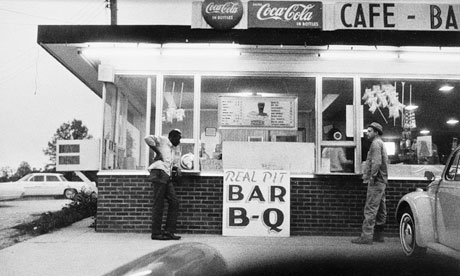
Artists see the world through different eyes to most people; they see the beauty in things that may be considered boring or mundane, and there are no photographers who capture this beauty as well as William Eggleston. Eggleston is a pioneering photographer and is credited with…
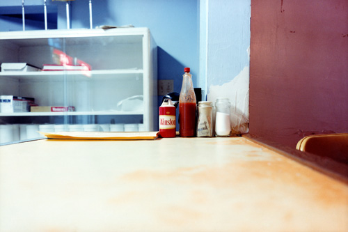
hot_sauce
Artists see the world through different eyes to most people; they see the beauty in things that may be considered boring or mundane, and there are no photographers who capture this beauty as well as William Eggleston. Eggleston is a pioneering photographer and is credited with introducing colour to art photography in the late 1960s. To understand how avant-garde this was, it must be acknowledged that most art photography at the time was shot in black and white, and colour was considered to be ugly; no serious photographer would photograph in colour.
The reason behind art photographers shooting in black and white is summed up best by John Szarkowski, writing in the introduction to the book "William Eggleston's Guide."
He stated, "For the photographer who demanded formal rigor from his pictures, color was an enormous complication of a problem already cruelly difficult. And not merely a complication, for the new medium meant that the syntax the photographer had learned - the pattern of his educated intuitions - was perhaps worse than useless, for it led him toward the discovery of black-and-white photographs. Most serious photographers, after a period of frustrating experimentation, decided that since black and white had been good enough for David Octavius Hill, Brady, and Stieglitz, it was good enough for them. Professionals used color when they were paid to, doing their very best, without quite knowing what they meant by that."
Below is a photograph by Eggleston, taken before he started shooting in colour.
eggleston-before-colour-006
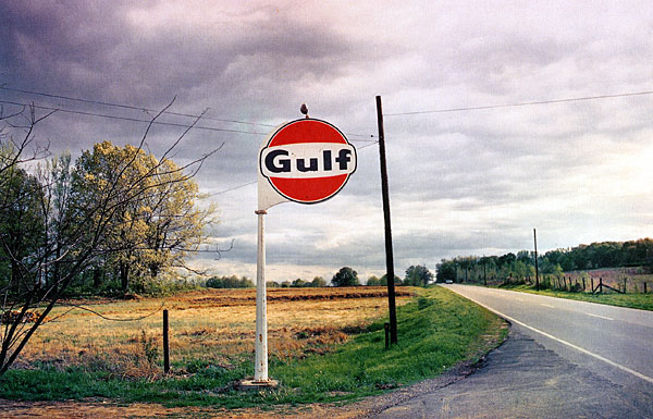
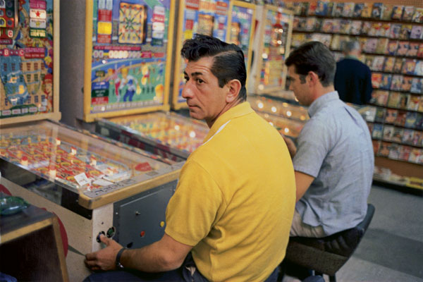
Eggleston was born in Memphis, Tennessee, and it is here that he has done the majority of his work. According to his wife Rosa, when he was first getting started in photography he told his friend that in Memphis everything was ugly and he didn't know what to photograph; his friend responded "well, photograph the ugly stuff." So this is exactly what he did. He began photographing otherwise unremarkable subjects yet achieving remarkable results.

troubled_waters_i
He has been said to photograph democratically, where he treats everything he sees equally and produces pictures out of nothing.
His subject matter could be described as banal, boring, mundane and everyday, however he shoots it with such beauty, and what at first seems simple turns out to show quite a complex message where nothing in the frame can be taken for granted. His wife has said, “One thing that I will never forget in my mind what Bill did say to me earlier on when he was talking to me, ‘Now you must not take anything for granted when you are looking at a picture. Never do that. Every single little tiny space on that page works and counts.”

troubled_waters_b
Eggleston has gone on to achieve great recognition, however, in the beginning of his career he had a show at the Museum of Modern Art (MoMA) in New York City and one art critic deemed it "the most hated exhibition of the year." There were a lot of negative reviews by critics who simply did not get what it was he was doing. Another critic stated that it was "totally boring and perfectly banal" which is ironically the intention of the exhibition, and something that he went on to become recognised for.

dust_bells_v2_m
In the documentary "William Eggleston-Imagine," he said in response to his critics at his MoMA show, "“I think it was wonderful having a first major show at MOMA, of all places. It got tremendous recognition, great amount of it—-negative. I really felt sorry for them, because it was so obvious –-it was like they had the wrong time. They didn’t understand what they were looking at. And their job was to understand it. Modern art, it is the museum of modern art. And, they wrote pretty stupid things. Then it became known all over the world, so, the critics who wrote all that stuff later apologized [laughed] that they were wrong.”
southern_suite_c
Eggleston is truly great at what he does and his photographs are a joy to look at. What might be considered as mundane by some, his images transport us to a time where we are stuck in the moment that each photograph was taken. Despite living in an "ugly & boring" place, he has transformed it through his photography, and he is truly a master of his art.

los_alamos_s
To conclude, here is a great quote by Eudora Wetley that perfectly sums up the work of Eggleston, "The extraordinary, compelling, honest, beautiful and unsparing photographs all have to do with the quality of our lives in the ongoing world: they succeed in showing us the grain of the present, like the cross-section of a tree. The photographs have cut it straight through the center. They focus on the mundane world. But no subject is fuller of implications than the mundane world!”
los_alamos_o
All images are © Eggleston Artist Trust. All rights reserved.
You can see more of his work at the Eggleston Artist Trust website.

Fete Signs of Trinidad
As a graphic designer who studied abroad, I always think about what kind of design or aesthetic is intrinsically Trinbagonian; what colours do we use, what sorts of typography is used, what sort of trends are seen in our design? Now that I am back living and working at home…

Image
As a graphic designer who studied abroad, I always think about what kind of design or aesthetic is intrinsically Trinbagonian; what colours do we use, what sorts of typography is used, what sort of trends are seen in our design? Now that I am back living and working at home I can't help but look out for things that set us apart from the rest of the world when it comes to design, and whether this design is done deliberately or not.
The one part of our designed environment that really stands out to me, and I find strangely satisfying, is the art of Fete (party) Sign Painting. These signs are painted and then attached to posts/trees/poles as advertisements for public parties. They are almost always up to date, due mostly to the fact that room has to be made for the next Fete Sign to go up. Each one is hand painted, and it is a breath of fresh air in a place where quality in design aesthetic is often over looked for cheaper prices, leaving us with eye sores at every turn.
One of the things that is common of these Fete Signs is hand painted typography over a background painted with a gradient. In just a few lines and with minimum words, all of the information needs to be placed so that it can be read clearly by passing motorists and pedestrians. They are used as an invitation to the nation.
There is not much info to be found online however I did come across this photo set on Flikr that has some really great, up close photos of some of the fete signs. There is also an Instagram account devoted to capturing found Trinidadian typography. If you have any additional information regarding Fete Signs, don't hesitate to send me an email via the contact page.