
Google Doodle - Steel Pan
About two years ago I received a message on Instagram from an Art Director at Google requesting my email address. The following day I received an email with an NDA and then the brief for the project…

About two years ago I received a message on Instagram from an Art Director at Google requesting my email address. The following day I received an email with an NDA and then the brief for the project. The Doodle was to be “a celebration of the Steel Pan”, the national instrument of Trinidad & Tobago which was invented right here in T&T. When I was first approached to tackle such a culturally significant topic for this Doodle I was a bit nervous because I wanted the story being told to be one that Trinbagonians worldwide would be proud of. I was also very excited because I love creating art that showcases Trinidad & Tobago and this Doodle will allow my country to be showcased on one of the biggest online stages
The Steel Pan is the national instrument of Trinidad & Tobago and was actually invented here. It is an instrument that was born from resistance and rebellion and is truly emblematic of the people of T&T. At the time, African percussion was banned among other things, and the steel pan developed out of that. The fact that such a sweet tune can be extracted from industrial oil drums is something that should be cherished. The steel pan is also closely associated with our national Carnival celebrations, and therefore is a great source of national pride.
The initial brief was for a static illustration, but after some more conversations it was decided that the essence of the pan, and the music should be showcased. It was decided to postpone the initial launch date in 2020 to work on a full length animation with original music. Mick Seegobin (motion design), Etienne Charles (composer, arranger, producer) and the living legend Lennox “Boogsie” Sharpe (composer) were brought on to the project.
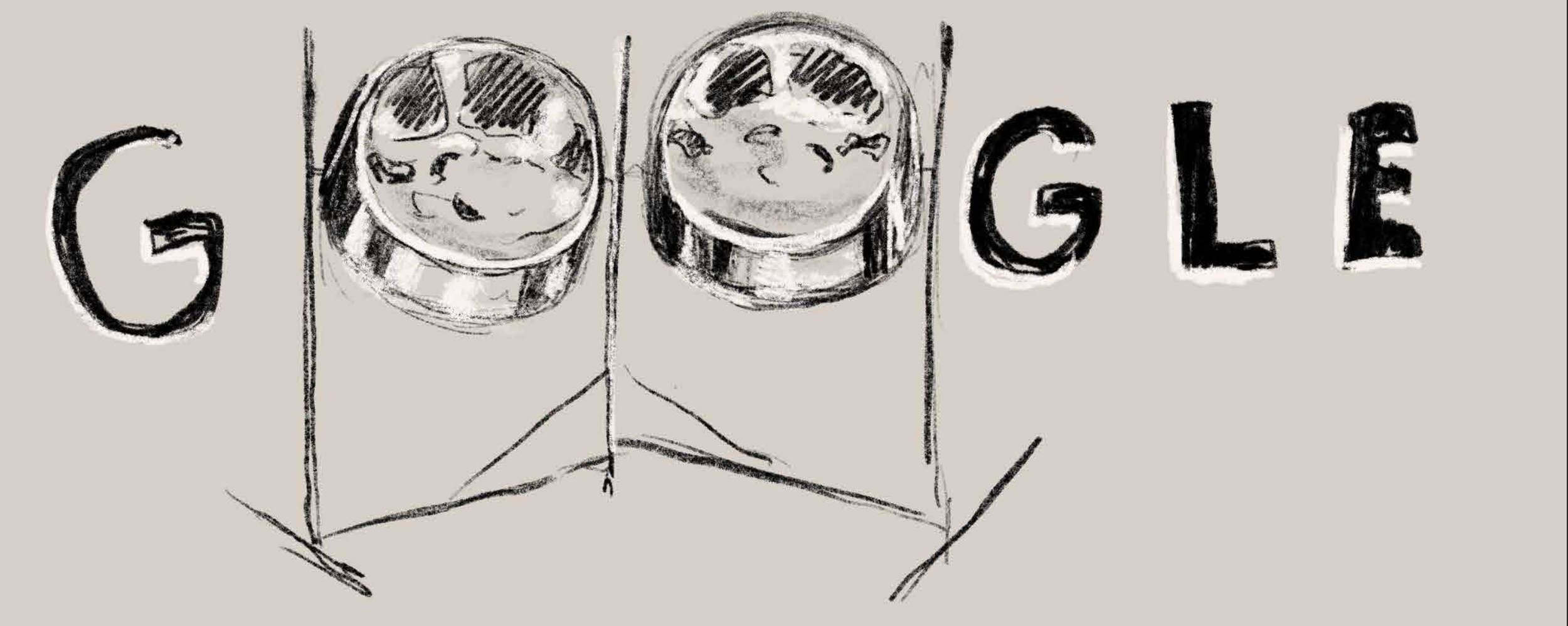
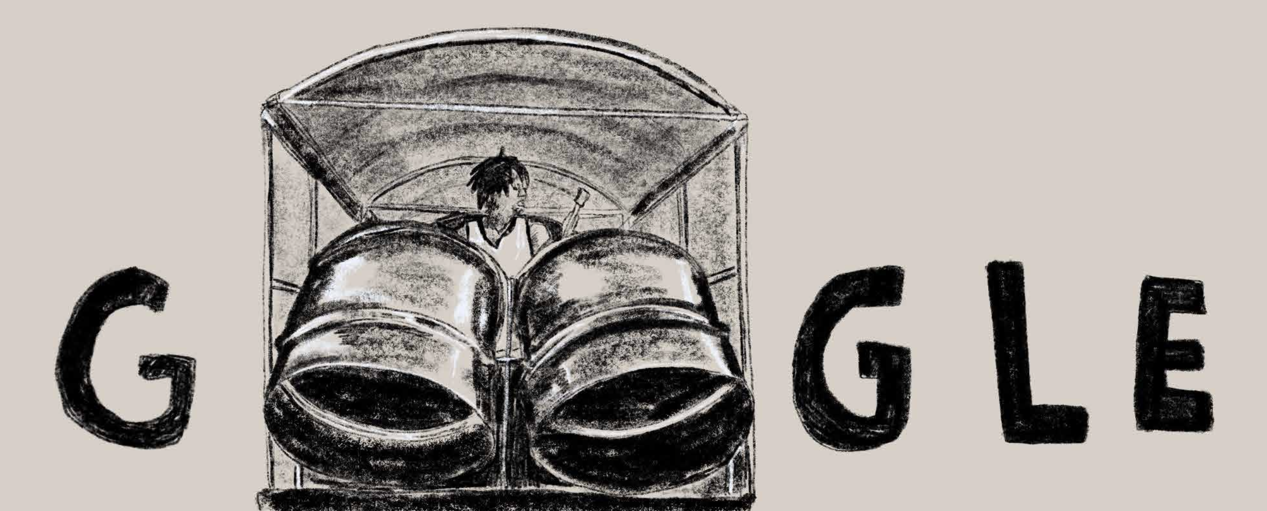


Once the decision was made to do the Doodle as an animation, the next step was to do a storyboard and create sketches that could direct the flow of the storyline. The truck was used to tie together the different scenes and to be a motif used throughout the animation. The initial sketches were done really rough simply to show the idea behind the piece. Below, you can see some of the initial sketches.


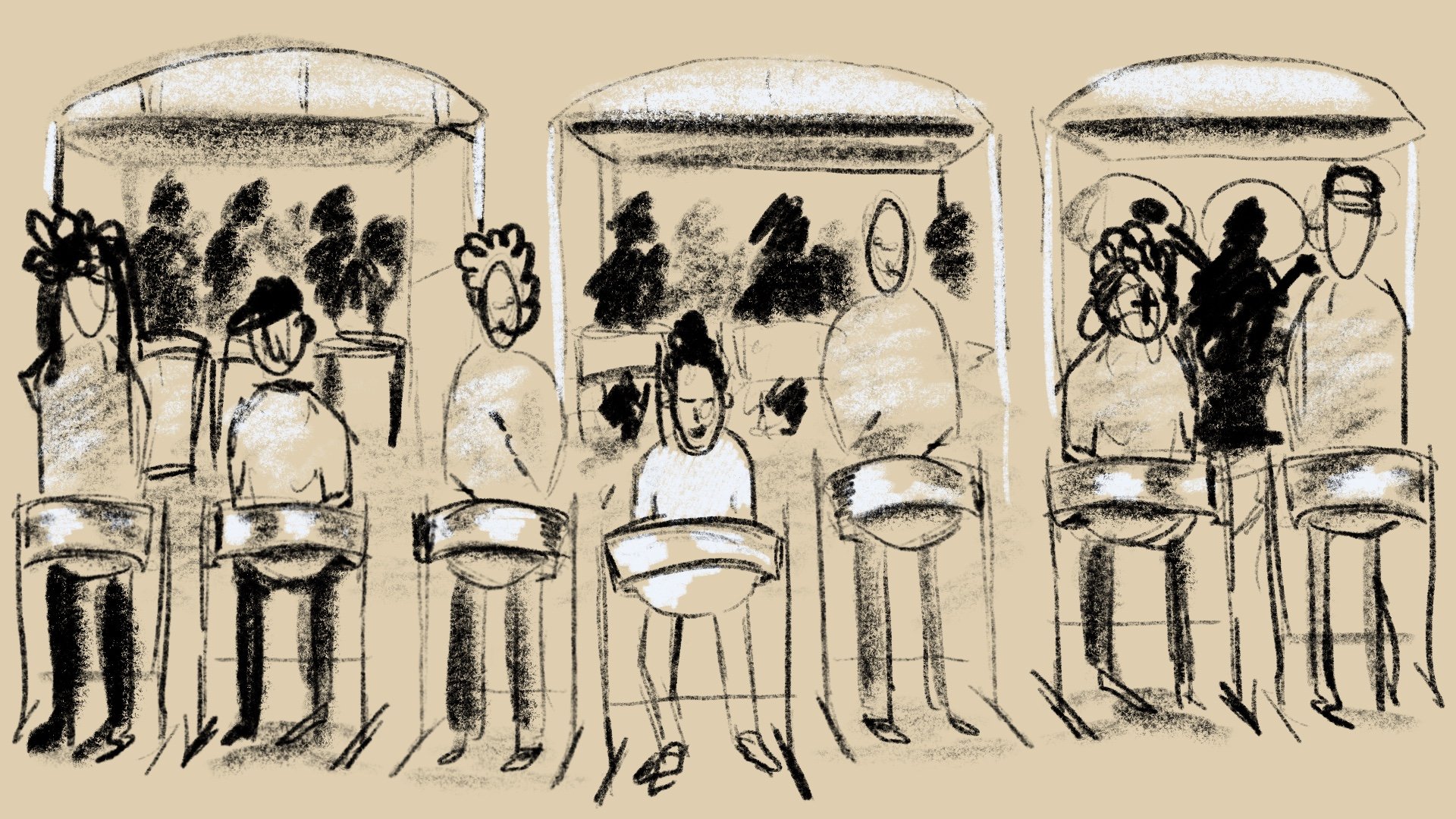
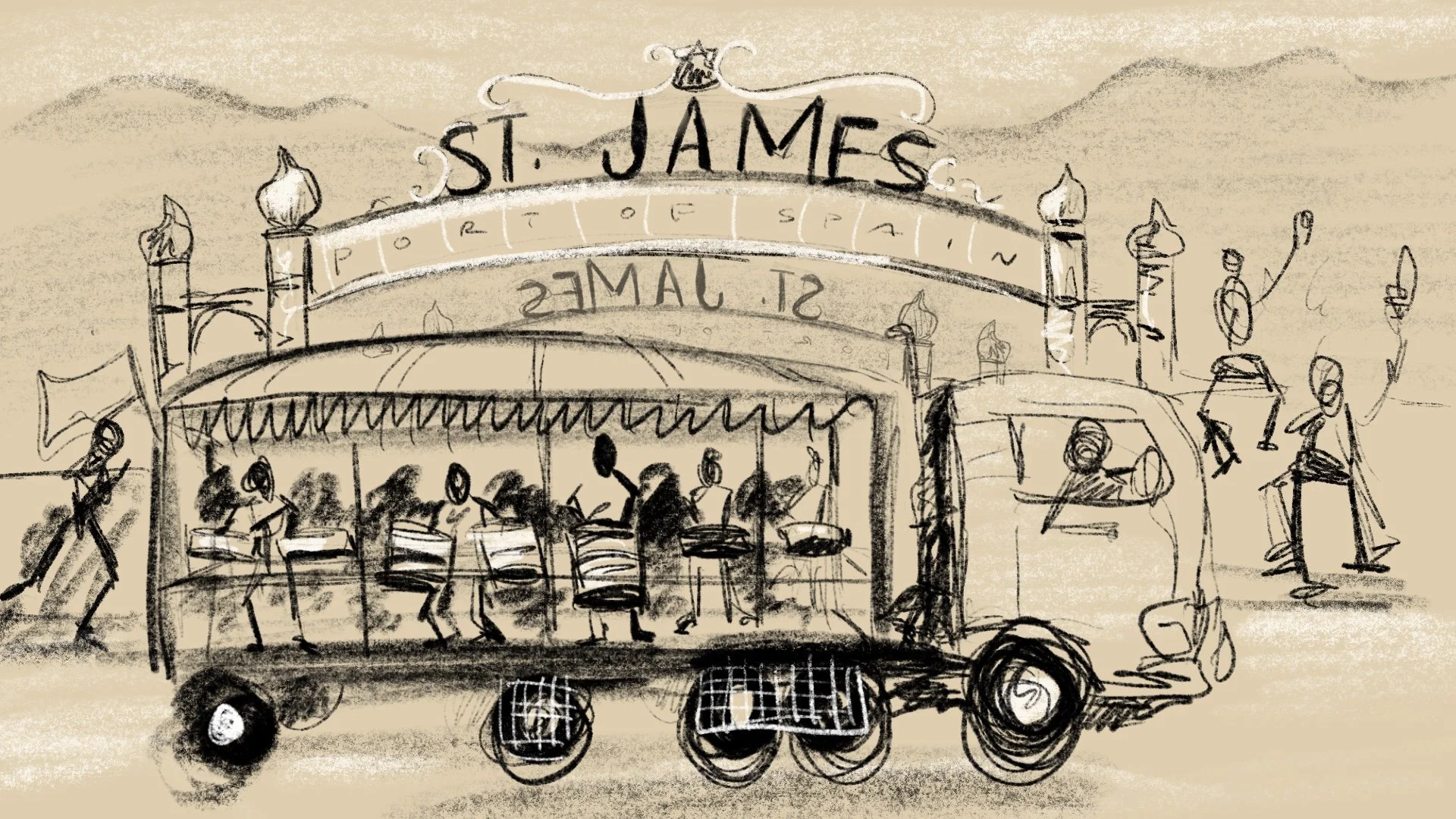
Before animating anything, we created an animatic that showed the basic timing of each scene and gave an idea of what the final flow of the animation would be. The animatic also gave the music team an idea of what was needed as far as the length of the piece of music that had to be composed. It was also decided that we would create one long tracking shot of the truck which meant that I had to illustrate a panoramic scene that the truck could drive through. This scene turned out to be one of my favourites in the entire animation.

The final step for the animation was to refine each scene illustration as well as to refine the actual animated movements throughout the video. Once this was done, the music team of Etienne Charles and Boogsie Sharpe were then able to make sure that the music and sound effects matched perfectly with the visuals.
Overall, this was a great project to be a part of, and hopefully the end product is something that Trinbagonians and Steel Pan lovers everywhere can be proud of. I hope that people can take away the sense of the industriousness and creativity of the people of Trinidad & Tobago. We are a small country on the global stage but the fact that we have given the world such a beautiful instrument is something to be held in the highest regard.
And of course a special big up to the team that worked with me on this:
Mick Seegobin : Motion Design
Etienne Charles : Composer, Musician
Lennox “Boogsie” Sharpe : Steel Pan Soloist
See the final piece below -

McDonald's Illustrations : The Process
What do you do when you’re on holiday and McDonald’s asks you to work on 3 illustrations for them to celebrate their 10th anniversary in Trinidad & Tobago?
You say yes and thank your lucky stars that you cleared your week in advance.
The brief for the job was simple…
What do you do when you’re on holiday and McDonald’s asks you to work on 3 illustrations for them to celebrate their 10th anniversary in Trinidad & Tobago?
You say yes and thank your lucky stars that you cleared your week in advance.
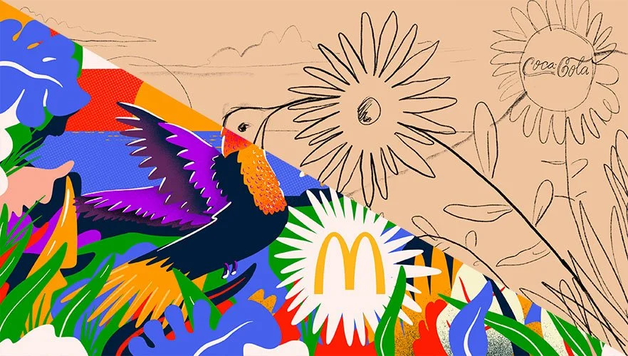
The brief for the job was simple, to create 3 custom illustrations which are patriotic, family-friendly, and feature local landscapes/ topics. Sounds easy enough…but how do you capture the essence of a place like Trinidad & Tobago in just 3 illustrations, there are literally hundreds of things that you can do to represent T&T.
As with all jobs, the first thing I did was to start brainstorming ideas. I also decided to ask my Instagram followers for some help by asking them what they think of when they think of Trinidad & Tobago. I definitely got some good answers that helped me get a gauge on what were the most frequent answers (example: Carnival.) I’ve included below a selection of the answers that I receieved.

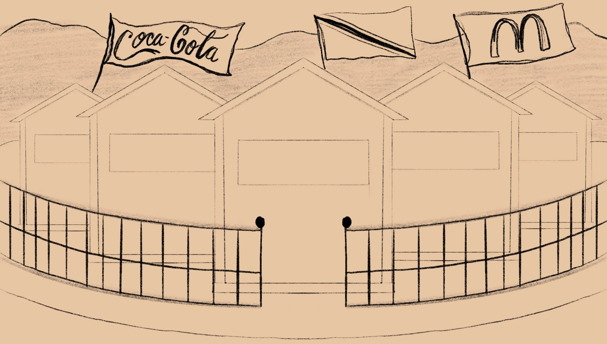
Once I narrowed down some of the ideas, the next step was to start sketching. At this point I had a pretty good idea of what I wanted to do so the sketches would be super rough just to try to figure out the actual composition of the concept. If you look at the sketches below, you can see how the final designs originated in these thumbnails.

The sketches above aren’t shared with the client during the process, however what I typically do is send across refined pencil sketches for the client’s approval before I move on to adding any colour. This way, the layout can be approved and there are no surprises for the client at the end; and of course if there are any changes to the layout, all I have to do is change a pencil sketch and not redo an entire section of a fully formed illustration.
The concepts that I chose covered a lot of bases of T&T culture and life.
Design 1 showed a hummingbird in the hills; the original Amerindian name for Trinidad is Ieri or the Land of the Hummingbirds so I felt it a fitting tribute to have a hummingbird as the focal point in the illustration.
Design 2 was of course an ode to Carnival. I tried to capture the energy of Carnival showcasing masqueraders at the Queen’s Park Savannah in full revelry.
Design 3 was meant to showcase the melting pot that is Trinidad & Tobago using many elements of what makes us who we are in one design.


Once the sketches are approved, I usually work on a colour-study which is a more refined sketch that includes some colour so that the client can get an idea as to what the palette will be.
This job however, had a pretty tight deadline, so I included a small segment of colour in the initial sketch presentation so that the client can both see the layout and palette in one shot. There were a few minor changes after this stage of the process but nothing major.
Next up was to create the final illustration!
For the final pieces, I had a pretty good idea of the style and vibe I was going for. The three designs were done on the iPad Pro using the Procreate app. Procreate is an extremely versatile program that I really enjoy using. If you want to know more about my Procreate work flow, click here to check out a video I made. Once I wrapped up the finished illustrations, I worked on some mockups so that the client can best see what the final product would look like.


Overall this was a really fun project to work on and I am extremely happy with the final result. If you scroll down you will see the promo video as well as the television interview for the launch of the illustrations. I hope you enjoyed this insight into the process, and if you have any questions make sure to leave them as a comment.
Nick