PAZ coffee: The Design Process
In 2019 PAZ Coffee & Kitchen launched in Trinidad & Tobago with their first product - Cold Brew Coffee. PAZ was founded by three sisters who shared a passion for good coffee and wanted to enter the burgeoning craft coffee scene in Trinidad. They had originally approached my design company, Backyard Design, to create their branding back in 2017 when the ideas was still in its infancy. It wasn’t until a year later in 2018 that they approached BD to put the branding to use and to design the packaging for their line of Cold Brew coffees. This would be their first product to market so it was important that the communication and launch was spot on.
The brand name was originally PAX (meaning “Peace” in Latin) but because of reasons outside their control, had to rebrand to PAZ (meaning “Peace” in Spanish.) I mention this only because some of the visuals that I will be sharing of my initial work will have “PAX,” even though all the final work will have the correct branding of “PAZ.”
The client brief for the packaging was to create a visual on the label that was both indicative of the word “Cold” because it is cold brew, while still maintaining a somewhat Caribbean aesthetic. Now, if you’ve never been to the Caribbean, I can assure you that the temperature can in no way be described as “cold.” This was going to be a challenge. As with most jobs that I take on, I was tasked with creating 3 options for the client to choose from. Because the brand identity was already completed and approved before, it was simply a matter of applying the brand identity to the label.
The first idea that I had to represent both “Caribbean” and “cold” was the image of the lolly man. A typical sight on Maracas Bay in Trinidad, the lolly man brings cold treats to everyone on your typically warm day. My second idea was to show a lady leaning out of a window with the cool breeze blowing through her hair while enjoying a sip of cold brew. For both of these concepts I tried to put myself in these situations, my imagination had me leaning out of a window on a cool December day (maybe at a beach house), first thing in the morning. Both the cool breeze and the cold brew would serve as a pick me up. This concept resonated with me the most and (fingers crossed) I hoped it would be the one that resonated most with the client.
Normally I try to present very different stylistic options, but in this case the branding was already completed so we knew pretty much what the client expected in terms of style application and aesthetic. The main challenge was coming up with a concept that would ring true to the brief. At this stage, we didn’t have the additional information for the back of the label as the client was working on getting that while we were working on the design. That meant that we presented only the front while keeping in mind that more info would have to fit on the sides and back of the label. Once we had the options to present to the client, I put together a presentation and met with the PAZ team to present the ideas and options. They were most excited about my favourite option with the open window and the breeze and they bought in to the concept.
Creating that option was a lot of fun. I started off by doing some quick sketches in Procreate on my iPad…they were super quick and not that good, but I just needed to get a good layout that I can work with.
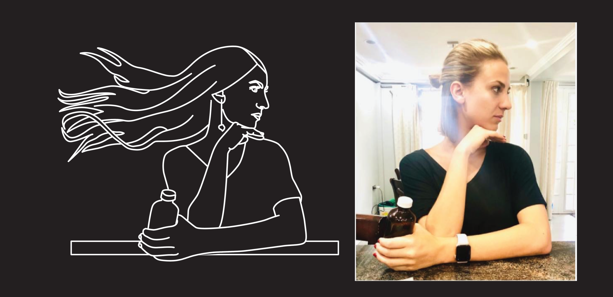
Once I felt that it would work, it was time to refine the sketches to something that would be usable. The one thing I knew had to be changed was the scale of the woman in the window…she had to be bigger to have more of an impact on the design. I had Alex, my fiancé, pose in the exact position I needed and then found an image on shutterstock with hair blowing in the wind that I was able to combine in the refined version.
From there, I put together a few versions of how the front of the label can look. They were all very similar, but developing these iterations helped a lot with the process and gave the client some options to choose from when it came to deciding on what the rest of the label would look like. The size of the window was different in the options and just that small tweak gave the label a different feel. In the end they went with the top right option where there’s a lot of focus on the woman in the window…and I liked it the most because the logo sat nicely on top of the flat top of the illustration.
This proved to be a really fun project despite the slightly challenging creative brief, and it was a success in terms of the client chose an option directly from the presentation with very few changes. This design went on to win a silver Addy Award for packaging design in 2020 which was really cool for Backyard Design and for our client, PAZ coffee. I hope you enjoyed reading about the process of this project, and if you are interested in working with me on any branding or packaging design projects feel free to reach out through my contact form, or check out Backyard Design on Instagram.
This project has been featured on:
The Dieline
Packaging of the World
Enjoy the photos of the final product below:


