How I Created the Kes "We Home" Cover
Kes’ new live-album just came out, and I’ve been getting a lot of questions recently about the process of creating this album art. Here, I will outline what was done from the start of this project through to completion.
To give some history to how this project even came to life, it all started in February of this year. A couple weeks before Carnival I posted an illustration of Kes on to Instagram. From there, I got a DM from Kes saying that he wanted to work together in the future. A few months after that, in June, Kes sent me a WhatsApp asking to jump on a call to discuss this album and the artwork.
From there, Chevonne (Backyard Design’s Account Director) and I worked with Kes’ management team to solidify deliverables, job expectations and all that not-so-fun admin stuff that’s super important in running a design business. The deliverables calendar looked like this:
Step 1 - Work on sketches and concepts for a week. At the end of that Week I presented 7 refined sketches for them to approve their favorite, but Kes and team really liked 2 of them which takes us to step 2.
Step 2 - This phase consisted of creating colour sketches of the 2 initial sketches that the team liked. Based on a brainstorming session with Kes, I already knew what kind of colour palette to use, so it was just a matter of adding some life to the black and white sketches.
Step 3 - After presentation of the colour sketches, the team was able to choose which direction they liked more. That means that I then had to create the final composition from the initial sketches and studies.
Step 4 - I presented the finished art work and all mock ups. Based on some client feedback there were a few small changes to make until we finally landed on the final piece.
This whole process took about 3 weeks, and below I will show some more behind the scenes images as well as some technical information as to how I created the artwork.
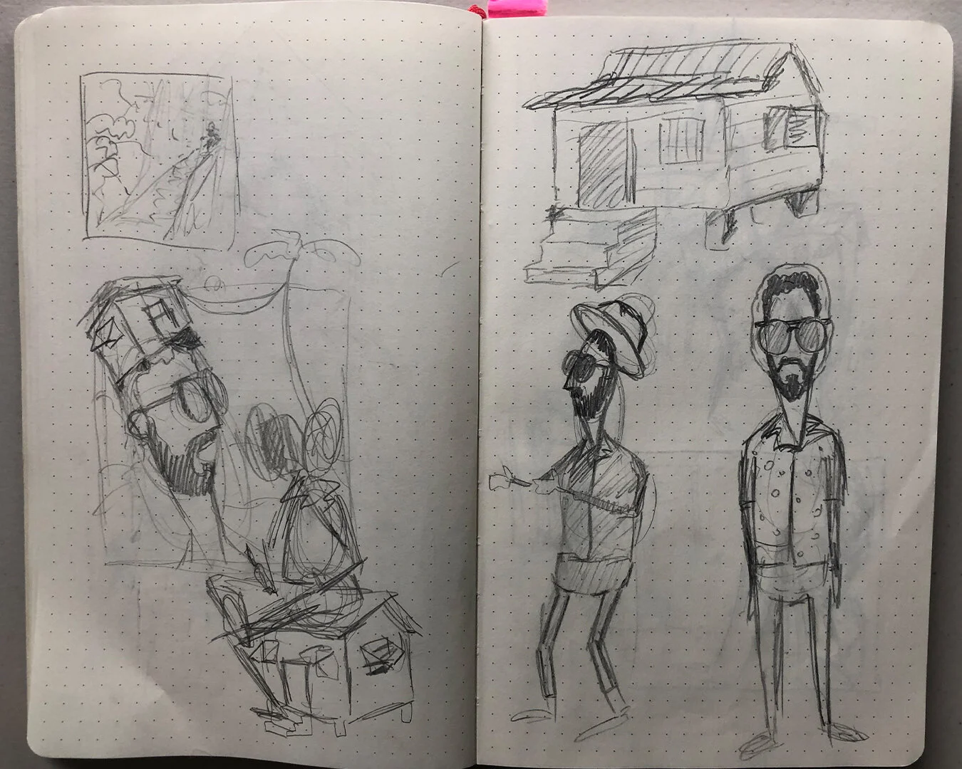
As with any project, this one started in my sketchbook. I like the dotted paper for thumbnails, it’s a nice medium between sketch book and note book. In between sketching I like to make a lot of notes so that when I look back on the sketches I can remember what I was thinking at the time. These sketches aren’t meant to be anything great, they are simply to work out my ideas quickly in a way that I can understand later on when refining the ideas. After filling up a load of pages with quick notes & concepts, I then chose some directions to further refine to show to the client. Note: The client won’t see these early sketches, these are solely for the purpose of note taking and idea generating. They will see the refined sketches.
The above 7 sketches are the first thing that Kes and his team would’ve seen. Based on my initial ideation in my sketchbook, I chose some concepts that I thought would work best for the project and refined them. At this stage, I want to show the client some options that fulfill the creative brief while also making sure that if they choose any of the options that it’s something I can be proud of once the job is done. This means not presenting “filler” options simply to meet a quota of “I was asked to present 3 options, 2 are good, but 1 isn’t great.” It’s important to make sure that all options are good! All of these sketches were done in the app Procreate using the iPad Pro & Apple Pencil.
Based on the initial sketches, the team liked these 2 options and asked me to flesh them out further. These colour options were done, and the option with the house on his head was chosen to be used as the main artwork for the album. Luckily the option that wasn’t chosen still saw life as the cover art for the single “Hello” off the album.
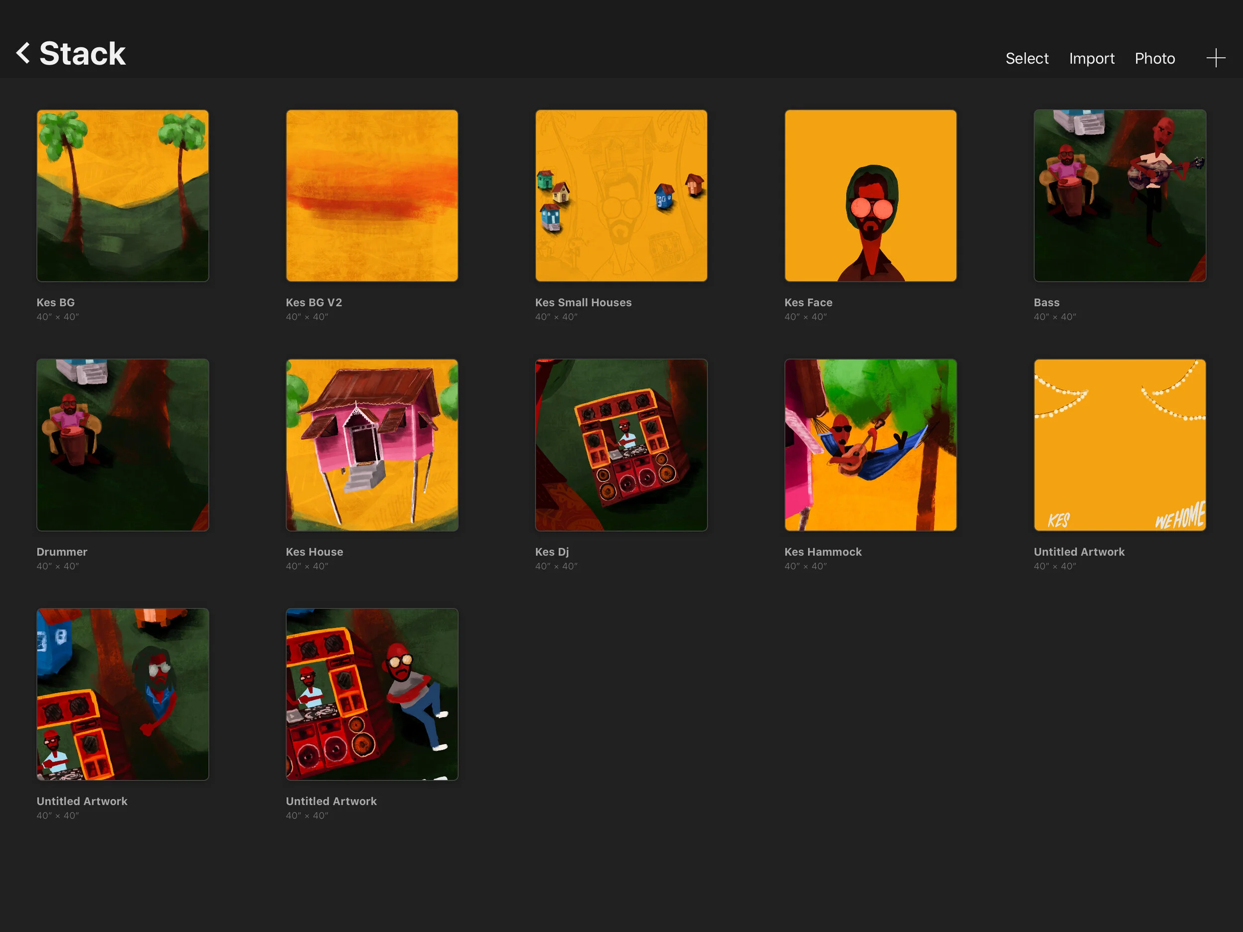
Now the fun begins! Once the colour sketches were approved I needed to create the final rendering of the album cover. To do this I used both Procreate on the iPad Pro and Photoshop on my Mac. I created each element in its own Procreate file so that I can use the maximum amount of layers for a large artboard. Each element was done on a 40” x 40” artboard which only allows up to 10 layers in procreate, however by creating each individual element in its own Procreate file I was able to have all elements nice and big while still utilising the layers. Once I was done creating all elements in Procreate, I exported to Photoshop & combined all elements where there’s no limit on layers.
In this screenshot, you can see that each 40x40” Procreate artboard has only one element from the main design. Each element was created at the largest size possible and treated as its own artwork.
Once I was done creating the final rendering of the artwork, I put together a few mockups to present to the client. Mockups are a nice way to “sell” your artwork as it allows for the client to envision what their artwork will look like in the real world.
Apart from the main album art, I also created the artwork for the 4 singles that were released before the full album was released. This was a lot of fun as it allowed me to expand this illustrated world a bit more, almost like a story book. I kept the same colour scheme, and utilized some of my initial sketches and ideas in these to be time efficient.
All in all, this project was really rewarding, especially seeing all the positive feedback online. It’s really cool to do work for someone that has so many eyes on them, both regionally and internationally. As always it’s a really great feeling to be trusted to do my thing by my clients, especially a client like Kes who’s creative work is so widely regarded as being great.
To wrap up, if you have any questions on this project, feel free to leave a comment. If I get enough questions I may do a follow up posts addressing them. I know I didn’t get into the technical aspects of designing this very much in this post, but if you think it would be worth doing an entire post on some more designer-y elements of this, let me know.
Actual photo of me and Kes


